After making my lino prints I thought that making individual shapes with print then arranging them digitally might suit my work more. I want to overlap tones of colour and repeat the same shapes throughout my compositions. I found some illustrators that use printed shapes in their work. Nicholas burrows works with collage and print, two things I am very interested in at the moment. This wrapping paper design uses abstract shapes arranged in a composition. I particularly like the contrast between sharp cut edges and torn edges. The choice of colour is interesting I would not expect to see grey used along side bold colours in a composition like this. I like the overlapping edges, I think it is important to find a balance when doing this. I have seen a lot of work where the shapes and forms become lost by overlapping too much.
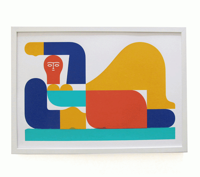
This wrapping paper reminded me of a screen print I saw recently at Colours may vary. The print is by Jay Cover and is a homage to the Henry Moore statue outside the art galley in Leeds city centre. The print is incredibly well crafted, the layers of colour are lined up perfectly. The quality of the craftsmanship that has gone into this print is plain to see, the only overlap is one rough torn edge at the bottom of the composition. The texture is subtle and the overlap is only slight but it is emphasised by the clean flowing lines of the rest of the print. The rough edge compliments the rest of the composition, it feels like the two aesthetics placed together highlight the qualities of the other. The contrast in texture may have been representing the contrasted between henry Moore's smooth flowing metal sculpture and its surroundings. I want to include some elements in my composition that crisp clean geometric shapes to contrast with the rough edges.


No comments:
Post a Comment