Thursday 30 March 2017

Book Ideas

So far I have been designing double page spreads so that the pages are landscape but it might make more sense to use a portrait layout if I am going to use mostly double page spreads or the layouts will be stretched out especially for the pages that concentrate on characters. I could use the compositions I have already made but each one could form a double page spread by itself with some minor adjustments to the placement of the characters and key objects in the composition.


I am going to move on to some of the pages later in the book to test out some of the compositions that are close ups of the dog character. I also want to see how I can illustrate the other landscapes in the story using the same aesthetic as these first few pages. I also need to explore how I am going to add the thought/speech bubbles to the compositions. They need to be bold and easy to read while fitting in with the aesthetic and composition of the page.


Wednesday 29 March 2017

Second page

I have started the second page of the book, I used the same shapes that I used to make the characters on the first page to see if  I could find a way to show the interaction between mother and daughter where the daughter says the dog is a polar bear. I am really happy with the results. In this page the characters are at the forefront of the image. and scaled up compared to the first. This made me think that maybe the characters should be larger in the on the first page but I think it works to set the scene of them being in the park and creates interest in the characters before they become the blatant, bold centre piece of the composition, also the rest of the book is going to be focussed on the dog and the majority of the compositions I have designed are fairly close up so the landscape composition will add some variation. I want to make sure there is variety in the compositions throughout the book and that they would work as a one of print as well as part of a narrative. I want each page to captivate the viewer and become an immersive environment. The children's book illustrators that I think are most effective manage to do this consistently through a variety of widely varying compositions so that each page grabs your attention and draws you into the scene.

I kept the original landscape in the background of the image to show how they have moved closer to the dog. I lowered the opacity slightly to give the image more depth. I could maybe add some more shrubbery to the foreground but it might make the composition too busy. I am going to work on the other half of this double page spread next, I need to make the dog look confused as to why he is being called a polar bear haha.

Collaborative slides

I have concentrated on the work I did for the collaborative brief as it says to do so in the submission briefing slides. I have aimed to cover what I did, why I did it, how I did it and how it will be used in the final outcomes. I wanted to include the gif I made that shows how my illustrations will be used to show there is available live content on the app as it was not included in our submission to D&AD but it will not work in the form of a PDF so I have included three images that demonstrate the animation.
On the first slide I included the simplified description of the brief and a paragraph explaining how me and the rest of the team approached it. On the second slide I included a images that show the range of our research into the festivals, BBC coverage and apps as well as a paragraph explaining our research and what we aimed to create. I made a range of characters for the app logos, most of which did not make it to the final designs so I made a board based on character development to try and illustrate the process I went through and explain why I made the choices I did. The development slide includes a large range of logos experimenting with fonts, hand drawn type and composition. The finals slide shows a mock up up image of how the illustrations look in the finished app layout.


Characters

I was not happy with the characters I made for the second page of the book. I don't think the was enough detail in the characters clothing or hands. I like the legs of the character with the crimpled walking socks and the stance. The stance look well grounded, linking the character with the landscape which could easily not be the case with a full white landscape. the character is wearing walking gear, walking socks and shoes so decided she should be wearing a nice coat to go with them. I wanted to add more detail to give more shape to the character, something more interesting than the standard body shape that I have used before. I added a mouth to the character but it didn't suite the aesthetic and if anything made the characters face less expressive and confusing. I added a flower in the mum characters hair the same as the flowers around them to add more character (that she had picked the flower earlier). The mums stance and posture is confident striding forward on their walk in the park. I moved onto the character of the little girl who I wanted to appear more apprehensive and unsure of her surroundings. I tried to do this by having her posture more leant back resting on her heels and reaching for her mums hand to lead the way. I am thinking of possible adding some line work to the shape with the Photoshop brushed I have been experimenting with to see if I can add more expression to the characters with overcomplicating them.


The bottom image will make up a double page spread so I need to make sure the characters are not too close to the centre fold. If I position them wrong the focal point of the page could become the trees of the background. I'm not sure whether it will be confusing that the dog and the characters have never met before. I will start work on the next page and see how I could work around that problem. It will be made clear on the next page but I would rather remove the confusing aspects all together.

Tuesday 28 March 2017

Presentation Boards- Project Report

I think I now know how to go about making my presentation boards and project report and the difference between the two. The presentation boards are a more in depth look at each individual brief and the project report is a broader overview of all of them. I have started on some of the individual presentation boards trying to decide how much text to put on each one is tricky but I have been looking at the examples from the slide shows to give me some help. I want to include enough text to make sense of the images and explain the thinking behind them without writing full paragraphs of text. I have been trying to pick out work that demonstrates the development of ideas as clearly as possible and what I see as important parts of the creative process. I have tried to keep a constant layout throughout all of my boards, changing the colour scheme to differentiate between briefs.


These are the research boards for 2 of the briefs, I think there may be too much text on the second one. I could possible break the text up and change the layout to change the focus more onto the images. On the top image I may change the design and remove my name and the details of the brief from the board and include them on another board that explains the brief and my analysis of it.

second page

I have been working on the second page for the book to make my first double page spread. I played around with the positioning of the character and scenery on the page to alter the scale and perspective of the composition but decided that if I made the composition too complex it became confusing and had a negative impact on the narrative. So far I have only added the 'mum' character to the page and still need to add the child, I think the character needs some changes. The colours don't really work the skin tone doesn't stand out against the white background, I think I might try some brighter colours rather than sticking to realistic skin tones, I could use these to show the emotion of the character or just stick with the same colour to build up the characters identity. I need to add more expression and emotion to the face of the character, this is something I find a lot when taking sketched characters into shape based illustrations. they lose something on the process and I need to find a way to address the problem without overcomplicating. I want to make the characters hair darker to match with the darker sections of the scenery, I think this will give the character a stronger presence on the page. The scenery is a mix of the same tree illustrations from the first page and a lot of new small pieces of plant life. I have found of way of image making that I am enjoying at the moment and need to make sure I keep refining my images and compositions instead of getting carried away and trying to complete page after page.


Monday 27 March 2017

Preparing Work For Presentation

I unfortunately missed the submission briefing and the briefing for studio brief 3 last week because I was ( and still am ill). I looked through he slideshow for both last week and have been starting to prepare my project report. The examples of reports from previous years was really helpful, it can be a bit difficult to sum up everything from the briefing at first. I have started by gathering all my finished pieces and some development work. I have downloaded some mock ups from Graphic Burger to demonstrate how my illustrations will look when they are applied as various products. I think showing the designs incorporated with the product they are designed for is especially important for the phone app and the book cover I made as they are designed for a specific purpose. The app illustrations are designed very specifically to work at the dimensions of a phone screen so it was good to be able to illustrate this on the boards.


I will need to try and balance the number of images and text on each slide, I don't want them to been too confusing or cluttered. I will also need to make sure I choose development work that demonstrates the how and why I ended up with the finished pieces I made. I have started to mock up my slides with images for final pieces and some alternate variations. I need to start working my way through my development work and get some good quality clear photographs.


Saturday 25 March 2017

Page layout


This is the page layout I will be using for my book. I have had to make a few adjustments to my original roughs as I had illustrated the book with too many pages. The pages I have removed were not really necessary for the narrative of the story and I do not think leaving them out will make the story feel disjointed. Pairing down the number of pages leaves me with 14 double page spreads, I want to leave a blank page at the back of the book as I think it would look like quite an abrupt end and not fit the flow of the illustrations. I spoke to the owner of Colours May Vary recently about another book I was working on and they said it was best to leave the back page plain and it could be used for important information that needs to be included on the publication, such as who the publisher is and when it was published. I am going to illustrate a number of the double page spreads for the project, in total I need 6 illustrations. I am thinking of illustrating 5 of the double page spreads and the cover/promotional poster. I would like to show how the illustrations could be applied to a number of products or to promotional material to explore how my illustrations would work in various settings that make up my chosen area of practice.


I made my page layout into an issuu document to get an idea of how the pages look in a book format.

Thursday 23 March 2017

Manuscript


This is the manuscript I made for the book. I got it back with some suggestions of how I could improve my book. A few of the idea for the book were a bit confusing and needed to be cleared up. The beginning of the boom where the child and the dog meet is not clear, why don't they know each other? I am going to start working on my page layouts for this book working towards a 32 page book layout. I want to make the pages for the book double page spreads so will have to think about how the characters are arranged over both sides of the page and remember not to put any important objects directly in the centre of the illustration. Making mock ups of my pages will help me to get a better idea of how the images work as spreads.

Mojo

After a week of hating everything I have finally got my mojo back haha, well maybe. Researching work from other artist, trying to understand what I don't like about my work and getting some useful feedback in the peer reviews seems to have helped. I got an idea for how to draw trees for the first page of the book that seemed to trigger more and more ideas. I think this highlights how important it is to break from sketching when it isn't working and change focus to research and evaluation.


I wanted to make trees from a variety of contrasting shapes that still manage to capture the aesthetic of leaves. The idea for these was that I could create a landscape that floats in the centre of the page with the contrasting shapes creating an interesting silhouette like sky scrapers or mountains. I am still debating whether to add texture and extra colours to these but I like the simplicity and the focus on getting the shapes right with no texture or detail to hide behind.

I added ricks to give the composition more depth. I also wanted the rocks to make the trees seem grounded on the page. I added small details of flowers but didn't want to add too many and clutter up the design. I made a few more flower designs but they were more complex and got lost when scaled down. I decided to get rid of the stems for the flowers as all you notice from a distance is the bright bold flower itself. I am still going to experiment adding textures and shading to this composition to make sure I have tested all possibilities but I think the simplicity and bold shapes are the key features of this piece and don't want to do anything to lesser the effect of that. I am moving on now to character design, I have already sketched out a character I am happy with in a number of poses but need to make them into a shape based design, something I have struggled with over the last few weeks. I have some new ideas to try out and will test out multiple techniques to see which best suits this composition.

Changes to design board

Chris was ill and couldn't make it into college before the hand in so I added his illustrations to the designs board. It would have been confusing for the judges if half of the illustrations from the app were missing from the board. As well as including all the work the board looks better and the size of each illustration is closer to the scale they will appear in the app giving a clearer summary of how they will work at that scale.

Tuesday 21 March 2017

Jon Klassen


I have been looking at Jon Klassen's work after he was suggested to me during the peer review. I started of looking at lettering but think his work has given me some new ideas about composition, He creates the impression of fill landscapes with a small number of thoughtfully placed details like rocks or trees. I could use similar details to silhouette my dog characters against a white background. I though about using a couple of tones of light grey for the dog as a way to distinguish all his features but I want to keep him as simple as possible. He keeps the text in his books separate from the illustrations mostly placing it on the opposite page or creating a border that contrast with the rest of the illustration. I want to use this same approach making sure that the text I separated from the illustration and is not interfering with the composition unless it is specifically designed to do so. Jon Klassen uses traditional fonts in his work that I think suit his illustrations. I would like to use looser, bolder bulkier lettering that matches the narrative of my book. I will have to make sure it is functional as it is its primary use, if it is hard to read or off putting in any way it will hinder the story.


Peer Review


We had peer reviews this morning which normally I look forward to but after the struggles I have had over the weekend with this project I didn't really want to show my work. The peer review definitely helped though, it reminded me why I want to illustrate this story and what the strengths of it are (emotion, comedy and character). I have been thinking about whether to include text and I like the idea of having similar sentences when the dog starts to think he might be a bear ( I look like a polar bear, I have teeth like a polar bear, I growl like a polar bear, etc). We talked about this in the review and the group thought I should limit to the text to speech and thoughts. I think this is a great idea, I want the images to tell the story without me having to try and explain what is going on, I want the text to add to the illustrations rather than be a crutch for them not working as they should. I need to look at how text is used in children's books and Jon Klassen's books were suggested to me as a starting point. It was suggested that I could bring back the girl character at the end of the book which I think could work really well and is not something I had considered before, it could add another joke to the end of the book with the girl saying he's and dog and the dog looking confused again or unimpressed (this might not make any sense, i'll have to work on it). I am going to stop making landscpaes for the moment and concentrate back on character I have sketched what seems like hundreds of dogs and have found a character I like, FINALLY. It is one of the simplest I have drawn so I now need to experiment with colour and texture.

Nearly hand in

We are going to hand in the brief either today or tomorrow, I got a message this morning form Irfan asking if could do a couple more illustrations for the 'My Profile' page of the app so that they matched the rest of the illustrations rather than using stock images. I drew up a couple of illustrations, one male and one female and sent them in the group chat but was told that the app was now finished so I am not sure if they can be included or not. I have them inked up and ready to be scanned in just in case they are needed at shirt notice.


I have been trying to sort out the design boards for the submission. I thought we were going to work on them as a group but it seems we are making one each as there is a maximum of 4. I have been trying to talk to the other members in the group chat to make sure we are making boards that work as a set. We need to make sure they all use the same dimensions, similar layout and that there is no overlap between them. I have made a board of my work and asked if it is ok but I have had little to no feedback. We are meeting at 3:30 today to arrange the submission so hopefully we can make sure everything matches up and that the submission works as one cohesive body of work. It has been hard to get work done with the level of communication. Today has highlighted the importance of constant clear dialogue between all members of the group and everyone needing to understand their roles in each and every stage of the process. I think we have communicated fairly well for the most part but have worked separately and have had relatively little face to face contact. I think we would have made a piece of work that better showcased all the members ideas and skills if we worked more in close proximity allowing ideas to naturally and to bounce ideas of one another instantly rather then over messenger which is delayed at best and useless at worst.


Monday 20 March 2017

Something different

I tried something different combining shape and some rough brush pen sketched out lines. I think it has helped to add some add some depth and character but still needs some work. The shapes of the leaves are a bit too blocky. I have been struggling to make characters that match the composition. I have tried drawing them with rough looser outlines but haven't got it right yet, they end up looking like cheesy cartoons. I think this style could be even looser, using more block shapes and making the landscape bigger. I could use light tones to keep the landscape light so that it doesn't feel too heavy. That would allow the rough outlines to highlight key areas of the composition and they should still stand out along with the characters. I have been trying to work with brushes in photoshop as well so I added some tones to the leaves to see how lighting would impact the atmosphere of the composition.

I like the variation in tone from the shading but the linear way I have done it seems to accentuate the fact that the shapes are flat rather that add depth. I think that simpler is better in this respect and that if I manage to get the shapes right then the composition will work without the shading. I need to work on my character design and expand the scale of the composition.

Sunday 19 March 2017

Research

I have been looking at a few artists while trying to figure out what direction I should take this project in and one that stood out was Zoe Persico, she combines shape based illustration with a huge amount of texture and loose line work that gives her work incredible depth. She used unusual expressive shapes to illustrate the landscapes her characters inhabit and they make the compositions more dynamic adding movement and directing the viewer to the focal points of the composition. Another thing that adds depth to her illustrations is the use of light and shadow, she uses unusual colours in all aspects of her compositions that set the tone or mood of the scene. I think my works has become a bit stale and I have been drawing landscapes that are fairly generic and boring. I need to experiment with different shapes and compositions, to feel free to think outside the norms and find new ways to illustrate every aspect of my compositions. As a number of the pages in my book are set in a park I think I should research the plants that you would expect to be in the scene and see if I can reimagine them in my own way.


Urrgghh

Had one of those days where nothing works. It is always slightly frustrating when trying to work with new processes that you are not comfortable with but today has been terrible.  I feel that my work recently has become overly reliant one specific process making my illustrations appear too flat. my 504 project and most of my responsive briefs have been shape based illustration. I think I need to start to combine processes digitally to move my work forward. I have also been getting drawn more towards loose line work after looking at Bill Watterson's Calvin and Hobbes illustrations. his line work is very expressive showing movement and character. His compositions are dynamic and make the scenes more interesting, the compositions also accentuate the movement of the characters. As movement is something I want to work on in this brief I think his work is a good starting point.


I think the contrast between rough, thick black outlines for key details of to show something is in the foreground compared to washy watercolour with no outline is really effective an forms a very appealing aesthetic. I was taking previously about having my illustrations for my book floating in the centre of a white background and I think the middle image of these three is a brilliant example of how this can be done while suggesting a larger landscape around the illustration while making sure the characters are the focal point. I am going to try and combine fine liners, brushes, markers, felt tips and digital brushes to make some roughs and more developed pieces for this project to see if is a direction that I want to go in.


Saturday 18 March 2017

moving on

I started working on some digital images for my book but struggled with composition and colour. I found that trying to work in the style I developed in 504 didn't work with more complex compositions with overlapping layers of scenery, I couldn't find the right combination of colours to get the sense of depth I wanted and the shapes I used seemed over simplified and crude. 


I struggle with brighter colours, especially when working digitally. I think a lot of the colours that look too bold and garish on screen look much better when printed and not back lit but it is hard to constantly print out versions of designs to test out colours especially seeing as you can only get a true sense using a good quality printer. I have made these images by drawing each individual part as a blocked in black shape and then arranged them in illustrator, the problem with that is that you don't get a full sense of how they work together until you assemble them. I think one of the problems I am having with this brief is that I don't have a clear direction to take my illustrations in, I have been looking at the work of a few different illustrators that contrast drastically, I am very invested in the story I am illustrating and want to try and do it justice which is adding extra pressure. I have talked before about getting stuck in a rut and the importance of realising it is happening a break out of it as quickly as possible. It was suggested in the group tutorials last week that I should try out brushes on illustrator and photoshop so I bought some of Kyle Websters brushes. I have really enjoyed suing them today and am just starting to scratch the surface of what is available and what I can do with them. It has been slow going trying to get back into using photoshop after predominantly using illustrator for the past couple of years but I'm getting there. 


I am still not completely sure what style I want to use to illustrate the book but the freedom and control these digitally brushes have given me has started to help me feel more positive about the process. I always struggle to keep the loose quality of my sketches in my final finished pieces and I think this process may be a way to help me do that. I am going to keep working on this piece adding the dog character and some flowers and enjoy learning the new process. 

I need to make sure I concentrate on emotion and movement in this book.

Thursday 16 March 2017

Submission summary

I have created three illustrations based on scenes from three separate stories. I have chosen scenes that I remember from reading the books as a child. I wanted to chose sections of the books that stand out to me as quintessentially Roald dahl, from the scary villains in The Witches to the unexpected friendship in The BFG and the sheer disgustingness of The Twits. The illustrations are from three separate books; however, I have maintained a consistent aesthetic throughout that compliments the Roald Dahl Literary Estate logo.

Roald Dahl Submission

I have been looking back over the submission details and brief for my Roald Dahl project as the brief and submission details are fairly vague. The brief asks for a set of illustrations should "appear as if they are part of a published series." I take this to mean that they could be used in a range of illustrated books or marketing material with a aesthetic that is constant throughout all three illustrations/stories. The brief includes brand guidelines for text but I have not included text in my illustrations and it is not mentioned anywhere in the brief that it should be. The brief simply asks for 3 scenes from Roald dahl children's stories that complement the logo which is included in the project pack, I have used similar colours and a white background and included the logo on my art board throughout the design process but I don't think I am going to submit it as part of my submission. I think including it would make it clearer that my images complement the logo but adding text to my illustrations could take away from the impact of the characters. Similarly I have been tempted to make my illustrations into posters of book covers advertising the stories but I think that would limit their use in the eyes of the judges. The specific brief submission details are very vague, and state that we should use the YCN submission guide. The YCN guide askes that we submit work digitally in the form of a PDF with our illustrations and any additional information. I am going to make a PDF consisting of  my illustrations and a brief description of each one. it is tempting to add images of processes and research but I think this would distract attention from my finished pieces and if I have been successful with my finished pieces it should be clear which story and scene they are based on.  

Acoomodation, travel and tickets


I have just sent my designs for the links to the rest of the group. I have tried to make them as universally recognisable as possible and maintain the aesthetic used in the rest of the app. I have tried to make them more playful and fun that the logo's you see on a lot of apps, adding characters to add an element of fun to tie in with the spirit of the festivals. I think I have managed to maintain the clarity needed to successfully communicate what the links are. for the transport link I chose to use a logo of a train as it would most likely be the most commonly used to get to the festivals that potential visitors could need help navigating. I think we are including a separate page with a map of the festivals and surrounding areas that would be useful for festival goers planning to drive to the venues. For the accommodation link I illustrated someone in bed enjoying a nice nights sleep, the other accommodation logos I looked at were images of houses. Apps often use a house logo as a link to the home screen so that could have been confusing and annoyed users of the app. I wanted to try and find a logo that was universal to hotels and private accommodation (like airbnb). I thought that the most important element of accommodation for most people is somewhere they can get a good nights sleep so tried to illustrate that in my design. The ticket link was simpler in concept than the other two, I just wanted to clearly show that tickets were available to buy and only a click away. I chose to illustrate the ticket in a hand to communicate that the link was a way to get hold of the tickets and suggest the idea of them having a ticket themselves rather than sitting looking at information on the app. I think adding these links to the app has improved it, I think the app will now be much more appealing to festival organisers as it is tailored around encouraging people to visit the festival rather than just sharing content. We would have to talk to the festival organisers and decide which content from the shows to share to spark peoples imaginations and curiosity enough to encourage them to make their way to the festivals. We don't want to give away too much and allow people to sit at home and watch the festival on their phone. I will wait to see what feedback I get from the rest of the group and make any changes I need to, we are meeting again on Monday to put together the presentation boards for the submission.

Wednesday 15 March 2017

Extras

We had a group meeting today to see where everyone is with the project. Chris is going to send his illustrations over to Irfan and Luke today so they can include them in the app and the animation. The animation is really taking shape now that it includes the images from the app and the dialogue has been added. I am going to make some illustrations for the transport, accommodation and ticket links that were suggested in the group crit. I will have them done by the weekend and send them over to Luke and Irfan. I need to look at the brief to see what file type the presentation boards are supposed to be so I can find out if I can include Gif's with the submission that way. I could illustrate the live stream function with 3 separate images but it would not be as clear and would take up more space on the boards. We are going to meet up on Monday to finish up our submission and prepare the boards. I am going to try and keep the link illustrations simple and easy to understand and make sure they have a similar aesthetic to the rest of the illustrations in the app.

Tuesday 14 March 2017

Group Tutorial

We had a group tutorial today where I presented my work for my book so far. the feedback was that the concept and story for the book is strong. The group though the story was funny and entertaining which is important is it needs to appeal to both children and parents. I want the story to tackle the idea of identity and belonging but it was printed out to me that it is important for that to be subtle and be a product of the story rather than the emphasis of the book. The book should entertain the child first then open up an opportunity for dialogue between the parent and child about the themes in the story. From what I could tell the group thought my story managed this well but I will have to keep these ideas in mind when making the book. There are some issues with my first digital character tests like the nose of the dog being too overpowering and seeming separate from the dog, I could try changing the scale or adding some texture to match the rest of the dog. I have a good plan of what I need to do next and some decisions I will have to make. I need to

- Work on scenery and composition (already started with more detailed storyboarding)
- Start to experiment with colour
- Decide how much text to include in the book and how it will work with the illustrations
- MAKE SURE THE CHARACTERS SHOW MOVEMENT!!!! (I have already talked about this on my blog and the idea was reinforced to me today)
- Try out new ways of shape making (I want to make the environments more detailed that my last book but still work with shape and make sure the characters are the focal point, could use colour and environment to highlight the characters)
- Think about the title and cover (don't give away too much about the story)


So far I like my most recent compositions for the majority of the pages that I think will only needed some minor tweaking to get right but there are a few that need to be experimented with more to highlight the movement or emotion of the story.


Gif

I wanted to look at how we could show that there are live stream available on the app without having to click on each individual festival. I thought about illustrations of radio towers like these.


I am not sure if we are going to be able to apply it to the app in time hand it in with our submission but I thought I could make a gif of the animation to include in our presentation boards to show what it would look like in the full app. I think this would be a useful way to illustrate the availability of the live stream that is easily recognisable and grabs the users attention. I tried out circles around the illustration as well as lines and found that the lines complemented the logo especially when hand drawn. Because the shape of the logo is not perfectly symmetrical I found that looser hand drawn lines looked much more natural when combined with he text and character. I altered the speed that the lines flash on and off a few times, it was difficult to find a balance between it being too fast and almost stressful to look at and too slow where it looked like it was struggling to load. I had already mentioned this idea to a couple of members of the group but have now sent the gif to everyone to get some feedback and see if they would like me to make any changes. The deadline is getting close now and I still think we could make some improvements to the app. Some oft he things that were mentioned in the group crit I don't think we will be able to fully implement but we could include the in the presentation boards or in a simplified way within the app itself.


Sunday 12 March 2017

Storyboard


I made a storyboard to see how well the story works as a picture book, These would be double page spreads so I will need to make sure I don't put any of the important parts of the illustrations in the centre of the image. I need to decide whether I should have the illustration crossing both pages or place the illustration on one page and the text on the other. I could vary the composition throughout the book. Any illustrations that have two focal points could work on double page spreads with one on each page, I want to make landscapes that float in the middle of the page on a white background, I need to draw up some more detailed roughs as it is hard to explain what I mean.
I want to book to be for children, not an 'arty' book that only the parents like and ends up sitting on a shelf unread. I want the book to help children to understand the idea of identity and being an individual, that is ok to be different from the people around you, and to help them to think of themselves as an individual. I need to look at what age children develop self awareness to the extent that they could benefit from and understand the ideas in the book so I can aim it at the right age group. The next step is to research children's psychology, children's books and to experiment with compositions.

Friday 10 March 2017

Cultural Barriers


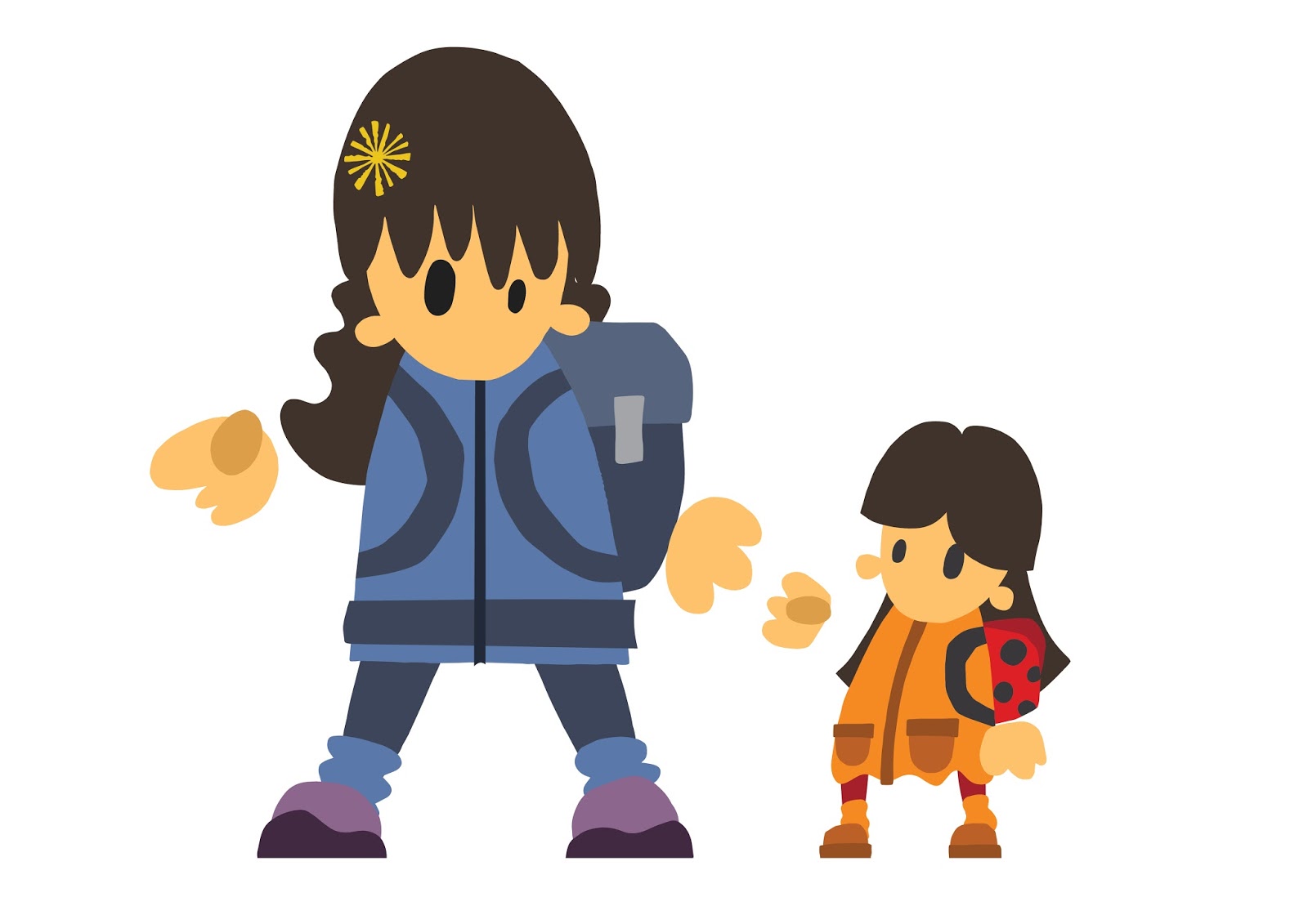
I found a very interesting article by Gabrielle Emmanuel talking about cultural barriers that impact on writing and illustrating children's books. She highlights some cultural differences that she discovered on a trip to Mali. Knees are seen as a private part of the body in West Africa so illustrations of characters that would seem perfectly acceptable in many other places in the world would be viewed as entirely inappropriate. Even something as simple as a plant or animal that is not native to the area can cause confusion, "Robert McCloskey's Blueberries for Sal caused trouble too. The kids seemed unsure whether blueberries were real or the stuff of fantasy. Same with the bear Sal stumbles upon."

Gabrielle Emanuel came back to America and met with E B Lewis who was going to illustrate her book. Lewis taught her a great deal about illustration and her summary of his methods and ideas is inspiring.

"he told me there was one theme that connected all the books he illustrates, "and it's emotion."

"His arrival promptly ripped apart my long-held perception that a book's illustrations and words were nearly inseparable. I'd always imagined they were born together or, at least, in close collaboration.
With a chuckle, Lewis set me straight: "I don't think about the author at all. They had their opportunity to play in their sandbox, and now this is my turn to play."

"He talked about "writing" the images. He said he spends time thinking about the punctuation in his paintings. A comma is an element that gives the child's eyes a little visual break. An exclamation mark helps indicate the drama of the scene. Lewis talked about this in a matter-of-fact manner: "This visual language is actually a language, and I don't look at it as illustration."

"It made me realize that a picture book is a story told in two languages: one that kids are learning, and the other that they're fluent in."

"In addition to learning what Lewis is doing, I also learned what he wasn't not doing.
He was not repeating the text. "That's already told. Why would I tell it again?" He flips to the last page of our story. The illustration is a panoramic view of a village at dusk. Everything feels quiet. Lewis admitted, "The text doesn't suggest any of that."

"First, color contrast. "Look at this one where she's pounding millet," he said, pulling out our book. The page is full of greens and oranges. "Then you turn the page and you go to these blues. So blue and orange are a direct contrast." This is almost like varying the inflection in your voice as you read aloud.

"you can never compete with a child's imagination," Lewis said. "Their imagination is going to be far greater than anything you can ever paint." This often means not depicting the most fundamental parts of a story."

"As I listened to Lewis, I started to realize that we were both tiptoeing along a balance beam, trying to figure out just how much to give kids in order to inspire their own confidence. Confidence to trust their imagination. Confidence to see the written word as theirs to own."


There are some interesting ideas in this article both from Gabrielle Emanuel and E B Lewis. I would like to try and apply them to my work concentrating on
- Not simply repeating the information in the text.
- Using colours and compositions to describe the tone of voice of the illustration.
-Suggesting parts of the story and allowing the readers imagination to take over.
-Concentrating on emotion.


Thursday 9 March 2017

Group Crit

We had a group crit today with three other groups. It was great to get some feedback from other groups and a tutor and helped us to highlight some changes we need to make, possible pitfalls and additions we could make to the content of the app. It was pointed out that mine and Chris' illustrations need to be adjusted so that they are more similar and will maintain a consistent look to the app. I think Chris is going to add characters to his lettering which should rectify the problem. As we are going to have a live stream of the main festivals to showcase what is happening at the time I am going to make a logo that can signify when there is a live stream available. A pitfall of the live stream was highlighted during the crit, we will have to be careful how much of the show the livestream shows. The idea of the app is to make people want to be at the festival rather than watching on the phone, it needs to motivate them to go out and get a ticket rather than simply allowing them to view the festival from the comfort of their home. The live stream could only be at set intervals decided by the organisers to make sure they only give a snippet of the event or the camera could be placed in an area that shows the atmosphere and the crowd without being focussed on the acts or events at the time. One of the key features of the app will be the link to photos, videos and information from social media sites such as twitter, this section allows people to get involved in spreading information about the festivals and showcasing the smaller events that don't get much/any coverage through mainstream media. We could encourage users to share photos of the vent by holding a competition where the winner gets free tickets to one of the events.  There were also some really good suggestions about how we could make the app even more useful to people wanting to attend. We could have links to maps, where to buy tickets , travel services and accommodation. Often at festivals there are problems with phone signal so making the map downloadable so it can function offline would be very useful for users.

I need to look at
- How live stream from other events are used
- What other logo's I need to make for the added features
- The best sites to link to for additional information like travel, tickets and accommodation

Tuesday 7 March 2017

Sanna Annukka

I have been doing a lot of very rough sketches to try and work out how I would like to illustrate the dog character in my book. he will be the focal point of each page so I want to make sure he coveys the emotion and character that I am aiming for. It was mentioned in my feedback in 504 that I should start trying out using different shapes in my illustrations so I started trying to find illustrators that work in a similar way. I was reading an interview with Chris Haughton in which he was asked which illustrators he liked, which led me to the work of Sanna Anukka. She creates shapes based illustrations usually based on landscapes and animals. The animals are very stylized, almost abstracted in some cases but they all have character and personality. The animals are made up of a wide range of shapes and colours creating beautiful patterns but without losing the characters form.


I have been trying to use silhouettes for the all white dog in the story keeping them as simple as possible. I think these birds show ways that I could add some small details that won't compromise the aesthetic.

 
I have been trying to decide how to layout my illustrations for this book. I want to have the dog silhouetted against his surroundings but at the same time I would like to have the scene sitting in the middle of a clean white background. I made a breakthrough in 504 creating landscapes as I had struggled with it prior to that brief. I need to keep experimenting with full compositions including character and landscape instead of creating them separately then trying to combine them.


Sunday 5 March 2017

All done for now

I have sent my illustrations to both Luke and Irfan so now I will have to make sure I am ready for feedback and to make any necessary changes. I also need to be available to provide feedback any help that I can with creating the app and the animation.

Adjustments

Chris sent me the illustrations he has made, they are very good. His illustrations are more text based than mine and could make the fonts I have used a bit simple. We talked about making some adjustments so that both our illustrations could work together more cohesively. we discussed each individual illustration and came to the conclusion that the Children's Festival and Storytelling Festival needed some work. As Chris had used silhouettes for two of his designs I made a speech bubble for the text on the storytelling illustrations to tie them together. I then decided to make some hand written text for the children's festival which I think much improves the communication of the identity of the festival. I was previously thinking about adding colours to the text for this festival but with this change I don't think its necessary and would change the way the rest of both mine and Chris's illustrations would need to be made. I have messaged Luke and Irfan to see how they would like me to transfer the illustrations to them, dimensions, colours, file type etc. Luke has replied straight away asking for various colour so I am going to make them now and send them through so he can keep working on the animation. That way when I hear back from Irfan I will be free to work on the specifications he needs to create the app.