Monday 31 October 2016

Monoprint


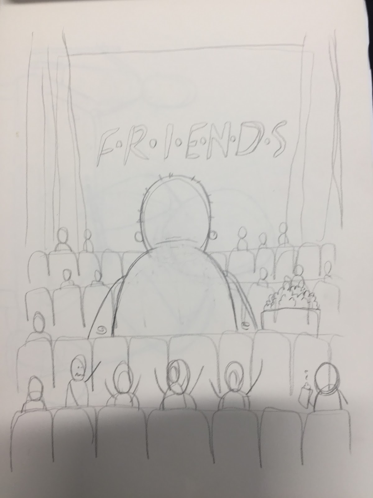
Today we had a monoprint workshop, I have tried monoprint a fair few times in the past and don't really enjoy it. Today I tried monotype for the first time think that it could be a very useful process for me. The line quality is interesting, it reminds me of spattered spray paint bit in a more controlled line. I have been looking for ways to keep my work loose, drawing quickly and I think this could be a method that could help me move forward. I tried to a draw a few different characters from my storyboards as well as some backgrounds. The texture of the line work combined with solid blocks of colour and some torn paper edges could help add a really nice hand crafted feel to my work. I made a collage last night of a full scene from my roughs that I am very happy with. I made all the elements of the composition separately then scanned them into Adobe Illustrator and made them into vectors. Shapes can lose some qualities when vectored but the rough torn paper shapes maintained their loose jagged edges. I would like to see how my monotype sketches can be manipulated digitally. I have been trying to use other media such as ink and brush and a variety of pens to add to the elements that I like from my sketches without making them into polished digital images. Until today I hadn't found a process that I liked but monotype may be the one I was looking for, the lines are solid and bold enough to work with strong colours and block shapes and have an aesthetic that compliments loose drawings full of movement and character.


Saturday 29 October 2016

Frustration

I am very happy with with my storyboard for for this project so much so that I ma a bit worried about doing it justice. I have been trying to work differently to my usual style and methods which has led to me making images that I don't like. I have been struggling to stay focused on experimentation, after a while I start to drift back to tried and tested techniques. I am trying to keep my mind on the emotion my images convey and not worry about them looking like polished finished illustrations. When a few things I try don't work out I start to lose motivation and confidence in my work. Not liking my work can act as a catalyst for change and become a positive influence on my practice. Losing motivation has been a problem over the last couple of days so I decided to try and get some inspiration from illustrators that work with different media.


I chose Chris Haughton because he often works in full page spreads and works in block colours that could be used in screen printing. Haughton uses very similar colours for almost every element of these compositions and still manages to draw the eye to important parts of the illustration. I won't be able to to use this many colours in my prints but could manage three if I use overprinting successfully, so could potentially have a mid blue, light blue and an overprint dark blue. If I print full bleed i could use the white stock to highlight key ares like eyes as Chris Haughton has done here. Haughton works with collage and torn paper, something I have very little experience with. Using this method limits the amount of detail which could be a beneficial constraint for me to stop concentrating on polished line work. It also makes some nice textures, rough edges and a hand crafted feel. His compositions are amazing, he manages to create an atmospheric landscape with fairly simple shapes. The visual language he has created in this book from the shapes of the trees to the posture of the characters have obviously been worked on and refined to a point that it can be illustrated with clock colour and shape. I am going to research his processes and experiment with similar techniques to hopefully push past my current rut. Thats the plan!

Friday 28 October 2016

Computer Workshop 4

I have been using the Computer workshops as an opportunity to experiment with different techniques that would help me to prepare an image for print, specifically screen print. The first 3 sessions I concentrated on halftone so today I wanted to see how I could use illustrator to add more texture to my work. I only had a couple of images to work with, ideally the images would have already had more texture and a sketched aesthetic with all the original sketch lines still present.


I like some of the textures and line qualities, especially on the ogre character. Some of the 'paint spatter' textures I also like I think they help add movement and atmosphere to the image. I tried adding an enlarged image as a backdrop to show how imposing the soldiers are in the narrative even though they are smaller that the ogre. I think most useful outcome of this experiment is the rough dotted/sketched lines, They add a crafted feel to the image even though it has been live traced in illustrator made into a vector. I need to try this again with an image that is rougher to begin with, I added lots of the lines a  texture myself in illustrator and i think that some of the original movement of the characters has been lost. I like the idea of changing how the two colours that we are allowed are used. i keep thinking of simply colouring in the line work but overlaying two images may provide a more interesting image as long as both of them are still clear and work together.


Thursday 27 October 2016

What do competition brief setters say they do?


On the D&AD website it says that "The D&AD New Blood Awards – identifying,showcasing and nurturing tomorrow's creative superstars." The word nurturing seems to me to be crucial in this statement as it suggests they do more than just critique and praise work that they deem to be the best of the entries. I would hope that this would mean some level of feedback to help budding creatives to learn from the experience of entering one of the New Blood competition briefs.
the sire also states that the new Blood awards allow students to "Meet the people from the places where you want to work. Get a taste of life in the creative workplace. The D&AD New Blood Awards opens doors." From what I have seen and heard of the new blood awards this seems to be D&AD's strong suite. The award ceremony provides a platform to showcase work for an audience of industry professionals/potential employers. Apart from developing my practice through working on a professionally styled brief I think the exposure from entering these awards will be the main benefit to me.

Wednesday 26 October 2016

Loose

In the tutorials a couple of people said that they liked the loose line work in my sketches. I have never been able to take this feeling of loose movement to a final product that I like and usually end up reverting back to tried and tested methods. I get frustrated battling with this problem but think I need to experiment more with media. I have been looking at the work of Jay Ryan who makes positives for his screen prints without using digital media and often includes his pencil lines in the final prints.
I want to keep pushing these ideas even when it frustrates me.


Shape and line in print


I found this fabric print by Jane Farnham that I really like. A lot of her work is based more around solid blocks of colour without overlapping line work but this pattern stood out to me as the most interesting. The line work and colour still interact even though they are not governed by the form of each other. Often adding loose line work to a piece creates a feeling of movement but I don't think feel like it is the case with these prints, the contracting shapes and colours seem to add depth, space and shape. the layers are separate enough to suggest the object is separate from the page. I think the choice of colours and the qualities of the line work are immensely important in illustrations like this. The only thing I think would improve this work would be print textures within the solid blocks of colour, I think that would add a crafted feel and give the fruit even more form. The imperfections in the print process can produce some appealing shapes and textures.


This illustration by Ryn Frank demonstrates the kind of print textures and effects I was talking about above. Ryn Frank has produced work for John Lewis and Penguin Books among many others and in most cases seems to use very fine detailed line work contrasted with solid blocks in the same colour. In this example the illustration is made entirely of block shapes with no line work and the appeal for me comes form the textures of the shapes. The texture created by the ink and the rough edges to the objects are what make the illustration appealing to me. if the same illustration was made with perfectly printed shapes with smooth edges it would have lost its personality. I fall into the trap of trying to make sure everything is neat and tidy and sharp. I draw with fine liners to make sure \I am in control of every detail of my work. This project is making me move away from that and realise some of the most appealing shapes, textures and composition come form experimentation that is not necessarily intended, and that the imperfections created during a process are often to most appealing part of an illustration.


Tuesday 25 October 2016

Group Tutorials


Today we had group tutorials looking at the roughs we have made for this brief. The tutorial helped me to know where to go next. I want to make a book as the roughs I have made are narrative based. Even though I have been working towards telling a story up until this point all the images I have made have been separate with the overall order an afterthought rather than a solid format to work to. It was mentioned in the tutorial that I should make a storyboard and re draw my ideas in the page layout  that I will be using so I can see how they will work and if I want to use single pages or double page spreads. I will also need to refine me ideas and decide which will combine best to make the narrative work. I can then print them off and see how they look in the final format.


I want to fit quite a lot into this book but really want to avoid the images feeling too busy or oversaturated with imagery. I am thinking of using the cover the kick start the narrative. I am going to see if this works when I make my mock ups. I don't want it to be a crucial piece of information but I would like it to set the scene for the rest of the pages. If this works it will free up more pages and help me to tell the story. I will make some mock ups then try to get some other peoples opinions on whether it works or not.

Monday 24 October 2016

Breakthrough

“People talk about escapism as if it's a bad thing... Once you've escaped, once you come back, the world is not the same as when you left it. You come back to it with skills, weapons, knowledge you didn't have before. Then you are better equipped to deal with your current reality.”  
 Over the weekend I had a breakthrough with my roughs and started working on ideas for a concept I really like and think I can communicate well as a book or as a series of prints. The idea is to illustrate fantasy characters trying to use typical modern day escapism to get away from there normal lives. I want to try and create a narrative where the ogre/cyclops fails in very attempt to use escapism finding himself in sad and quite funny situations. I want the final image to be the ogre sat in his cave reading a book and looking happy and content.


I want to use this role reversal to show how people that find it hard to fit in or take part in popular forms of escapism can use reading, especially reading fiction as a way to get away from their day to day life. I have been researching activities that are commonly used as escapism such as television, music, sport, drugs, video games and adrenaline. The next step is to find activities that an ogre couldn't do (which is obviously all of them because he's a made up creature from a fantasy book), activities where its stature or effect on 'normal' people means the activity doesn't work. I want the images to be funny but use the right tone to show how sad the situation is for the ogre.


“Fairy tales are more than true: not because they tell us that dragons exist, but because they tell us that dragons can be beaten.”  


I want the narrative to end with the ogre finding its perfect form of escapism reading a book. I think the book should be something as far away from fantasy as possible, something that could tech the ogre something it would not find in its own world. I also need to keep brainstorming more ideas for situations the ogre can get into on his escapism adventures, I want each one to stand out and work as a concept without having to stretch or manipulate the scenario.


“I think that pretty much every form of fiction (I’d include fantasy, obviously) can actually be a real escape from places where you feel bad, and from bad places. It can be a safe place you go, like going on holiday, and it can be somewhere that, while you’ve escaped, actually teaches you things you need to know when you go back, that gives you knowledge and armour and tools to change the bad place you were in. So no, they’re not escapist. They’re escape.”

Neil Gaiman

Computer Workshop 3


Today we started to work with half tones on out own work. I wanted to see if I could find other ways to use halftones to be able to add textures and manipulate them more easily. I decided to look on google images for half tones the n live trace them in illustrator and and manipulate them manually to suite my illustration. I understand that this method has drawbacks and would not work in all scenarios  in this instance I enjoyed working in this way and think the results were quite good. For some of the additions in the image such as the flames and the wings I used images from google that I hadn't drawn as templates for the halftones. I don't like doing this but it was a useful way to test out ideas without being able to draw them from scratch at the time. I would like to recreate this image with my own components. the flames are too regimented and neat, I would like to see how this would look with flames created using ink or torn paper to add a looseness that is missing in this. Overall I think the experiment was extremely useful, I have never tried this method before and I think I will be using it in the future. I would like to experiment more with layering halftones and and changing scale to add more depth to the tone created.


Sunday 23 October 2016

Proposal Form


During my research I have started to look at Neil Gaiman interviews as much as the works he created. He has some very strong opinions of the importance of fiction and what we can do to improve literacy levels among children. I wanted to use this as the starting point for this brief.


Saturday 22 October 2016

Brief Analysis 2


Looking back at the briefs I think the Adobe brief best suites my learning process at this time. I am very interested in communication and want to continue to try and understand how to create images that start a thought process rather than simply present information and I think this brief will best allow me to further this process. the brief is balancing in terms of practice as it states that craft is "crucial and idea is key. The judges will be looking for real skill in your chosen craft, but craft is most powerful when driven by a strong concept.". The brief will test me both in terms of concept and in craft, two things that are central to my practice and that I want to improve.
Adobe are the biggest creative software developer in the world and their programmes are used by a huge number of creatives from students to professionals. I think a large number of people who respond to the brief will be overly focussed on the processes involved in their programmes and I would like to concentrate more on the message of creativity at the core of the company. I would prefer to showcase imagination and ideas over digital proficiency. I think this could help me to stand out in the competition.
Because I am researching such a big company it is not easy to tailor my work to the tastes of the people the work is for so I would instead like to focus on the ideals and identity of the company and try to communicate these through my work.

I am not happy with this analysis so decided to revisit it after looking back at the brief. I want to try addressing each question individually to see if it helps me to keep focussed.

I have tried to open this files I downloaded the website and they will no longer open, I have successfully opened these before with no problem and all of a sudden none of them will open. I have tried to download the file again and still no luck. I had previously printed of one of the briefs but unfortunately not the Adobe brief. For the purposes of this task I will use the Fur For Animals brief to answer the questions.

What problem(s) are identified by the brief?

The problem is to raise awareness of the fur trade and mistreatment of animals that it involves.

What is the brief asking you to do about it/them?

The brief asks me to create a piece of online content that will be shareable on social media, such as an image or even just simply an idea.

What is the brief trying to achieve?

The brief is trying to raise awareness of the unethical practices of the fur trade to people who buy fur, could be thinking about buying fur and to the wider public to undermine the consumer want for fur. The overall aim of the trust is to completely eliminate the fur trade and this campaign is designed to contribute towards that goal.

Who will benefit?

The main benefit will be to the animals that are killed in this trade. The secondary benefit will be to the people that are concerned about the way the animals are treated.

What is the message?

The message is that every year 100 million animals are killed for fashion and that there is no such thing as ethical fur.

Who is the audience?

I have already talked about this in the question about what the brief is trying to achieve but I think it is important to note that the fur trade is thriving in Russia and China so for the campaign to be successful it would need to be able to transcend language and cultural barriers.

How will the message be delivered?

The message will be based online and need to be something that can be shared via social media so that it can reach a wide audience without costing a large amount of money. A subject can go viral and reach millions of people in minutes at no cost at all such as the ice bucket challenge. The content could be an image but interactive content could generate more of a reaction. It could be something fairly simple that makes people feel involved in the campaign.

Can you foresee any problems in responding to the brief?

I think it will be difficult to create something that manages to communicate the grim subject matter effectively without it being off putting to certain people. I would not be able to make any images that were too graphic or extreme as they are supposed to be sharable over social media so judging what is and what isn't appropriate for the campaign would be a major consideration. There is a lack of control when creating a campaign to be shared on social media the content lacks a stable context and it can be misappropriated, the meaning can change and the original message could be lost or even worse misrepresented.


brief analysis

I have looked through the three briefs I originally selected to decide which would be the most appropriate choice for me. I want to select a brief that is challenging but that is near enough to my set of skills that it will help me to progress my practice. I need to keep in mind that these briefs give me invaluable experience working on a professional brief. They also provide me with a platform to showcase my work to people within the industry and have my work assessed by professionals. The drawbacks are that I will be working without pay and that if I chose the wrong brief I could put lots of time effort into something that does not benefit my work. For example the Hasbro brief is mainly based around creating a concept for a game which would challenge me creatively but the design element of the brief is an optionally extra rather than a key component. The brief that Appeals to me the most and that I think would best suite my progress in this module id the Fur For Animals brief. The brief is based on a delicate subject that will need to be tackled very carefully and will present a number of challenges along the way. I need to research the trusts previous campaigns and the judges that will be assessing my work.
Even the first impression of the Respect for Animals website with its blood splattered background gives a string impression of the impact they are trying bring to the public and the seriousness of their message. Most of the content of the site is factual articles about the fur trade and animal cruelty. The site showcases a number of posters used for previous campaigns.


the posters are very graphic and often use blood as a way to highlight the origin of fur. I think it must be difficult to find a balance between images that re shocking enough to showcase the message of the trust without making people feel so uncomfortable that they are immediately put off from engaging with the message.
The dumb animals campaign consisted of both posters and a video that showed models walking down a catwalk in fur coats, as the models get to the end of the catwalk and turn the audience is splattered with blood. watching the video back it has the same impact now as it did then, it looks dated as it was made in 1985 but it has similarities with classic horror films of its time that a lot of people will be familiar with. I would like to try and find a new way to communicate this powerful statement that will challenge perceptions and spread awareness.


My work is often quite 'cartoony' and I will need to make sure the aesthetic I use will not undermine the message behind it. This brief is based on a very serious subject that will have to be dealt with delicately to make sure my work is not offensive but is still effective. The further information provided with he brief gives some interesting ideas as a starting point such as the ice bucket challenge that didn't need any specific content to be shared but a concept. it is not something that would benefit my practice but it could help with brainstorming an interactive idea that could be shared via social media.

The more I think about this brief the more I am unsure if it is something that I would benefit from working on. I think I need to go back to the briefs and look in more detail at some of the ones I only looked at briefly initially. I want to push myself out of my comfort zone but not away from my creative practise.

Friday 21 October 2016

Computer workshop 2

We are using the spot colour channel in photoshop to create a tint. We have to work in greyscale for it to work. You go to the channels tab above the layers panel and select new spot channel. We then select the colour that we would like to work with. We started off with the solidarity at 100%. This allows you to paint with tints of one colour in a greyscale channel. 


The reason we work like this is to be able to use the image as a positive for screen printing, we are actually working in tones of black but the method allows us to se how our selected colours will work once we take the image to print.
If you want to use the magic wand tool to select sections of the image your need to skip back and forth between channels, something I keep forgetting to do. once we have added all the tones that we want, we can un tick the original channel to see how the tones look in grey scale.


The above image is without using the magic wand tool. it is messy but I would like to experiment with this to see if i could create some nice effects. The image below is using to magic want tool. This makes being neat a lot easier and could be used with vectored images to make some really crisp half tone images.


We save the document as a psd then open a blank document in illustrator and drag the file into it. When sending the image to print we go to the output and an chose separations. in the document ink options panel we can change frequency of the dot channel by altering the LPI number. if we chose 60 we will get a very fine detailed number of dots, the lower we go from there the more obvious the dots will be. I need to experiment with this too see what effect the variation in halftone has on the aesthetic of my prints. I like the idea of trying to use very obvious, bold half tones. 


If we want to be able to see the effect of half tone on screen we can bitmap the image in photoshop. The image has to be greyscale and flattened into one layer. You can do this by going to image and mode, completing those precesses then image and mode again and bitmap. When using bit map we are given a number of choices the main one being the output which is the number of pixels per inch. In other words the lower the number the more the image will be broken up into a simpler layout of larger blocks.

  
 I tried 1200 and 100 pixels per inch.


Wednesday 19 October 2016

3 Chosen Briefs Evaluation

The three briefs I have chosen are 'Fight The Fur Trade' for Fur For Animals, 'Set The Scene for Film Lovers' for Mubi and 'Next Generation Party Games' for Hasbro. I have chosen these because the subject matter appeals to me and matches my interests. These briefs also present challenges that I have not had to tackle before. For example creating a new party game for Hasbro will mean I will have to take into account how long the game will take to play and have to make sure the game is not too similar to already existing games. It is an unfamiliar platform for me but I am looking forward to these new challenges. We have been learning to try and understand how to identify and appeal to a target market over the last year but this will be a leap into 'real world' live briefs where this consideration becomes all important. The Hasbro brief has the target audience restriction that it is for young adults, not children. In some ways this opens up more possibilities in what I can do with the brief in that I can include themes and even overall concepts that would not be appropriate for children. I will however have to research the interests of young adults. The Fur For Animals brief is trying to raise awareness of the Fur trade so can be aimed at a very wide audience but with a more specific target of people that "have bought or are considering buying fur".
I will also need to be careful when working with branding. The terms and conditions state that any misuse of the brands names, trademarks and logos will result in disqualification from the competition, I need to make sure I fully understand what this entails. each brief has a set criteria for how the work should be submitted, this is a crucial section of the brief, The concept and outcomes could be very good but if they are presented in the wrong format the work might not be accepted. Even if the work I accepted it is not professional and does not reflect well if you can not meat a set of specifications.
The Fur For Animals brief deals with some difficult subject matter, it is important to highlight the shocking and inhumane processes in the fur trade but it is easy to put people off engaging with your work if the imagery or subject matter is too graphic or distressing. I will need to research effective methods of engaging with an audience to stimulate a change in behaviour. The Mubi brief presents the challenge of deciding which platform would best spread awareness of the service they provide in terms of reaching the target audience and delivering the desired information in an engaging way.
Reading the brand guidelines from Mubi was very informative, I have never encountered these guidelines before. I knew there would be guidelines for company logo's as they are a major part of the brands identity. I did not know how rigidly the guidelines are set out in terms of colour combinations, logo placement on posters and configurations of the logo in terms of the lettering in relation to the icon.

Monday 17 October 2016

Computer Workshop- Preparing Images for Screenprinting

I normally work with Illustrator so this workshop was helpful in that it showed me alternative ways to prepare screen prints that open up new possibilities and allow me to create different aesthetics. I already know most of the information in todays workshop but think the workshops will get a lot more useful as we progress. I might try to work in photoshop for this module as I want to work with rougher hand drawn shapes rather than crisp vectored images in illustrator. Today we looked at how to use multiply to help us understand how the colours we use will overlay creating a 3rd colour. This in incredibly useful to me as i have never liked to colour combinations I have created when screen printing in the past. I think this will help to me experiment with compositions to see how I can balance colours and make use of negative space without having to make a huge number of prints. 


After the image has been created we need to keep the colours on separate layers and convert them all the 100% black so that they will work properly as negatives when we print them out. I have printed before using both paper and acetate and it can be difficult to get a dark enough print on acetate unless you know how to set up your print settings correctly. We also leaned how to separate colours by cutting out to remove any overlay of colours. This will be very useful to stop colours overlaying where it is not wanted. I have tried to do this by hand in the past and it is extremely annoying and time consuming, it is a similar process to using the pathfinder too in adobe illustrator. I still want to try and complete this module with as little digital editing as possible but these techniques will allow me to test out ideas, compositions and colour variations.


Sunday 16 October 2016

Illustrators that use print 3


Ben Newman is an illustrator that has work for a number of well known publications such as The Tate Modern, New York Times and The New Yorker but now spends most of his time working on the children's book series 'Professor Astro Cat' with his friend Dr Dominic Walliman. This really interests me as I would love to work on children's books and collaborate with writers. His work is made up of crisp digitally created shapes and lines combined with bold colours. The main point of interest for me at this point looking at his work is the way in which incorporates the stock colour into his work to great effect. He uses the white of the paper to make up a number of elements in his composition without the image becoming cluttered of lost on the page. The blue he has used in these prints is really nice, it is perfectly placed between the white and black to contrast with the black and still be bold enough to not appear washed out on the white of the page. I think I am going to need to experiment a lot with colour throughout this project and be prepared to redo prints with various colour combinations to fine tune the compositions.


Illustrators that use print 2


Natalya Balnova's work stood out to me in the presentation of Friday. In the past I haven't enjoyed screen printing, I have screen printed clothing on a few occasions and usually stick to one colour designs as I have struggled to get to grips with making a limited colour palette work effectively. Natalya Balnova manages to use 2 colours with brilliant effect, I think a large part of this is her understanding of the colours she is using and how they work as combinations. In the past I have not liked colours overlaying during screen printing, I think this is due to me working a lot digitally and having full control over colour and opacity. Natalya Balnova's designs work perfectly with the aesthetic quality of screen printing, The bold loose line work takes on the textures created during printing and combine to form shapes with a real feeling of energy and crafting. After looking at these 2 illustrators I want to try and experiment with different media during this project and spend time trying to develop a better understanding of line quality, I have a tendency to fall back to using fine liners because I am comfortable with them and I think it is limiting my practice. I thin learning to make the most of the stock colour will be key in this project, Natalya Balnova makes brilliant use of this with full bleed pages and blocks of colour with cut out lettering. he creates work for a long list of publications including The New York times, The Washington Post and The Wall Street Journal.


Illustrators that use print


Jay Ryan is someone whose work I have liked for a number of years. he started out screen printing posters for his band. As time went on he began to make posters for other bands and for venues. He by chance met a group of screen printed poster makers that sell work all over the world and he now makes posters daily. he had released a few books, has his work exhibited at galleries and often visits conferences and universities to talk about his work. he says that his posters "aim to attain the same goals as other concert posters, but using raccoons and toasters instead of skulls, breasts and hot rods."
He creates screen prints without using any digital design which gives his work a really nice gritty, scratchy hand crafted feel. Because of this the line quality in his work differs from other screen printed work making it stand out. The number of colours in his work vary hugely but he always manages to create a balanced composition, I have been concentrating on his work with limited number of colours because of the restrictions applied to this project. Looking at his work has given me some ideas of combinations that could work. The final thing that I think makes his work stand out is his creativity with subject matter and composition, he experiments with scale, subject and characters in some very unusual ways. lots of his compositions are complex, containing lots of detail and often a variety of characters but I think his prints work best when they are simple, he has the ability take something simple like a line drawing of a house and make it beautiful with considered use of colour.


Saturday 15 October 2016

Final Crit


Yesterday we had a mega crit with our 3 finished editorial pieces.


One of the comments says that the reflections in the landscape composition are too bold and look like a second pair of hands. They are supposed to be a second pair of hands so on one hand they may not be too bold but the composition is confusing. This is the composition that I am least happy with and the feedback yesterday was very useful. In the same comment they also said that I could try lowering the opacity of the hands under the water. I will definitely try this method as well as slightly altering the colour of both outline and fill. The same person mentioned the outlines being too bold on the pairs of hands, I fully agree, then image looks too cartoony and the outline takes over the image making it feel heavy and overpowering.
I got some really nice positive comments but the two that I found most useful were both focussed the landscape composition. The second comment mentions the need for more detail. again I completely agree. I got too caught up making alternative versions of this piece trying to alter the concept that by the time I came back around to my original idea I didn't have time to do it justice. I have mentioned in previous posts some additions I would like to make to this composition and I will be remaking this.


Thursday 13 October 2016

Finals


I have a print appointment booked today at 2 so have been making a few final adjustments to my designs. I am happy with 2 of them but the third has been causing me lots of problems.


I have tried a few different ways of illustrating this image and idea but have failed to create anything I'm completely happy with. I have run out of time and think that this is the best version of the illustration I have made so far so I will have to take this one to print. I would like to continue with this concept at a later date as I think it could be much better if I can find a way to do it justice. I think the composition could be used in a more emotive thought provoking way. I could maybe have a character looking back out of the book and the 2 interacting in some way. I want to show that what is happening in the book is having a lasting effect on the reader. I also wanted to add more detail to this image like fish swimming around the hands to signify the amazing worlds that fiction can take you too away from your normal life but I got too preoccupied with different versions and ran out of time.


Wednesday 12 October 2016

Decisions


I have started to question my decision making during this project. I am torn between designs that have received good feedback and that I believe are based on a better thought out concept against designs that I think work better as compositions that I find interesting and intriguing but cannot fully justify or summarise the appeal of. I want to use this post as a way to quickly go through each of my illustrations trying to clarify their strengths and weaknesses.


This illustration has received really good feedback in the various crits and I have got some good ideas from the group on ways to improve it. I want to try and focus this image more on empathy so have tried a couple of new variations on this general theme.


This illustration is supposed to show the reader sharing the pain of the characters in the book and learning empathy in this way. Neil Gaiman often deals with quite dark subject matter so I thought this way of communicating his ideas would tie into his various works. I don't think the idea has worked anywhere near as well as I would have liked. The image could be off putting to potential readers and doesn't communicate a balanced portrayal of what a Neil Gaiman article would be about. This image could be easily misunderstood as being about self harm. I need to find an action to portray that creates  thought provoking narrative that better suites an article about Neil Gaiman.


I have made some changes to this design, I did not like the fades I had previously used as a backdrop. Although I originally wanted to create a darker, colder looking atmosphere I didn't want to make the image overly saturated with colour or tone. I have also removed the colour form the floor and instead used the splashes of rain to suggest the floor being there instead. I trimmed down the line of the floor that went to either side of the image, I think the character floating in the middle of the raindrops helps to give a feeling of being in the middle of the weather.


Tuesday 11 October 2016

Roughs 9


I made this image before the peer tutorial and got some helpful feedback on it. Other members of the group thought that at first glance the hands looked like reflections which could confuse the message. The idea behind the image is that you enter a new world when reading fiction and return changed and also that fiction helps young people to develop empathy. The idea of a reflection could tie into the idea of empathy but I think it may be too complex an idea that only really works if you already know it. I have also drawn some roughs of holding hands that I like think communicate the idea of empathy more in a thought provoking way but it is hard to illustrate without one of the pairs of arms being crossed. I need to try a few more compositions to see if I can find one that keeps the balance of the composition.


Heavy line work is an issue on a couple of my designs. It overpowers the illustration and the other colours in the composition. I wanted my illustration with 'fiction' spelled out in keys to seem positive and bright but the combination of thick black line work and the colour schemes I tried made the image seem quite dark and moody. I struggled with that particular illustration, something about the composition or the keys themselves caused me lots of problems. The feedback was very useful. I need to make my illustrations less 'cartoony'. That's not to say they can't still have elements within the piece but the illustration needs to capture the tone of the messages I am trying to communicate and have failed to up to this point. I need to keep experimenting with visual metaphors and colour. I still like the ideas for these images and want to find a way to make them work but I need to be careful not to force them to fit the dimensions. If something isn't working I need to step back, re-evaluate and approach it from a new angle.