Tuesday 31 January 2017

Slide show 1

I want to start my research by looking at online resources and trends that will help me to understand this project and how I should approach my work. I want to look at Publisher, retailers, reviews, podcasts and social media.


Online resources-
SCBWI Podcasts
This one looks very interesting but I would have to sign up and pay to listen to the podcasts.


Trends-
-Stories about dragons, wizards and mythical creatures are popular possibly due to the success of Harry Potter and The Hobbit.
-Reissues or new versions of classic children's books appear to be popular often coinciding with anniversaries of the original release, or a film adaptation.
-Similarly to the last trend classic stories and fairy tales are popular but with a twist that brings them up to date.
-Research has shown that the number one characteristic that children want in a book is that it makes them laugh, making reading an enjoyable experience and encouraging literacy.


So far I have been looking online to try and find trends form review sites and secondary research, I think I need to go and research for myself to continue this process. I will visit Children's book retailers and see if there are apparent trends in design or theme.

Skateboarding

One idea I had during the briefing was to base the book on something personal to me that I think other people could identify with. I spent most of my teenage years skateboarding all day everyday whenever possible, redefining public places making them into a playground. Places that would seem so bizarre as a place to play and relax to anybody unfamiliar with the sport. I became very comfortable in these spaces from skate parks to  underground carparks to some random part of an industrial estate. To this day I find open tarmacked areas quite appealing when most people would consider them an eyesore or just not register them as anything at all. I would like to make a book that shows this point of view and try to communicate the message of different perspectives and how much they vary. everyone has these places from their youth that mean the same thing to them even though they are vastly different. I am not sure whether I want to use this as the basis for this brief, I need to do more research an explore other possibilities but it is some thing I definitely want to work on at some stage.

Update- I have been thinking more about this idea and I'm not sure it will work. I wanted to portray the characters as outsiders. When I was younger there were very few skateboarders and places to skate. The skate scene was made up of a relatively small number of people, skateboarding was definitely not seen as cool. Now skateboarding is much more popular to the extent that skaters have big money sponsors with brands like Nike and Adidas. If I try to make this book the way I wanted to it would probably only appeal to a very specific group of people who enjoy the nostalgia of the narrative. I would like to make a book that is more universally accessible. Although the specifics of the idea may not work I would like still like to explore ideas such as social groups, outsiders, perspectives and empathy.


briefing

I already knew which of the options I wanted to choose before the briefing, I would like to illustrate children's books and this brief provides me with an opportunity to have a lot of creative freedom. This freedom is really good and also daunting, although I knew I wanted to work on 'Publishing for v
children' I did not have any set ideas for themes or narratives. The briefing really helped me, I like the idea of making a book that is educational but not in the traditional sense, I would like to try and tackle life lessons that we encounter growing up. I want to look at the book 'The Dead Bird' illustrated by Christian Robinson that tackles the subject of death. This is something we all have to deal with but is rarely mentioned in children's books and it must have been very difficult to successfully and appropriately deal with the subject. I would like to try and illustrate a theme as important as this one, something that is challenging but has potential to be thought provoking, educational and appealing to both children and adults.
Its was mentioned in the briefing that it would probably be a bad idea to try and write the story ourselves. It would take a lot of time and would not count towards our mark. I would like to illustrate a book with little to no text if possible so I want to find a subject or idea that is quite simple but captures emotion. We were given some ideas of where to find stories to illustrate during the briefing, I would like to find something that is relevant to children growing up today, something that reflects modern life. I will need to consider whether the subject is appropriate and whether it will translate into other cultures. Of the list we were shown in the briefing I like the idea of basing my illustrations on song lyrics, specifically hip hop lyrics. There are a lot of hip hop tracks that are based around themes that are not appropriate but I know a few that are based on life lessons and teaching, they are community orientated, they talk about overcoming difficulties and maintain moral values where other people don't. This could be a very interesting direction to take this project.

New brief


One thing I learnt from 504 was that by keeping images simple and concentrating on the narrative, emotion and tone of the piece I could produce work that was more engaging. I changed the way I work and found new processes, at the beginning of the module I felt a bit lost wasn't happy with how I was working, trying new processes help me to get out of that rut and find a way of working that I enjoyed and that I thought was more suited to where I want to be and the industry I want to work in. I want to continue down this path to see where it leads me.

changing how I worked drastically in the last module help evolve and improve my practice and how I think about my work but I still think there is lots to learn and further improvements to be made. I need to continue to try new processes both to improve the way I work at the moment and to find new ways of working. Until this last module I have been working in a similar way for years and would not have thought my work would look like it does now. I would like to continue to push boundaries and not be afraid of failing along the way.
By May I would like to have produced a product to a professional level. I want to be happy with all aspects. In recent projects I have concentrated fully on parts of my work and others have suffered. I want to make sure I take into account all aspects of my chosen product. I want my product be something relevant to my practice.

Saturday 28 January 2017

Collaborative Brief


 For the collaborative brief I have chosen the UK Greetings brief to create a range of cards, wrapping paper, gift bag and notepad etc. I have chosen this brief as I would like to illustrate children's books and would like to learn about designing other promotional materials to go along side books, the other two briefs I have finished have been based on children's books so I would like to take this opportunity to expand my creative practice and learn more about the industry. This group brief would also give me the opportunity to work with graphic designers which is something g I will need to do in a professional setting.  I think this brief will help me to develop new skills and understanding of my role working within a team. The project sounds fairly straight forward but I think it has the potential to be very interesting and could be approached in a wide variety of ways.


The Witches 2


I am much happier with my final piece for The witches after making the changes. There is a much better connection between the characters and the mice now communicate the emotions I was aiming for. The mice stand out more against the darker colour of the witch and the witches hands now actually look like hands. I think the shape of the mice makes them seem more fluffy and three dimensional. They now have a presence in the image that was lacking before.

I think I should change the colour of the witches nails to make them contrast more with the hands. I would also like to try making the eyebrows darker. I have been thinking adding eyebrows to the mice to help accentuate their expression but I don't want to overcomplicate the illustration. I think I should try adding the eyebrows as it could be beneficial to the personality of the characters but I will need to be careful not to make them look too busy or confusing.

Friday 27 January 2017

The Witches

I started working on my illustrations for The Witches. This illustration was a little different as the witch characters are quite sinister and scary. I took inspiration for the appearance of the witches from the film made in 1990, I remember watching this film when I was a kid and rally enjoying it. The witches were made disgusting but still appropriate fro young audiences. I need to try and find this balance in my work. I have drawn up some roughs using the witches hands as a cage fro the mice. I want to use bold colours for the characters to match the Roald dahl logo so I changed the witches skin colour to purple,

I like the witches face but the hands don't work, the shape of them isn't obvious enough. I am also not happy with the bottom heavy symmetrical composition of this piece. I tried making the witches head bigger but it didn't help. The mice don't have any human qualities in this illustration, I want them express human emotions and for their to be a connection between them. I think the colours need to be changed, they don't contrast enough, I want the mice to stand out against the colour of the witch. I think this image could work much better if it was a simpler colour scene with he witch acting as a dark background and mice standing out from the darkness.

Because I want all three illustrations to act as a set I added textures to see if it would improve the interaction between the characters. I don't think it has and I am still not happy with the composition. I thought about ways I could make the hands look more like hands and bring the mice closer together. I decided that the witch could be holding the mice as they cuddle together scared. This could help show the relationship between all three characters much more clearly.


I much prefer this composition, although it still needs some work, next I am going to make the witch darker and remake the mice out of torn paper, I should have though of this earlier, the rough edges will make them look furry and almost make them contrast with the hands. I need to change the tails so that they look like they are dangling down between the fingers of the witch. I need to design the mice so that they look more like they are embracing. Once I have made the colour of the witch darker I should be able to make the mice lighter and make them stand out. I am quite hopeful that these changes will make vast improvements to this illustration. I am going to back to the roughing stage and redraw the mice, I need find ways to communicate their emotion and friendship!!

Thursday 26 January 2017

BFG


I have been working on an illustration for the BFG. I illustrate the connection between the characters. I had an idea to use a streetlight to highlight the girl in the story as to show the scale of the giant she would be very small in the composition. I wanted to show the giant in similar tones to the background to make him seem otherworldly and further suggest the difference in scale. From my roughs I wanted to depict the giant holding the girl in his hands so for this image I wanted only the elements in the light to be in full colour and everything else in dark blue, the problem was that as I illustrate hands separate from the character the giants hand is not obviously his hand and takes a minute to work out. I also wanted all the images ideally to be on a white background to work with the Roald Dahl institute logo.


The light also acts as a barrier between the two characters and I want to show the connection between them. I decided to start again and make the image simpler. In my first roughs I only drew the giants head and hand as if he is appearing from the clouds. I tried a few ideas to show the giant holding the girl, one being the girl balanced on top of the giants finger, I talked to a few other illustrators that liked this idea. I kept trying to alter my composition and the scales between the characters but couldn't find a combination that I thought worked. The had is almost a right angle and created a solid corner in the bottom left of the composition that created too much of a rigid shape to the composition. I could not decide how big to make the girl in the composition, she was either too small and got lost in the composition or too big and all sense of scale became lost or didn't have the impact I wanted.


The hand is not as clear I would like. I decided to use some ideas from my first attempt and changed the colour of the giant to make him more mysterious and to help highlight the girl. This meant that I could make her smaller and she was still a focal point of the composition. I also changed the hand so that she was stood in his palm. This helped to communicate how small she is and made the giant seem more protective. The shape of the hand is more appealing and clearer.

I like the simplicity of the giants face, drawing attention to his eyes and his focus on the girl. I am not sure whether I should add any more detail to his expression. I am going to come back to this illustration tomorrow and try to start with a fresh perspective.

Wednesday 25 January 2017

Gil Scott album covers

I looked at some of Gil Scott-Herons other vinyl covers including previous versions of the coves I am working on. I anted to get an idea of how practitioners had previously approached the design process. 


The covers all use muted colours and feature Gil Scott-Heron as a central part of the composition. I would like to keep to this tradition and create a composition that pays homage to these designs but in my own style. These covers do very little if anything at all to communicate the title or message of the record itself they promote the music based on fans knowledge of the musician. There is not even a background in any of these covers, the consist of purely the musician in front of a black background making sure he is the only focus of the viewers attention. i would like to try and communicate more of the themes of the music through my cover, my practice is focused on communication through images and I would like to use this project as a opportunity to further my skills. I will need to make sure I create an image that is appropriate for the purpose of the finished product. The cover needs to instantly grab the attention of its audience and communicate the personalty of the musician.

Tuesday 24 January 2017

The Twits


I have been working on my illustrations for The Twits. I have noticed that after working on a illustration I find it hard to see the overall image, I seem to focus in on small details and struggle to analyse the evaluate how well the illustration works. I find that if I leave the illustration for a while and look at it later it helps. I don't want to be focussing on small details when I am evaluating and reflecting on my work, all the small details could be well crafted and there could still be flaws with the overall composition that I miss.
Because I have used a simple background that is almost entirely white I have added more colours and textures than I have been in my other work. I think it helps make the characters feel as if they have a form , making the illustration more interesting. I am going to move on to another scene and come back to these illustrations to reflect on them further.


Saturday 21 January 2017

Roald Dahl roughs


I decided to start from scratch with the Roald dahl brief. I was not happy with the illustrations I had created so far and wanted to try and generate new ideas. I started roughing out designs focussing mainly on character and composition. The brief is to illustrate iconic scenes from the Roald Dahl children's stories, because the scenes are so well known and have been recreated through illustrations and in film I want to make sure my illustrations stand out from previous incarnations. I want my illustrations to celebrate the characters and emotion of the scene. I have tried to work in a way that would work as a spot illustration so it could accompany text, it is not a condition of the brief but I wanted to see if I could create an immersive environment using very minimal shapes and colours. Working with these simple backgrounds will help me to make the characters stand out, Roald Dahl's character's personalities are big and bold and I wanted their appearance to mirror that. I am aiming to create big colourful shape based characters that form intriguing compositions that play with scale and perspective. In a lot of the stories their is opportunity to use huge differences in scale from the mice and witches to the giants in The BFG. I wanted the BFG to seem otherworldly but relatable and friendly so I used some human features but distorted them, it was difficult to try and make a character that didn't look at all sinister. There is something about things that appear almost human that is inherently worrying. I want to only have parts of the giant visible with his face and hand appearing from outside of the composition suggesting his scale. I will need to make sure this doesn't draw the eye away from the image.

Thursday 19 January 2017

Mole finished?

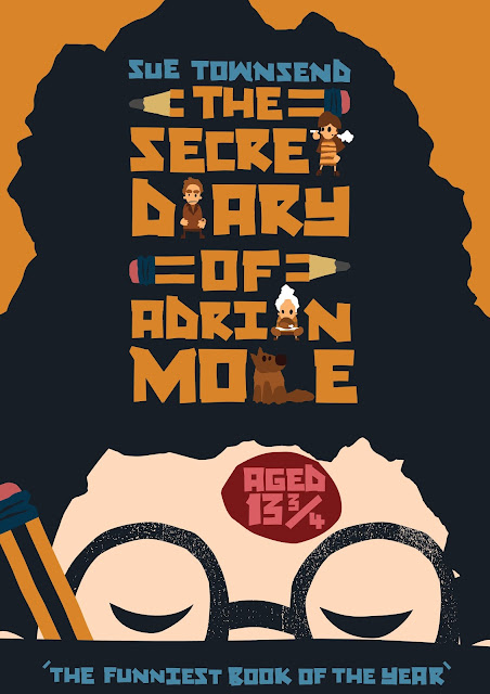
I have made a number of changes to my book cover. I have made the speech bubble and text on the back of the book smaller, I did this to try and make the composition more dynamic. I think the text is still big enough and bold enough to stand out and be easily readable. When I added the back cover to the template the character of Adrian Mole was too small compared to the barcode box and looked overpowered and lost. I changed the scale of the character and I think he now has a bigger impact on the cover and makes it much more appealing. Making the speech bubble smaller changed the layout significantly, on previous versions the speech bubble went past the edge of the cover and lost its shape becoming square and making the cover look like a grid of lettering. I think that the change in scale creates interesting contrast between the lines of text and the imperfect textured shape of the speech bubble. I tired a number of colour combinations for the text before settling on dark blue to match the text on the front of the book and the same orange as the background colour, which I also used for the title on the front cover.


I also made another book mark, the next step is to print off the bookmarks and book cover to see if the colours and size of the text work. If so I will take some product photos.


Wednesday 18 January 2017

Mole extras

I want to make so additional marketing material to accompany my book cover. I had the idea to make a bookmark that could be given away with the book. I want to make the book marks and print off the cover so that I can take some photographs showing how my work will look as a product. We are having photography workshops next week that should help me develop my skills. I have used the pencil motif on the cover and it was my first thought for a book mark. It suits the idea of the book being a diary and the classic yellow and black pencil is instantly recognisable. Another design I would like to try is a the Adrian mole character from the front of the book peeping out at the top of the book mark as if he is scribbling in the book himself.


Adrian Mole back cover

I decided I want to get my Adrian Mole cover finished this week so I can focus all my attentions on the Roald dahl brief next week. I had an idea to make the lettering for the back of the book out of blu tac shaped into letters then scanned into illustrator. I wanted to make rounded letters that look like felt tip, I thought the use of blu tac would add to imperfections and interesting tapes in the lettering that I would no achieve by just writing out the text with a felt tip. There was a large amount of text to make so I thought it would be best to create a full alphabet and arrange the letters in illustrator.


I made a note of the capital letters and numbers I would need. I added some texture to the lettering digitally and I'm not sure it works at the scale I will be applying it. The texture looks like felt tip at a larger scale but with the lettering so small I think it might look like its badly printed and have a negative effect on the quality of crafting. I have been trying to make the front and back covers balance but the large amount of text has been causing me problems. When I worked on the front cover I felt like I had to cram a lot into a small space but that was nothing compared to the back cover. I have had to learn throughout this process, if it was up to me I wouldn't include all the text but I have to work to the brief and stay motivated to make it work the best I can. This is a good learning experience for me working to a brief and solving problems as I go. I have been trying to keep and consistent and simple colour scheme on the cover but I am not sure the colour I have used for the hand written text on the back cover is dark enough to be clear or to resemble blue felt tip.


I think that types I have used are clear and easy to read but I would like to get some more opinions at it is crucial for this project. The cover has to make the book appealing, instantly capture the imagination of potential readers but also clearly convey the necessary information. I am trying to stop the cover becoming a grid of lettering,  I thought about placing the lettering a different contrasting angles but that would have taken up even more space and would have made the lettering less appealing/more confusing. On a side note I want to learn how to make my own fonts, the process of making each word individually was extremely lengthy.


Monday 16 January 2017

End of Module Evaluation


Moving Pictures proposal


Printed Pictures proposal


Pinal Piece-Moving Pictures

J WHARTON 253302 OUIL504 STUDIOBRIEF3 from Joe Boon on Vimeo.

Final Pieces- Printed Pictures

Final Pieces- Idea Pictures

Journal Pages

Journal Pages

Journal pages


These pages from my journal show the development of my editorial images through stages of roughs and then refining my ideas. Once I had decided on the themes or visual metaphors I thought were most effective I created a variety of different versions with different compositions and narratives.

Wednesday 11 January 2017

Alternative cover


I made a second book with a black cover, unfortunately the second print of the pages was in greyscale so I can't see if the black cover brings out the colours of the print through the key hole in the cover but I do think the black cover works much better. The crisp black book cover looks like it is a finished professional cover. I made this as a test so the cover is made of black mounting board as that was the only material I found that would work at short notice. I cut the board down to the correct size, slightly larger than the pages to disguise any imperfection in the folding of the book. The white edges of the card di not look good at all, they highlighted any mistakes in the cutting or texture of the board and acted as a distracting border around the keyhole. I coloured the edges with ink, it actually worked much better than I thought it would. the porous texture of the card soaked up the ink and match the matt finish of the card. I wouldn't use this method in future but it did help me to be able to see how my book would look if I remake it with more suitable materials. I wanted to make another belly band for the book but this time cut out the lettering, I didn't take into account the holes within the 'A' and the 'P' of 'escapism'. The letter was not clear without them included so I decided to add the holes as white eyes directly onto the cover of the book. I used paint pens but reflecting on it now I should have used cut paper. It wasn't clear that the white circles were meant to be eyes so I decided the make the eyes into one of the characters from the book by adding hair to the cover with cut paper. Once again I suffered from leaving this second copy of the book until the last minute and only had a few choices in terms of colour. I chose to use grey as it was the closest to the colour scheme of the book and contrasted with the cover. I would ideally like to have used either a darker grey. I think a darker grey would have matched the tones visible through the keyhole, the colour I have used is too bright, it becomes the focal point of the cover overpowering the other elements. Neither of my covers are in any way perfect but I have learnt a lot about materials and design during the process of making them. I really enjoyed illustrating the book and like the narrative so I think I will work further on this project after I have handed it in so that I can get the finished project up to a standard that I am happy with.


Tuesday 10 January 2017

Analysis


Looking at my finished book there are a few things I think could improve the finish. I would like to have printed the book on paper with a deckle-edge if possible but because I was using digital printing to finish my book and the scale of each illustration I was limited to a few paper choices. I normally use textured paper for my digital work because it adds another dimension to vectored shapes but because I was going to have to fold the paper to make the concertina I only had a couple of paper choices available to me. I used grey board for my book cover but looking at it now I think a matt black cover would have worked much better making the page showing through the key hole appear more vibrant. I like the raw unfinished look of grey board with no cover but I am not sure it suits my book. I found some high quality paper to make my belly band for the book, I found a colour to match the illustrations in the book and lino printed the title onto it. I think I could have spent more time designing the belly band and experimented with different colours. When I was researching book cover i saw some belly bands that hade patterns cut into them that I think would suit my book . I have another print off of my book so I am going to try and find some thick matt black card to use as a cover. I have been trying to get some good quality photographs of my book but the scale of the illustrations makes it difficult to photograph all in one with the images laid flat.


Final Briefing


Process and Production

To do list

- blog storyboards-issuu
-blog about industry- publishing, clothing, printing-research
-750 word summative evaluation
- make sure all visual journals are present and organised
-make sure outcomes of all study tasks are present and organised, zine, editorial
-present work in an organised professional way, clips, labelling
- print out project proposals, should be on blog
-Last post to blog should be the summative evaluation
-blog posts of the final outcomes for each brief
-make issuu document of selected pages from visual journal
-Once the blog is finished make blog archive pdf file
-look at evaluation guidance when writing final evaluation
-hand in is at 11am on Tuesday!!!!!!
- individual briefs should be kept separate, clips or paper dividers
-1 portfolio per student
-if there is anything relevant in summer sketch pad then scan relevant pages and make issuu document

work on blogging and research and posts before moving on to organisation.


Sunday 8 January 2017

Scenes


I wanted to look at more illustrations of scenes from Roald dahl's work by Quentin Blake. The illustrations are concentrated on the characters often with very little background or none at all. The characters stand out on the white background even when coloured with darker or grimier colours like The Twits. I think illustrating my scenes in a similar way will help me tie the designs into the Roald Dahl foundation logo but I would like to try and find ways to subtly suggest scenery and landscapes. I want my characters to feel like they are grounded within a scene rather then floating in a completely blank space.


I have been working on this brief so far by trying to illustrate the scenes the same way as my book for 504 because I feel I made a breakthrough in that brief. I think it has meant I have become too set in a specific process rather then responding to this brief individually and has caused me to feel like I am just going through the motions. I need to take a step back and try to use this brief to push the breakthroughs I have made further, to try out new ideas and processes to see what works and what doesn't. I want to try and create scenes that celebrate the history of Roald Dahl's work but not replicas of previous works.

Saturday 7 January 2017

Final Animation

bouncer animation from Joe Boon on Vimeo.

This is my final animation, I have made some small alterations and added sound effects. Adding the sounds was fairly straight forward, the main problem was trying to find sounds that fit the tone of the animation and worked together. It took a while to find a scream sound effect that was long enough to fit the animation, in the end I had to use two of them together. I downloaded lots of them and eventually managed to find two that matched. I added a background of forest sounds with birds tweeting and footsteps/movement to the transitions between pages. I wanted to use sounds to give an idea of the scale of the ogre/giant but because he doesn't move much throughout the animations I couldn't use footsteps. I found so very deep bassy breathing sounds that I thought could create more of an atmosphere to the sting. The ogre makes small movements that are very important to the narrative and I wanted to add more emphasis to them so looked for crying and sighing sounds that matched the bassy breathing. I left the end credits silent to begin with but the abrupt finish to the sounds made it seem unfinished. Even the subtle background forest noise that is barely audible at points suddenly becomes a lot stronger when it is taken away and replaced with silence.
I have a friend who is a music producer and sound engineer who asked if he could have a go at creating audio for this animation as well, I think it will be useful to see how he goes about it and compare it to my own. Hopefully I can pick up some techniques from analysing his version of the audio.

Friday 6 January 2017

Belly Band

Making my lino prints the wrong way round gave me chance to go back and think about the lettering I was using. I was trying to use lettering similar to the font I had used for the animation and the t shirts but My lino cuts didn't come out as well as the digitally designed fonts. I designed tome more rounded lettering to use on the belly band that I think suites the band much better and makes the book more appealing. I struggled with the printing process. I didn't want the prints to be sharp as I wanted some texture within the print but I kept getting a build up of ink around the letters that made the print blotchy and made the lettering hard to read. I washed the lino block a few times and think I may have added too much ink to the reservoir that was overloading the roller and then the block. I made a  number of test prints then cut six belly bands to print so that I had opportunity to variations of the design. I wanted to add some texture to the rest of the band around the lettering but in the end decided not to use them as the lettering didn't stand out enough. I would like to try this again at some point with different colours to see if that would help.


The colour of the strap matches the colours used in the book and the rough textures of the print work well with the uncovered grey board of the cover. All of the illustrations in the book have textures and rough edges, almost all of the shapes in the book are purposefully not perfect. The only circles in the book that are digitally made and perfect circles are the moons that appear on nearly every page, apart from the all the shapes are hand cut and have imperfections that I think add to the appeal of the illustrations. I think the cover should match the content, the shape of the keyhole is not perfect and neither is the lino print on the belly band, I think this adds the hand made aesthetic of the book as a whole. This sounds like I am aiming excuses for poor crafting on the book but when I say 'perfect' I mean geometrically, the keyhole way drawn and an cut precisely with a craft knife then sanded to create a appealing aesthetic. The project for me has been about experimenting with new techniques and ideas. I wanted the processes to dictate the outcome to some extent. The errors I made during the print processes produced some of the qualities I have used in my final piece. I would like to work with these print processes more in the future, exploring all the possibilities they open up.

Thursday 5 January 2017

Book cover progress


I started to work on my book cover today with mixed results. I had thought about using a drill to make the circular section of the key hole in the book cover and have arranged to try this out next week as I don't have the tools myself. I have a couple of spare section of grey board in case I made any mistakes and decided to try making the key hole with a craft knife and sand paper. I didn't know if sanding the grey board would work and would need to find out to use it with the drilled cover as well. The test went well and may end up being the cover I use for my final book. The key hole isn't perfect but the sanded, rounded edges create a nice aesthetic.


I tried to line up the key hole with the image to the bird would be visible as well as the forest floor and flowers. It looks like for once I got the measurements correct. I want to keep the cover of the book completely blank the eye is drawn straight to the key hole with no distractions. The key hole creates a nice contrast with the smooth plain cover.


The title is present in the book on the inside cover along with the quote I based the book on but I wanted a way to present the book with the title even when the book is closed. I the briefing on Wednesday it was suggested that we make belly bands for our books and I though that could be a nice way to present my book and preserve the simple blank cover of the book. I got some coloured paper that is similar in colour to the illustrations in the book. I wanted to lino print the title and possibly my name onto the belly band but made a rookie mistake by cutting the lino without realising that the lino block is a negative and the word needs to be written backwards. I should know this as I have made the same mistake in the past. I also ran out of ink, all I had to hand was acrylic paint as used the paint as a test with the backwards lino print to see if it would work. It didn't, at all!!!!!!


I am going to get myself another lino block tomorrow and some more ink, I thought about using collage on the belly band but I think the lino print will look more professional. I am going to start again tomorrow with the right tools and hopefully more sense!!!!!! I don't want to cut corners with the finishing touches!!!!!!!!

Changes Adrian Mole


I made some changes to my book cover for Adrian Mole, I haven't made all the changes that were suggested to me as I started to feel like I was making too many compromises to the design and that the changes I have made have helped to make the other changes unnecessary. I have made the works 'THE' and 'OF' smaller in the title and used pencils to keep the text in a block format, the change in these two words has changed the overall dimensions of the text and meant that I have to make the title slightly smaller on the page to stop it impacting on other elements of the composition. I think it I have managed to keep it large enough within the design for it to remain the most dominant element on the cover. I have changed Adrian's skin colour to a skin to a skin tone that is pale enough to make sure it contrasts with the other characters and more importantly the orange of the background, keeping the composition weighted and balanced. I have change the hairline of the of the character to make the haircut look more masculine and to make space to add a spot to Adrian's face without making the features on the characters face look crammed together. I am still not sure if I want to keep the spot as part of the composition but it is important to the story and would be an addition that could appeal to readers already familiar with the book. I did try out using the spot instead of a thought bubble to illustrate '13 3/4' but it looked a bit graphic, not very appealing for first time readers!
I am not sure whether I should use a different colour for important words in the title to make them stand out more. On one hand it could give the words more impact on the other hand it could break up the composition and make it appear messy. the composition is already fairly heavy with detail due to the long title which is why I think the block shapes I have used help to keep the cover looking crisp and clean. I am going to rework the back cover next and see if during the process I can find any new idea that could be transferred to the front.


Wednesday 4 January 2017

Animation Alterations

I have noticed a few small mistakes in my animation, frames that stutter and a couple of the movements are either too slow or too quick. I am going to get rid of the stray key frames that are causing the problems and change some of the movement speeds. In the animation where the girl screams and the letters appear one by one I think they appear too slowly at the moment but that could be down to there being no sound to accompany the letters. I am going to add sound before I make any changes to that part of the animation and see how it looks all together. I have managed to get some help from a friend who is a sound engineer and music producer. he is going to provide a soundtrack for me and help me to match it to the animation. I would like to find a piece of music made by him that communicates the tone of the animation. The stings narrative is sad and the slow simple movements wouldn't work with a fast past piece of music. I have been looking for sound effects to run along side the music to help provide the atmosphere of the forest but all the ones I have found so far have too much going on, too many animals and movements. I would like to find a soundtrack similar to the beginning of the 'The Last of Us-Part 2' trailer.


The sounds I would like to replicate are at the very beginning of the trailer.

Feedback

It was really goo to get back to college today and get some feedback from the tutors. I thought I was close to finished with my Adrian Mole book cover and wanted to get some feedback before adding the text to the back of the book.


I wanted to arrange the lettering in a block down the centre of the page but didn't take into account that by doing this I would make 'THE' and 'OF' the biggest words on the page, drawing attention to the least important elements of the title. I want to shrink down the text of these two words but keep the block format of the title. I thought I could add a dash at either side of the words but that could be confusing. I then thought about making the dashes into pencils or pens. I am going to try this idea and see if it works without making the title unclear. it was also pointed out to me today that the colour blue used for a character often signifies strong emotion, that coupled with the character looking down means the character looks depressed, this is not something I wanted to communicate so I will have to change the colour. I think using a skin to could unbalance the cover. White could work but might be too bold, I will try out a few different options to see if I can find something that works. I really like the hair as part of the composition but it looks like a beehive haircut and makes the character look slightly feminine. I am going to experiment with the hairline and the shape of the hair to try and find a solution that doesn't effect the composition negatively. I am also going to add some spots to the characters face as they are part of the story, I don't want to add too much to the cover though, as it is already quite a busy composition. I am glad I waited to get feedback before going any further. Today has been incredibly useful. I hadn't thought of any of these things but they seemed obvious as soon as they were pointed out to me. learning these considerations is important for my practice and I will need to keep them in mind for future projects. Especially hierarchy.

Tuesday 3 January 2017

Danny The Champion


I made a couple more digital roughs for the Roald Dahl brief but I feel I have got a bit stuck in a rut in terms of how I make images.


I need to try out some new techniques, research other illustrators and rethink my ideas. I have an idea for combining the way I used to make my work with my more recent shape based methods that I want to try, I got the idea from looking at butcher billy's work. I am going to make some detailed fine liner drawing s and remove the line work to see what shapes I create inside the lines and try to draw fully with the idea of no outline at all. I think this could create some really nice forms that could help me move my practice forward. I always notice small details that I like in other peoples work and my own, often in the background of a piece. I think this might come from doing a lot of graffiti when I was younger, because of the scale you work at you start to see small details you like rather than an overall impression of the piece. I found this illustration of a cathedral by Butcher Billy, I like the colour scheme and the composition but my favourite part is the clouds/explosions in the background. I think I could try to use something similar for my illustrations of the Roald dahl books. The shapes add a lot of detail to the illustrations but the lack of outline combined the colours he has used mean they don't overpower the main components of the piece.


This next illustration is by Mike Mignola, I really like the way that the objects piled up in the foreground appear out of the darkness. The few objects that are visible suggest the rest of the pile without having to illustrate them all and make the piece overly complex. I want to start using visual tools like this more in my work as I think it is really effective in the same way that you can suggest objects outside of the frame that help communicate the message of the piece without adding too many components and allowing more freedom in terms of composition. The darker tone of red at the bottom of the piece helps to balance out the bold red at the top. By doing this he manages to stop the piece appearing top heavy while making sure the bright red stands out.


These four compositions create atmosphere through the colours ha has used and the compositions. The houses and gravestones are all at different angles making the compositions slightly unsettling and dream like. Large sections of each illustration are completely black with shadow and the colours that are used are muted, the solid black makes the illustrations feel like solid, angular objects.

Right, feeling ready to try some new techniques now. I want to create amazing scenes for the Roald Dahl brief that will appeal to their target audience. I want to try and make new worlds. I need to be careful not to fall back into old bad habits while trying to combine different techniques. I want to add more detail to make my illustrations more intriguing without overcomplicating compositions.


Book cover


I went to see a friend who works at Spink and Thackary book binders in Headingley. He helped me out with ideas for my cover. he gave me some 2.5 mm thick grey board cut down to be 5mm bigger that my page size. I wanted the cover to be slightly oversized to disguise and slight variations in the page size from my folding and the board to be thick enough to add a solid frame for the book as it is over three metres long when unfolded and could seem very delicate. I think the board could provide a simple, clean low key cover for the book. I still need to figure out how to cut the keyhole into the cover. I have a couple of spare boards so I have the opportunity to try out two different techniques. Laser cutting would provide the most precise cut but would also burn and discolour the board. I want to add a title and my name to the cover but keep the rest of the cover plain. I want the lettering to be very small so that it doesn't affect the aesthetic of the cover, especially on the front. I want the readers attention to be drawn to the keyhole and the image they can see through it. I think this will have more impact if the rest of the cover acts in contrast as negative space.


I wanted the colour to be white but the only board or card I could find was either too thin or low quality. If I was using white it would need to be perfect or the effect wouldn't provide the aesthetic I wanted.

Sunday 1 January 2017

Book covers


I want to make a book cover with a cut out in the centre that acts as a window into the book. While researching escapism I have talked about fiction being a doorway into another world. I wanted to use a keyhole shape to make this window. I want the rest of the cover to be very simple so that the readers attention is drawn to the keyhole only. The book cover is often the first interaction between the reader and the author and needs to make a strong impact instantly. I want the cover to create intrigue in the contents of the book. The boom cover should match the narrative of the book, You could have an amazing, well crafted book cover that has a contrasting tone to the contents of the book and creates confusion for the reader. I need to consider the materials and processes I will need to use to make my cover. I want the cover to be quite thick and create a sold framework for the concertina as it is over three metres long and can seem quite flimsy. I need to figure out how to include the title of the book without distracting from the keyhole.


The book that is cut into the shape of a gun has been made into a sculpture more than a book. I really like the design as an object but the design has changed to purpose of the text. The books with cut holes with the glasses and moustache are interesting, The features give the cut outs their own form, I think this could help my book cover design but I am not sure if the features on the cover become the focal point rather than the page seen through the cut out. I will need to carefully consider what colours to use to make sure they contrast with the colours of my illustration. One of the book cover designs has no text on the front cover but uses a belly band to communicate all the information the cover would usually contain. This could be a good way to keep the cover crisp and clean in appearance. I really like the two black covers with cut outs, the negative space created by the matt black cover really highlights the illustrations that show through. I need to experiment with  different materials to see which ones create the aesthetic I want and are practical.