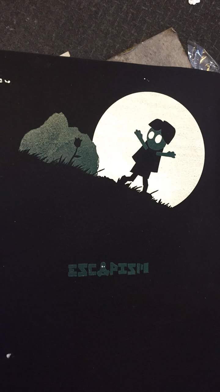
I have been screen printing one of the characters on my designs onto t shirts to accompany my book, I used the colour of the t shirt as the silhouette of the tree and landscape so that I could use two colours as the leaves and the moon, using the moon I was able to silhouette the character. It took a while to get the colour right. The colour seemed a lot lighter when mixing it. in the end we used a layer of white first then covered it with the green for the leaves. this made the colour brighter and also meant that the double printed white layer matched up perfectly so there was no difference between the two colours. We double printed the white so that it was bold even on a dark coloured t shirt. I have used this technique before and notice it on a lot of clothing I but. I often notice that they two layers don't match up correctly so there is a thinner layer of white around the edge of the design that almost looks like a shadow, I have seen this on clothing from a number of well known brands and it does not look good. We tried to make sure we lined up the layers perfectly to create a crisp image. This was especially important because my designs are simple and shape based so any changes to design can have a very detrimental impact on the print. matching up the number of layers on both colours means the prints are flush creating a professional looking finish. I made on children's t shirt for my niece using just the front design because the back print was too large. I have printed clothing designs before and thought about making children's clothing, one thing I noticed is the vast amount of sizes of children's clothing. I would need a much better understanding of my target age ranges if I want to try this as a business.


No comments:
Post a Comment