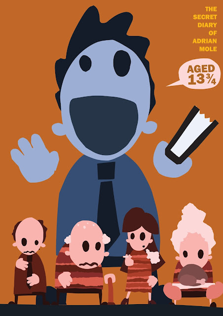
I used cut paper to make some of my character sketches into vector shapes and started to experiment with my composition ideas. My original ideas didn't work very well. Over lapping the characters was confusing and made the cover look messy. If I want to use this composition I think I need to change the way I am illustrating the characters and make them into more abstract shapes that fit together like a jigsaw, I made the characters at first and tried to jam them together hoping it would work. I should have spent more time working with them in the composition instead of making them separately. I wanted Arian to stand out in the middle but he seems lost in the composition and the title doesn't look jammed between the characters. I think the shape of the characters is one of the things that makes them interesting and this composition means that shape is lost.
I started to mess around with the composition to see how I would make the characters more interest and make the cover clearer. I like this composition, I don't think the idea of him being smaller than them is as clear but the change of orientation giver more space for the characters and text and makes an interesting eye catching image. The way Adrian is grounded at the bottom of the page and the contrasting colours make him stand out now that he has space around him.
I think this may be the best design so far, Adrian is big and bold, as he is in his diary. There are other characters I could add to continue the design around the book onto the back cover. I think the text needs to be made bigger, I could lower Adrian's hands a bit to create some space. I could also make the ground at the bottom of the page a bit bigger so I could use it as placement for some of the other text. I think I could refine this image further and make some of the shapes that make up Adrian more interesting/abstract. I would also like to try adding textures but need to make sure I don't get carried away. I want to make the lettering with cut paper I don't think it works with the image in a perfect typeface. I will have to try out a few had drawn fonts, I may need to use more that one for different sections of lettering.


No comments:
Post a Comment