Saturday 31 December 2016

finished T shirts


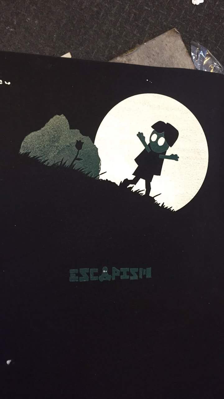
I have just picked up the finished screen printed t shirts and the colours work really well. I have not managed to avoid the rough edges from overprinting as well as I would have liked but it is only noticeable close up. The colours and shapes look crisp and clean and the navy blue of the t shirts themselves add atmosphere to the prints acting as silhouetted landscape. I decided to make the front print larger than typical t shirt prints and I think it has paid off, the character could easily have been hard to see at a smaller scale and the size suites the bold, block shapes.


I want to do a photo shoot at some point to advertise the book and the t shirts, I tried to get a few shots that show off the designs but need better lighting to show off the vibrant colours.

Thursday 29 December 2016

Screen printing


I have been screen printing one of the characters on my designs onto t shirts to accompany my book, I used the colour of the t shirt as the silhouette of the tree and landscape so that I could use two colours as the leaves and the moon, using the moon I was able to silhouette the character. It took a while to get the colour right. The colour seemed a lot lighter when mixing it. in the end we used a layer of white first then covered it with the green for the leaves. this made the colour brighter and also meant that the double printed white layer matched up perfectly so there was no difference between the two colours. We double printed the white so that it was bold even on a dark coloured t shirt. I have used this technique before and notice it on a lot of clothing I but. I often notice that they two layers don't match up correctly so there is a thinner layer of white around the edge of the design that almost looks like a shadow, I have seen this on clothing from a number of well known brands and it does not look good. We tried to make sure we lined up the layers perfectly to create a crisp image. This was especially important because my designs are simple and shape based so any changes to design can have a very detrimental impact on the print. matching up the number of layers on both colours means the prints are flush creating a professional looking finish. I made on children's t shirt for my niece using just the front design because the back print was too large. I have printed clothing designs before and thought about making children's clothing, one thing I noticed is the vast amount of sizes of children's clothing. I would need a much better understanding of my target age ranges if I want to try this as a business.


Roald dahl research


I want the illustrations I make for this brief to be different from any previous versions of the characters and scenes. there have been some iconic illustrations of Roald dahl's work, Quentin Blake created the most iconic work associated with Roald dahl to the extent that one doesn't seem right without the other. I want to learn from Quentin Blake's illustrations but create work that is very much my own. I want my illustrations to be bold, colourful and full of character. I remember the books and films from when I was a kid and want to capture the emotion of the characters as they take part in magical adventures.


Quentin Blake tended to concentrate on the characters in his illustrations often with no background at all. This means the viewer is solely concentrated on the character and allows Blake to clearly communicate the characters emotions and gestures without the viewers attention being taken by the characters environment. I would like to illustrate the stories creating an immersive scene that makes you feel like a part of the story. I will need to make sure that the characters do not become lost in the composition. I want to experiment with colour and texture in this brief. Quentin Blake uses some bright, bold colours but I would like to be more experimental and try different colour combinations for the characters and magical beasts in the stories.


Wednesday 28 December 2016

Roald Dahl 3


I made a mock up of one of my designs for the 'BFG'. I used the colours form the 'Roald Dahl Foundation' logo so that the illustrations compliment the logo and work along side it. I think I need to keep experimenting, I am not that keen on the results and if I start to alter the tones of the colours the idea will become unclear. I could try and use the colours over the 3 scenes so that together they make up the colour scheme of the logo or try to incorporate the lettering into the images. There is a kite in the logo that could be added to my illustrations on a small scale without being obtrusive.


I like the scale of the illustration but the image looks too flat. I want the emotions to be clearer, the girl should appear scared and the giant more angry. I want to giant to look more like he is searching. Overall the composition too balanced, it lacks movement and doesn't create a sense of what the characters are doing. I think this composition might work better with more limited colours. The giant and the background could all be tomes of the same colour with the girl standing out bold in the foreground in a contracting colour. In this scene the girl then hides in a snozzcumber and almost gets eaten, I could either illustrate her hiding inside it or the point just before the giant takes a bite out of it, that could add more movement to the scene while marinating the same contrasts in scale and character.

Saturday 24 December 2016

Roald Dahl 2


I have been trying to decide which of the other Roald dahl children's stories I am going to illustrate for this brief. I need the 3 illustrations to form a set so I want there to be a common theme between them. I have been looking at 'The BFG' which was one of my favourites as a child and 'The Witches'. The images I like most from my roughs for 'Danny The Champion of The World' include the child in the book hiding from the villain, which are two of the characters the brief asks for. I would like to continue this theme throughout all three scenes and keep a constant colour scheme also. The BFG characters differ in size and could make an interesting composition with scale, I could use this same compositional technique with the other two stories with witches and mice and Danny in the forest. I need to make sure the compositions compliment each other but are not too similar in layout.


I think of the two roughs the second one is a more iconic scene from the story and would have more impact. the scale of the buildings makes the size difference more obvious, for someone unfamiliar with the story the top image might be unclear, whether one of the characters is very large or one is very small. I want the colours these scenes to match the Roald Dahl logo but toned down. This scene especially is very atmospheric and bright bold colours wouldn't communicate the narrative. I ma really starting to enjoy this brief the more I get into it and think more about compositions and links between the stories. I think I might watch 'The Witches' over Christmas to refresh my memory.

Sunday 18 December 2016

Roald Dahl

I have started on my next responsive brief. I have decided to leave the Adrian Mole brief for the time being, I have almost finished my design it just needs the text added to the back but I want to get some feedback before I complete it. I have a few different ideas I will test out. I have moved on to the Roald Dahl brief. I had already drawn up some quick roughs for this brief but hadn't managed to come up with any ideas for scenes or compositions. I started out experimenting with character design which I think was a mistake. I want to get the ideas for my compositions first and then create characters that compliment the design. I have been working a lot recently with cut and torn paper and want to use this brief to move my practice forward. I am going to start with similar techniques and try to incorporate traditional print processes.


The brief says that the illustrations should compliment the logo. I would like to do that using the colour scheme. The colours of the logo are vibrant and fun and I think they could work very well for my shape based bold designs. The brief leaves a lot of room to decide how much work I should produce but is also a little confusing. it says "you should illustrate at least one child character, one villain character and one fantastical creature — whether this be a witch, a giant, an insect or an oompa-loompa!". The first scene I have chosen to work on is from Danny the Champion of the World and contains a child character and a villain as well as the birds from the story. I would think that the birds do not count as "fantastical creatures" but I am not sure. To meet the brief I will have to illustrate at least one more scene from another Roald Dahl story. This brings me a new problem, the brief states that "You can select scenes from a mixture of novels, although the illustrations should appear as if part of a coherent series. " So what constitutes a coherent series of images? Narrative? Composition? Colour scheme? I will have to research other stories and see if I can find themes that connect the characters and narratives. I like the idea of creating three compositions that compliment each other and work as a set but I have to remember the brief states the images should "appear as if part of a coherent series. "

The brief is for the 'The Roald Dahl Literary Estate' who describe themselves as "MASTERS of invention! MAKERS of mischief! CHAMPIONS of good" so I need to make sure my illustrations are inventive, fun and positive. The target audience is children between the ages of 5 and 11 that "don’t necessarily identify themselves as fans of Roald Dahl – yet!" My illustrations should be more based on introducing a new generation to the works of Roald dahl than celebrating their history for people who are already familiar with them. I want to make sure my illustrations are nothing like any of the previous illustrations of Roald Dahl.


Saturday 17 December 2016

Print texture experiments


These are a few examples of experiments adding texture to my illustrations using the lino prints I have made. I need to find a way to add textures without breaking up the shapes and composition too much. I want to maintain the integrity of the rough edges created with torn paper. I also want my illustrations to create an immersive landscape for the viewer and my experiments so far have not helped me to achieve this.


Friday 16 December 2016

Printed t shirts


I wanted to look at some clothing brands that screen print t shirts. I am limited by the constraints of the brief to 2 colours but limited colour schemes are common when it comes to screen printing t shirts as each additional cover ups the cost and the time it takes to make the screens. It becomes more difficult to line up each layer perfectly, with each new layer the screen has to be lined up which can take time. Because of these limitations t shirt designers find ways to include the colour of the t shirt in the design, effectively gaining an additional colour without the extra cost and effort. Complex designs to me seem wasted on t shirts as nobody pays close enough attention to the details one someone else's clothing. Bold shapes and interesting colourways create an instant impact. For some brands a colour combination can become as much their own as the logo itself. Colour choice can turn an average design into a much more appealing or ruin a design altogether. I keep getting too used to working digitally and being able to pick any colour I want from a palette and change it any time I like, its not so easy working with printing inks trying to mix colours, especially when they their appearance can change when the are printed and dried. I think screen printing on t shirts will suit the illustrations I have made and I should be able to use a dark coloured t shirt to act as a shirt colour within the print or as a silhouette to suggest the landscape.


Tuesday 13 December 2016

Bouncer animation

I spent ages today trying to animate the bouncer page from my book. I am still struggling with the best way to import my images from illustrator. I have tried every combination of import settings and still have problems. Sometimes the layers have been mixed up and moved around the composition. Sometimes all the layers are treated as being the same scale as the entire composition which can make it difficult to make certain adjustments such as rotation. Once I finally managed to import my files I tried to work with them as vectors so that I could start with the image zoomed into the birds face then zoom out to show the entire composition. My computer struggled to keep up with this process even with the resolution dropped very low (every 30 pixels). This made it very hard to see how well my animation was working. I also struggled to get all the layers to scale together and kept finding that one or two of the layers had shifted or scaled differently. After a few hours I decided to leave this section of the animation out until we get back in January and I can ask advice during the support session. The rest of the animation went well, I have animated the moon moving across the page, the first attempt I made was much too fast and was a distraction from the characters. I have tried to slow it down and use the moon to highlight the characters faces. I am still not sure if it works or is just a distraction from the narrative. I am going to show the animation to a few people and try to get some feedback.


bouncer video 1 from Joe Boon on Vimeo.

Saturday 10 December 2016

Cover template


I have made some changes to my book covers adding the extra information that was stated in the brief. It has been tough to add all the information without distracting from the composition. I have had to get used to the fact that the large amount of text will be a major part of the book cover and try to make it work as an integral part of the composition. I wanted to make it fun and bold, something that is not only clear and easy to read but appealing as well. I put the front and back cover together  the template of the cover from the brief.

I am not sure if the back cover works with the barcode box, I already had to move the character to the side to be visible but I think he looks a bit lost next to the box. I could raise the ground level up to just about the box and shorten the speech bubble. The only problems would be I would have less room for the text and the line of the book and ground wouldn't match up across the front and back cover. I will have to add the text to see if it is a viable idea. I made the speech bubble in a light pink to soften the contrast but looking at it now I think maybe white or just off white would work better. I tried a couple of different colours for the new text at the top and bottom of the front cover, I was thinking maybe a darker orange similar to the rest of the text or this blue. I think this colour balances the composition and makes it clear the authors name is separate from the title of the book.

I need to design the spine of the book next. I want to keep it as simple as possible, just big, bold text that stands out and catches the eye. behind all of the narrative and characters from the book I want the cover to be bold and fun!!

Thursday 8 December 2016

Bad day


One of those days when nothing seems to work out, I kept trying make progress with work from a few different modules but couldn't seem to focus. I think I had got stuck in a rut and was too focused on the work I had already don so decided to try something new. I spoke to a friend that runs a screen printing business and arranged to print some t shirts over Christmas to accompany my book. I am going to go to his workshop next week and screen print some of the characters from the book. This gave me some inspiration, I wanted to work with the images from my book but find a way to make them suitable for clothing. The main character of the book is the ogre but I wanted to concentrate on some of the other characters for the screen prints and communicate the idea of escapism/hiding/running away. 


The print on the from of the t shirt will be very small so needed to be kept simple. I liked the idea of using the colour of the shirt to suggest shapes in the landscape. This helped me to keep the number of colours down to a minimum. I think I might remove the flower from this design, it seems to unbalance the composition. Because I will be using the t shirt colour as part of the image I will need to make sure the screens are lined up perfectly for the image to work. If I don't it won't just be overlapping colour on line work, it will ruin the form of the character and the tree.


in a couple of recent projects I have used characters as letters and saw an opportunity to do so here. The ogre is a perfect shape for a capital A with the book acting as the whole in the middle. I have broken up the letters more than i usually do but only on a couple of them and where i thought it looked good but maintained the integrity of the text. I wanted to use the lettering to add some context to the t shirt and make it function independently from the book. I am not sure how well this works, it may still need to accompany the book to make sense. 


I have been talking to a friend that works as a book binder who is going to show me some materials that I could use for the cover of my book as an alternative to wood. I feel that I will have to compromise too much with the wooden cover and will lose the look I was going for. The practicalities of being a functioning cover mean I would have to use wood that will not have the look I wanted. Hopefully I can find a material that I can cut and neat key hole into and create a professional looking finish.

Breakthrough


I looked back at my original roughs for the book cover that were more focussed on lettering and realised I have moved away from them. I made two covers using the original compositions but removing a couple of the elements that made them too busy. I am much happier with these!!
They still need to be refined, I want to add a couple more textures and experiment with some of the colours. Some of the characters in the lettering become lost depending on the background colour and need to be altered. I don't want to add too many textures as I think they work because the contrast with the solid shapes that make up the majority of the cover. Some of the lettering is a bit messy, for example the 'M', I could create a full alphabet and make the lettering into a font to go with the cover. There is still some more text to add to these covers and I need to make sure I don't rush the process and try to cram it into the composition, all the elements will have to work well together. I could change the alignment of the lettering on this first cover. If the lettering is right aligned I could put the authors name in the top right in a slightly different colour.


I prefer this cover, I think it is a more interesting image and says more about the book. The though bubble fits the idea of seeing the world from Adrian's perspective. I could possibly use these compositions as the front and back cover of the book. On the top design I could remove the lettering and make the speech bubble bigger to contain text from Adrian's diary. I will have to test out these designs with the cover template to see if they work with the branding and barcode box. I tried this with previous designs and it forced me to change them, I have tried in this case to create compositions that will work but need to test that theory.

Level 4 and 5 crit


This was the final crit before the Christmas break. There are lots of nice comments that helped me to feel like my ideas have worked during this process. It seems from peoples reactions to the book that the narrative is understandable, I was worried that without any words in the book apart from the Neil Giaman  quote at the start that the concept of the story could be confusing or not understandable at all. I added extra pages as I went along and I think that has paid off. I changed my objective part way through from a set of prints to a concertina book which received some good feedback, people have mentioned that the layout works well with the illustrations as a continuous 'rolling narrative'. I am really happy with this, I want to work more and more with narrative in my practice and feedback sessions like this give me confidence that I can communicate ideas clearly.
there are a few concerns noted in the feedback, one is that there is no texture in the animation I showed. I am going to work on this, the problem I had is that I had to flatten he artwork for my book into a single layer to apply the printed textures I had made so when it came to animating I had to go back to older versions of the illustrations that still had individual shapes on separate layers and start to work forward again. The animation I showed is just a test and I fully intend to add the hand made textures to the animation by the time it is finished. There seems to be disagreement about the amount of texture I have used in my illustrations with some people saying not enough and some saying too much. While designing the pages I did try a variety of amounts of texture and methods of adding them to the images. I felt that if I added more I would start to lose the atmosphere in the scenes and the integrity of the shapes that make them. I tried adding more texture to the trees in the scene but the rough edges that I think really well were lost in the process. I think the person who said the texture is too strong might mean the texture in the background, I vectored the texture which worked well in smaller scale on the trees but looks out of place in certain areas. The sharp edges produced by vectoring the print texture don't look like hand crafted and don't have the same appeal.
To finish on a positive note, the colour palette I chose received positive feedback. I spent a long time testing different colour schemes and in the end printed off two. I wanted to make sure the colours captured the tone of the narrative.

Wednesday 7 December 2016

Book Cover Composition 2


I worked on a few more of my characters to try and make a back cover or alternate front cover for the book. I am finding it hard to create covers that are not over complex and busy. I think a few of my compositions look messy and I need to find a way around this. The more I work on this project the more I appreciate leaving space within the composition, My best results have been with illustrations that allow the important information on the cover space to exist without being crowded. I have kept trying to come up with ideas for including the text into the illustration but that may have confused the result I was aiming for. I should have been seeing the text and illustrations as two separate parts of the same composition that complement each other rather than try to force them together.


This was An idea for the back cover, there is quite a lot of text to add to the back cover so I tried to use Adrian holding a piece of paper to include it in the illustration. I think it looks a bit messy and forced, like the characters have been crammed together. I am starting to think about making the characters along the bottom of the page smaller, getting rid of Adrian all together and giving the text more space. I am not sure whether to use a speech bubble for the text or whether that will overpower the characters.


This is an idea for the back cover that would mirror the composition of the front cover with different characters from the book. I am not sure if it will work as a book cover being similar on both sides. I am going to try a couple more compositions then make mock ups to see how they will look. I like the speech bubble but it does break up the composition, I could try and make it a similar colour to the background to counteract this. I am going to go back to my research and see if I have missed anything that could help me when making decisions about the cover.


Sound Storyboard


I am still trying to get my head around storyboarding, my ideas for my animation involve a few simple slow movements. My aim is to produce a sad, sombre atmosphere to communicate the feelings of the ogre and his need to escape. I thought I should make a digital mock up storyboard to help me to plan out the sounds I will need for the animation. A friend who is a music producer offered me some of his productions but they were all too fast paced for my animation. I am not sure whether to have music playing throughout or use forest sounds to set the tone and pace of the sting. A combination of the two could work but I would need to find two that match in a similar way to the 'Last of Us- Part 2' trailer. The music is kept simple with slow lingering tones from a single instrument. I think the simpler the better for this sting, the same applies to the forest sounds, I found lots of sound clips that had too much going on. They were distracting and clashed with the animation itself. In terms of sound effects for this part of the sting all I want to use is the sound of the ogre crying, I will have to find a clip of a sobbing sound and lower the tone of it to make it sound like an ogre or alternatively I could record the sound myself. I also want to find a sound clip of heavy breathing for the ogre, in the full story from the book the ogre has just run away from soldiers and is out of breath, although that is not shown in the animation I think it would be  a good addition it will also help to communicate the size of the ogre.

I want to pan between the pages to transition between scenes and think I should add a sound effect to this movement to make the viewer feel involved in the animation. I thought about adding the sound of leaves rustling or footprints to give the impression that the viewer is part of the animation and is actually moving from page to page. I think this could help create a more intense, immersive atmosphere.
The second stage of the sting has two movements in it, the bouncer pointing at the sign and the ogres shoulders and head slumping as he is refused entry. I am not sure whether to add a sound to the bouncers arm moving as I want him to seem small compared to the ogre, I want the ogre to seem big and heavy and his movements to have presence. Again I want to keep the sounds quite simple. I want to find a 'sigh' sound clip as the shoulders slump. in one of my earliest animation tests I animated the moon moving across the sky but I have decided it is too distracting and does not benefit the narrative or the tone of the sting.


On this page the ogre tries internet dating and it does not go well. The background forest sounds and music will continue throughout all of the pages. I am going to animate a speech bubble to show the girl of the screen screaming and need to find a scream that lasts long enough to fit the lettering appearing in the speech bubble. After the scream the ogre will put his head in his hands a sigh again while the girl on the screen continues to wave her hands.

Tuesday 6 December 2016

Book cover composition.

I used cut paper to make some of my character sketches into vector shapes and started to experiment with my composition ideas. My original ideas didn't work very well. Over lapping the characters was confusing and made the cover look messy. If I want to use this composition I think I need to change the way I am illustrating the characters and make them into more abstract shapes that fit together like a jigsaw, I made the characters at first and tried to jam them together hoping it would work. I should have spent more time working with them in the composition instead of making them separately. I wanted Arian to stand out in the middle but he seems lost in the composition and the title doesn't look jammed between the characters. I think the shape of the characters is one of the things that makes them interesting and this composition means that shape is lost.


I started to mess around with the composition to see how I would make the characters more interest and make the cover clearer. I like this composition, I don't think the idea of him being smaller than them is as clear but the change of orientation giver more space for the characters and text and makes an interesting eye catching image. The way Adrian is grounded at the bottom of the page and the contrasting colours make him stand out now that he has space around him.


I think this may be the best design so far, Adrian is big and bold, as he is in his diary. There are other characters I could add to continue the design around the book onto the back cover. I think the text needs to be made bigger, I could lower Adrian's hands a bit to create some space. I could also make the ground at the bottom of the page a bit bigger so I could use it as placement for some of the other text. I think I could refine this image further and make some of the shapes that make up Adrian more interesting/abstract. I would also like to try adding textures but need to make sure I don't get carried away. I want to make the lettering with cut paper I don't think it works with the image in a perfect typeface. I will have to try out a few had drawn fonts, I may need to use more that one for different sections of lettering.


Monday 5 December 2016

Sound study task


The first video I have chosen isn't an animation it is a skateboarding video. I have chosen it because the video is edited so that every single trick throughout the video is timed with the music. The link between the soundtrack and the video makes the video much more enjoyable to watch. Both elements work as a combined composition rather than two separate entities. With my animations there are not as many actions to sync with the music but I would like the music to change with the tone of the scene and match up somehow with key moments.


This is a cartoon clip of a fight scene. The sound effects make the interactions seem real. They give the characters a physical presence. My animation will not contain as much action but I want the characters to feel real and have form to them. I think I could achieve this by have sound effects for each movement like the squirrel character rustling through the leaves of the trees and bushes.


This trailer for The Last of Us part 2 uses sound effects and music to great effect setting the tone of the animation. The animation would not have anywhere near the same impact without them. I need to find music that perfectly fits my animation. If I use the wrong sounds or music I could make the animations narrative confused. Some of the animation is supposed to be quite sombre, if the music is light hearted or too fats paced it will not work.


I want to use both music and sound effects in my sting. I will need to make sure I get the levels right so that both elements are clear and work together in harmony. The tone of the sting will change as I animate different pages so I will need to find a way to transition between them with music that fits the tone. Effectively my sting will be made up of 3 separate animations that work together as a sequence. I want to experiment with different ways to transition between the pages with both animation and sound. I have spoken to a music producer that I know who has offered to give me some music for my animation and help me with editing it into the animation. I will have to see if he has anything that suites my work, I don't want to try and force the two to work together. The main character is an ogre/giant so I want to try and show his size and weight through the sound effects of his movements compared to the humans and small animals. The last of us trailer has background noises and tones that create atmosphere, I would like to try and find sounds that could work in a similar way for my animation, they seems to work well with slower moving subtle animations making each movement seem more poignant.


Most of the book is set in the forest, in fact all the pages I want to use for my animation do. I want to add some forest sounds like rustling leaves and animal noises to create atmosphere. Possibly slow music or a low tone like a film score in a moody scene. I think it will be important to make all the movements seem real, they will be fairly simple so if I get them wrong it will ruin the animation. I want to find some gritty real sounds will make my add weight and form to the characters and objects.


Moving Pictures Proposal


I intend to produce...

I want to make a 30 second animation that highlights 3 of the pages from book and create intrigue in the narrative without telling the entire story.


The content will focus on...


1. The sadness and loneliness of the main character.

2. One of his attempts to escape his day to day life through common escapist activities.

3. The main character finding peace through reading and using it to improve his life.

I will be aiming to communicate...

1. loneliness and sadness, isolation.

2. Alienation from the real world, frustration.

3. Happiness, finding peace. Escapism teaching lessons and skills that apply to real life.

To an audience of...

1. escapist fiction fans.

2. Neil Gaiman fans.

3. People who have a negative view of escapism.

Saturday 3 December 2016

Character development


I have been roughing some characters trying to develop them as my first attempts where fairly generic. I didn't know enough about the characters personalities and actions in the book to make illustrations to communicate the story. I have tried to pick main characters that feature throughout the book that have strong personalities and contrasting physical appearances. I want to use the characters as a background for Adrian mole and I'm thinking of illustrating them all with the same colour scheme with Adrian in a contrasting colour in front of them. I want to make the characters into a landscape, like a forest. Scale will be an important element in this composition, I want the adult characters and even the dog to dwarf Adrian while he exclaims he is grown up. I will have to find a way to fit this idea into the dimensions of the cover. Ideally I want the adult characters to be at either side of Adrian with a skyline behind him but this may not work in a portrait frame without contorting the adults. I am going to develop the characters with cut and torn paper, I want to use this technique as it has worked well for me recently acting as a constraint that helps me keep characters simple. Adrian will be very small within the composition and the image will not work if he is too detailed, this technique will hopefully help me to develop a character that communicates his personality without too many unnecessary details. Speaking of overcomplicating I think that might be what I'm doing with this explanation. Basically I am going to continue to experiment and develop the characters and try them out in compositions along the way to see what works. I want the cover to be fun, bright and eye catching.


Friday 2 December 2016

Happy

Feeling much happier about the Adrian Mole brief after yesterdays crit. I have started roughing out ideas again incorporating the text into the illustration and using it to help me communicate Adrian Moles character and the narrative of the book. I got some good advice today, that as an illustrator I should treat text in the same way I treat my illustrations and see them as one. I have adapted two of my previous designs to incorporate the text and I think I have found a way to combine them that improves the image rather then overcomplicating and adding constraints. I want to make sure I spend more time roughing out a variety of options and fine tuning all aspects of the compositions before I try and make a final image. I have been researching the characters from the book, I have re-read sections of the book tried to find reviews/reflections on the book where people talk about how they view each of the characters. It is easy to find descriptions of the characters in the book that talk about their personality or appearance but as the book has been around for a long time I want to find out the lasting impression that the characters have left on the readers.

More research and more roughing!!!


Thursday 1 December 2016

Mega Crit


Today we had a Mega crit, I already had some ideas I wanted to apply to my project but the crit gave me a better understanding of my the work i have made so far fits the brief.


I want to go back to roughing and idea generation. I think I skipped the step to an extent, I roughed out a few compositions that I liked and started to make them straight away with cut paper and then adobe illustrator without fine tuning the designs. this has helped me in some ways, i have been able to experiment with colours and textures but I am not happy with the compositions and I think this has affected how I work with them rushing steps and making do. I have reused characters from other work to test out one of the compositions because i wanted to see how it would work but trying to force and image to fit the composition looks messy and only put me off the idea. I need to step back and consider all aspects of my compositions before I jump in the deep end.
From the feedback the strongest themes or messages are "the struggle of being a teenager" and "passing from childhood to adolescence". I want to make this the basis of my book cover as I think it is the basis of the book, there are many issues that Adrian Mole tackles throughout the book but that is the overarching struggle. 
The suggestions I received are mainly based around experimentation. I agree with all the comments, I need to experiment with colour, media and composition. I don't want to add much detail to the cover as it has to include a large amount of text which is something I haven't included in my images up to this point. I hadn't realised quite how much text there is until I saw other peoples work. i will need to find a way to tie the text into the image, I don't want image and text to act like two separate entities.


I was thinking of making the title of the book out of the characters hair or the lettering stuck in his hair. The title is so long I don't think it can sidelined next to an image and if I keep the two separate it will overpower the image. I will need to work out roughs to see how I can solve this problem through different compositions and colour schemes.


I think I need to work out the scale for this image and make more characters to make up the background. This is the image where I have recycled some characters and they don't suite the composition. I want the characters to look almost like trees in the background. I think I have made the Adrian Mole character too complex for his size, I want to make his character and emotion clear and need to find a way to to that while maintaining his appearance. I will have to sacrifice some detail but would ideally like to keep his hair, glasses and the diary.

Back to the drawing board.