Tuesday 29 December 2015

Change of Plan

I have had trouble getting into this project over the Christmas break and have decided to change the theme of my book. I lost my mum just after Christmas last year and want to base the book on her. I have been trying to think of a way to shape this idea to create a good book and to meet the brief. i think I would like to base the book around her life and this would enable me to research to locations and story's associated with it.
I have spent the last 2 weeks interviewing family members and friends of the family to find out how I could best sum up important events in her life and what locations I could research. During this research i have highlighted moments that sum up her life that I think are universal enough to appeal to the readers of the book and that should be possible to illustrate without words.
I want the book to convey the joys of her life and the sadness of her death so I need to try out different ways of illustrating the book that are fitting to the tone of the subject matter. I have been struggling with this aspect as I mostly draw cartoon like illustrations that aren't necessarily right for the emotions I want to convey. I have been drawing facial expressions to try and get a grip of how to show emotions with a degree of subtlety while still clearly illustrating each part of the story.

I have been collecting story's from my family and family friends that have meant I could put together a rough idea of how i want to put the book together in regards to structure and page layout but i need to do more research into each individual story and location. the story's I have chosen to start this process are

1. I want to start with my mums childhood in hackenthorpe in sheffield. my grandad had a very tough young life, he was the youngest of 12 brothers and had a toe missing on each foot from wearing handed down shoes that were too small for him. he was put into a sanitorium when he was a child because he was mal nourished. He went to war as a teenager and came back strong and healthy. He moved into a council house which he loved as he had a garden to grow his own veg. I want to show my mum with my grandma and grandad in the garden harvesting veg.

2. My grandad worked in  the steel mills in sheffield as a brick layer building furnaces in sweltering conditions. he worked in terribel conditions to provide for his family and to pay for my mum to be able to go to a good school. She went to notre dame and the uniform cost a lot of money at the time. It was a culture clash for my mum and must have been very difficult to adjust to her new surroundings. I want to try and illustrate this feeling of apprehension she must have felt arriving on the first day.

3. After going to notre dame she moved to london to study and work but hated the city. She loved the outdoors and used to get on a bus for 3 hours to get out into the countryside whenever possible. I want to show the anxiety she must have felt in the busy city and the serenity that escaping to the country must have brought.

4. She met my dad in london and they were together until she died i want to show their wedding as a celebration of that connection and how huge a part of her life it was.

5 I want illustrate my sister being born and then me a few years after. he was a teacher and a mother and was loved by her staudents and her children. I have never seen students react that way to a teacher in the schools i went to. She never gave up on anyone and I want to try and show how caring she was. Although these ideas are very personal to me I think people will be able to associate members of their families to the book if I illustrate it correctly. I need to highlight common situations that people have either experienced themselves or are familir enough with the make an emotional connection to them.

6. I would like to show the doctor giving my mum the news that she was ill and only had a year to live. this is obviously a very emotional part of the book for me and i need to make sure i can convey that emotion to the viewer and do it in a way that demonstrates the situation as clearly as possible. the situation is fairly simple it is the feelings of the characters i need to concentrate on. I have been struggling to get emotion right drawing facial expressions so will need to work on this by researching other illustrators work and trying different styles and media.

7. While my mum was ill and undergoing chemotherapy my sister had a daughter, my mums first grandchild and this was an amazing blessing in the final moths of her life. i want to show the joy and how important family is in times of sadness. Even though the last year of my mums life was extremely difficult I am grateful we had the time we had and that she got to see and enjoy the company of her grandchild. I want this to be a happy illustration but still illustrate the effect the illness and therapy is having on my mum. This will be a struggle to balance the complex emotion of this section of the book.

8. I want to show me and my sister and dad at my mums bedside the night she died. It is a very dark sad part of the story but think it is needed to show the realities of the situation and of life itself. I think that this could be very close to a lot of peoples emotions and be a very powerful image.

9. finally i want to find a way to show how my mum still inspires me in everything I do and the memory of her makes me stronger in times of trouble even in writing this book. In essence this is a book of me being inspired to illustrate this book.


Saturday 5 December 2015

Meanwood Towers Photos 2

 I got some close up shots of the doorway and balcony on the front of the building which both have some really nice detail i could use in my picture book. I want to illustrate the building a few differnet times throughout the book each time in a different way. I think the drawing of the original building as it looked years ago could be in black and white maybe with a colour backdrop. I also want to draw the building as a silhouette with the flats visible inside to show the modern living and stories of the residents. my friend lives on the top floor so I was thinking I could depict him as the lord of the house and contrast his lifestyle with the original owner. 
I need to take a trip to St Bartholimew's in Armley to look at the organ and figure out how to show its influence on the building, this opens up lots of possibilities to add a new angle to the picture book both in concept an layout. 


 I tried out a quick idea to colour the building with sold grey tones with no shading or highlights. I like the effect it creates especially against a colourful background and would like to try this with a completed illustration of the building. 
If I am going to compare modern living in the house with the original owner I need to do more research into life at the time and try to discover any similarities.


meanwood Towers photos

 this is a photo of meanwood towers taken in 1950 before the chimenys had been removed for saftery reasons, Apart form the chimneys the building remains intact with all its original features although it has been turned into flats. I would like to show the changes that have taken place over the years, especially the building surroundings and residents.


 This is a photo I took on Friday showing the building with the chimneys missing and its new residential surroundings. The buildings gothic designs is enhanced by the plain modern building that surround it. The building is tucked away on a dead end street away from the main road adding to its horror movie mystique.


I decided to make a quick digital rough of the chimneys that have been removed shown as a ghostly presence on the roof of the building. I would like to tell the story of the building and its inhabitants changing over time. I have a friend that lives in Meanwood Towers on the top floor so I will gon and take some photos and interview him.

Thursday 3 December 2015

Chosen location


The location I have chosen for this project is Meanwood Towers which was formerly known as Meanwood House and was built in 1866-67.The house was designed by Edward Welby Pugin and is in victorian gothic style.The owner of the house Thomas Stuart Kennedy commissioned Edmund Schulze to build an pipe organ for the house that was installed in 1869. The house featured an 800 seater wooden concert hall. The organ only stayed at the house for 8 years and was loaned to St Peters church in Harrogate for 2 years before being sold and given to Bartholomew's Church in Armley where it still resides today. The house used to have tall chimneys fitting wight eh style of the rest of the house but they were removed in 1969 for safety reasons. The house is now made up of flats although a lot of its original feature remain including a grand marble staircase. 

I want to tell the story of this house an how it has changed over time, including what it is like to live there now. I know someone who has lived in a flat in the building for 8 years so i will interview him about what his view of this building is and try to find out the more subtle personal things about living in  a piece of history. I will get him to show me round and take photos of both he exterior and interior. I will also keep researching the building and surrounding area. 

Mark Making 2

 For this piece I used a plastic nib paint pen hat works like a fountain pen on water colour paper. I have used these pens before and on certain surfaces the can spatter if used at a certain angle, if done right this can be a really nice effect and add some texture and movement to a drawing. I think the water and some of the shadows on the tentacles work well but I need to change the composition exaggerate the movement. I wanted the water to look like photographs of water taken with a fast shutter speed.i would like to work on a more detailed larger scale version of this piece.

This set of three images follows on from thew previous visual language task, I was truing to draw a version of a cat griffin type creature and struggles with anatomy of the cat. I wanted to work more on this and try to understand how to put together a character that even if not entirely anatomically correct, looked right! I Tried to use a combination a marks to communicate speed, movement and form. The spots on the cheetah really help show the solid form of the cheetah among the lines i have added to show its movement. Before I added the spots and shading the form was partially lost or confused within the composition.
For this next image i tried to redraw the cheetah vert quickly using loose layered lines. I realised that the shape i had created looked a lot more like a dog than a cheetah so stuck with it and added a couple of details to add to the character. I work a lot by building up lives into solid blocks so in this image i tried to use dingle pen strokes to show the contours of the form of the dog. I think the single lines work well but would be more effective if combined with a neater more detailed outline.
For the final drawing of the set I decided to switch to sold almost geometric lines. The image reminds me of old adverts for dog racing you would see in bookies years ago. I think the lines are too simple, uniform or even just too short to show any effective movement. I would like to try this again with a range of colours.I think that would open up opportunities to create and interesting form as well as movement.

This last image was lots of fun, it is a sharkgorillagoat? maybe? something like that. I like using copics markers and fin liner as a combination but I usually use them in a more more practiced,neat regimented way. I tend to use solid outlines in fin liner with multiple tones of copics to make blocks of shadow. This was an interesting experiment that I would like to follow up on with more thought put into composition and colour. I think an illustration with the darkest shadow made up of marker then combined with subtle tones of colics could be really nice.


Mark Making

I should have made this blog post a few weeks ago when I made these images but I forgot. This does offer me a chance to look back at the drawings with a fresh perspective. I think a couple of these images although created as mark making would fit better in the shape task, I was trying out different ways to use fine liners, paint markers and copics and found myself drawing in blocks of solid black with no outline.


I decided to keep working on the theme of mythical creatures by making up my own using combinations of animals. I like working with block shapes and bold contrasts between light and dark. I found that the more you remover the detail and concentrate your mark making purely on shadow the better the images looked. The solid black on the Gorillacrow is interesting and i think would look good in combination with good use of negative space. I think i need to try out more media to see what different textures and marks i can achieve.

Sunday 29 November 2015

hotdog book


After looking through our photos from our walk round Leeds we to make a book of the sword fight we had in the toy shop. We had a tough decision between that and an idea of sounds echoing in the dark arches. the dark arches idea was really subtle and stylized with the sounds illustrated using shapes in the darkness. The reason we chose the toy shop idea was that as we would be illustrating separate pages in our own individual styles the more easily understandable narrative would leave less chance of the viewer being confused. The dark arches idea was very subtle and would have needed every element of the illustration to mesh together throughout the images to work. The narrative of the toy shop idea is that 2 adults walk into a toy shop and turn into children as they start to enjoy themselves and play with the toys, the back cover shows one of the adults still holding the toys and looking sad because they have to return to being an adult.


 These are my first concept sketches for the book, I wanted to use block shapes to make up the images as they would be screen printed and I didn't know how much detail i would be able to use. I have worked with screen printing before but always with digital images printed on to acetate. I thought that the use of block colour would also help to simplify the colour scheme as we were only able to use two colours. As a group we looked at each others rough sketches and decided which elements to keep the same throughout the book to add continuity. We kept the characters clothing and the dinosaur in each page.

I drew my completed design and coloured it with felt tips to make sure the colour scheme worked. I think I could have added more detail to the toys on the shelves, it looks like they could be in an armoury not a toy shop. I like the colour scheme of bold primary colours that remind me of toys.


As a group we took turns to add trace our designs onto the acetate using various media, I tried to use posca paint parkers but the light was still showing through even after a few coats so tried the white solvent based paint pens from the college library that worked much better. Annie used a combination of cut paper, chinagraph pencils and maker that created some really nice contrasts in line quality and texture.


I think we made the right choice of story as even with a fairly simple narrative like this one the different styles effect the continuity. I think the colour scheme is bold and clear and the way the narrative is structured is easy to understand. I feel like I should have added more detail to my illustrations to match the rest of the group. It was a fun task and the group worked well together.

Saturday 28 November 2015

Shape 2

 For my second shape based image I used Adobe Illustrator again but this time used the pen tool for the entire image so that I could build shapes more freely and hopefully create a feeling of movement in my work. What I am finding while working with shape is that I like the simpler images, the moe detail I add seems to make the image too busy confuses the forms. I want to experiment more with very simple blocks of colour using only the bare minimum need. The same applies to shap, I want to try and perfect the shapes so that one block of colour can communicate the character or scene.


Shape


 I have been trying to draw with shape which has been a challenge as I normally draw with intricate fine liner outlines. I tend to use thin lines to make up shaped solid outlines with tapering points so creating abandoning outlines all together presented me with some interesting challenges.
  • How do form interesting shapes to represent forms
  • How to add depth and shadow
  • How to make objects stand out when similar in colour or tone
  •  How to add detail


This is my first attempt, I used Adobe Illustrator to make this image. The image is made up of a combination of rectangles and ovals sometimes overlaid to create different shapes. This is not how I usually create images and using shaped to build up the image felt quite mechanical. I felt that i was separated from the crafting element of the process. I use digital media a lot but tend to use a cintiq and pen tool to maintain some feeling of traditional process.

Monday 23 November 2015

Stories Around Leeds

 Today we walked round Leeds carrying out tasks, discovering stories and creating our own. In our group we posed with statues, put on a bet at a bookies, ate hotdogs, fed pigeons, went to a toy shop and bought some food we had never tried before form the oriental supermarket to name a few.


We went to Harvey Nichols and got some funny looks form some rich folk while looking at some extremely horrible incredibly expensive shoes. Even though the customers gave us some funny looks the sales assistant was very nice and really helpful even though she knew we weren't going to buy anything.


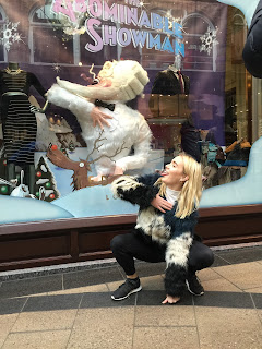
We posed with statues and window displays around Leeds (some stranger than others) and tried to match the poses, I tried to capture the essence of the owls at the Civic hall, I don't think it went well.


We went to see my boss and bought him a coffee, his immediate response was to shout abuse at me with lots of swearing. he did then share with us a story about 2 soldiers that were killed in a house somewhere near the corn exchange a long time ago. supposedly there are 2 stone skulls set into a wall in one of the buildings to commemorate their deaths. This might all be made though as my boss has just spent 3 days in Amsterdam.


This was the food we bought form the oriental supermarket, some of it was very nice especially the hot and spicy prawn crackers but the drinks were really really bad.
The highlight of the day was being asked for ID in the bookies for the first time in years. It was nice until he looked at my drivers license and seemed confused, I don't think he was aware that dates go back that far.

Friday 13 November 2015

Do Judge a Book by its Cover final Piece


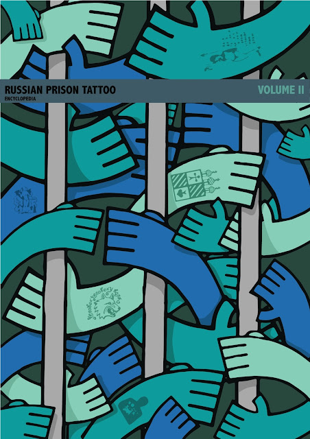
 This is my final piece for the Do Judge a Book by its Cover brief. I am happy with the final outcome of this project and have enjoyed working on this final design after having problem with my work earlier in the brief. I think the design successfully communicates the theme of the book without being too blatant or staged in doing so. i think the design is interesting at catches the eye and that the image wrapping the entire cover adds a feeling of craft and quality.


 I think the colours I have chosen are bold enough to to be eye catching while still being appropriate to the subject of the book. I tried to use colours that represent the sombre feel of the books introduction and imagery that shows the harsh conditions of the subject. I think this would work well as a book cover, the only adjustments i would possibly make are slight changes to the colour of the title to make the text even clearer that it is already.  I would like to work on more briefs like this as the constraints of dimensions, concept and layout made me think a lot more about composition and communication than I am used to. I think avoiding obvious imagery and motifs has made the cover of the book more engaging and hopefully more appealing to the viewer.


Self Assessment Form Draft

1.  Which practical skills and methodologies have you developed within this module and how effectively do you think you are employing them within your own practice?

I have tried to create crisp clean images to communicate my ideas using a combination of  analog and digital media. I have used Adobe illustrator to make my final pieces in two of the three briefs, I feel comfortable working with this program but still have a lot to learn. I have enjoyed generating ideas for the briefs through roughs but feel i need to dedicate more time to that part of the creative process. I spent the largest amount of time on that process in the typology brief and feel it generated the best results in terms of concept. I think creating a large number of roughs and creating multiple versions of the same concept has helped me to generate ideas that i would not have without these processes. group crits and general peer discussion has been very helpful in terms of new perspectives on my work highlighting positive and negative aspects i would not have thought of myself.


2. Which principles/ theories of image making have you found most valuable during this module and how effectively do you think you are employing these within your own practice?

Before starting this course worked with the intention to create visually appealing images often using adobe Illustrator to finish them to a high level and add a professional looking aesthetic. Since starting the course i have realised the huge importance of visual communication and problem solving in illustration. it has become clear to me that the concept and the way it is communicated to the viewer are the most important things to consider when creating an image. I have struggled at times with the idea of tone of voice and getting a balance between communicating all the information needed and producing a captivating image that engages the viewer. I want to work more on the subtleties of communication and what makes a tone of voice appropriate for a subject.

3. What strengths can you identify within your submission and how have you capitalised on these?

I think I have created some well crafted finished products during the briefs. I have tried to move out of my comfort zone while maintaining the skills that a had prior to starting the course. I draw a lot from imagination as well as from observation and reference and have tried to change the focus of my imagination to idea generation and problem solving. I have tried to create final pieces that communicate the ideas intrinsic to the brief while stimulating a thought process with the viewer, I have attempted to do this by applying the correct tone of voice combined with informative and thought provoking image making.

4. What areas for further development can you identify within your submission and how will you address these in the future?

I need to spend more time in the early stages of research and concept development to make sure i have explored a wide range if ideas and creative techniques. I need to do more artist research to better understand the techniques and methods used. I think looking more at other artists work will help me push my ideas further and take risks, I have a habit of drawing in the same way that I have for years as I know what the results will be and feel comfortable with my methods, it is a hard habit to break but I need to push further and further out of this comfort zone to improve my practice.  This idea can also be applied to trying a wider variety of media that will open up possibilities in terms of aesthetic and process.

5. In what way has this module introduced you to the Ba (Hons) Illustration programme?

This module has introduced me to the principles, methodologies and processes that are intrinsic to the course. The module has helped me get used to the way we are set tasks, assessed and how information is made available to us. The briefings and group crits have helped me become comfortable within the group and the structure of the programme. The principles and methodologies we have been introduced to have helped me understand how the programme is geared to towards professional practice.


Thursday 12 November 2015

Do Judge a Book by its Cover Development

Following on from the decisions I made after the group crit I started to experiment with my chosen ideas. I wanted to see how the image would look after i had added the tattoos to the hands. I live traced some images from the book using Adobe Illustrator and used them in place of the my own designs just to see how the overall image would look. I wanted to add enough to draw the eye and generate interest in the books subject without overloading the image and masking the pattern of the hands. 


I like the effect of only adding tattoos to a small number of the hands in the image but think i need to change the way the tattoo images are made. I want the qualities of the tattoos to match the simple bold design of the hands. I have made the tattoos a darker shade of the skin tone so that they have less effect on the structure of the image.


When I looked at the options I could use to add my title and author to the cover i looked at penguin books who often used a block of colour as a base to separate the patterned cover illustrations from the title. I like this design as it makes the text very clear and partially frames the illustration. The downside is that the block of colour covers a significant section of the design itself and with a small book like the one i am working on space is at a premium.


I wanted to create a space for the text on the spine that allowed the illustration to remain the main feature while keeping the text clear and crisp. I like the idea of the block of colour that leaves a gap at the sides as it almost looks like a add on or a label to the pattern, making the pattern appear like a solid object. I might change the angle of the 'volume II' text, I don't think there is any need to over-complicate the design and that the change in colour is enough to make the image interesting. I may also change the placement of the block of text altogether. If I decide to use the thin strip of colour design I would like this block to be at the bottom of the spine so that the 2 colour blocks don't overlap.


For this design I have shrunk the title box down into a thin line that I would like to continue around the entire cover. I think this will make the entire design look solid and add a feeling of quality crafting to it. The thin line provides a space just big enough to incorporate the text separated from the main pattern of the cover but allows almost the entire pattern to show. I think this way of incorporating the text is the best balance of clarity and maintaining the integrity of the illustration. The bigger boarder covers too much of the pattern and no backdrop at all makes the text too hard to read. I think the thin line creates a small amount of structure that contrasts well with the overlapping pattern of hands.


For the Dewey Decimal I decided to make change to the colour scheme and add pink. I wanted to make the number stand out and overlaying similar colours too much could have ruined the clarity of the image. I wanted to chose a colour that would work with the colours already on the image but would stand out and i think this soft pastelly pink does the job. I thought is would be a good idea to make the Dewey Decimal label stand out as it is a very important label that will be a lot of peoples first view of the book even before the title.

I didn't leave myself enough time to develop the other idea that I had selected to work on. I would have liked to have seen how the idea would have evolved into a final out come however I think i made the right decision in focusing my time on producing one book cover to the highest quality possible. I was interested in the idea of making an image similar to a repeating pattern that took up the entire cover and it is something i have never attempted before.


Tuesday 10 November 2015

group crit


Before the group crit on monday I didn't like any of my roughs, I thought certain elements of them were useable but overall I was not happy with any of them. The crit helped me focus on the pisitive aspects of my roughs and discsrd the negative. With the help of the group feedback I have decided to further explore 2 of my ideas, one of my roughs and a digital rough i made over the weekend. I had become too focussed on communicating every element of the book which was proving to be a constraint on my work with negative effects. I want to create a sublety of communication that is relevent to the brief without using obvious cliched imagery and ideas.


 This is the first design i chose. I would like to use photography to create the front cover, to do this i will need to photograph on site in a tatto shop. the idea is to get kitchen roll that has been used to clean a tattoo that is in progress. The kitchen roll will have a mix of ink and blood on it with colours beeeding into each other. I will push this kitchen roll onto a white background so that the colour runs down the surface. I have already gone over the health and safety issues with a tattoo artist and this process should  not be a problem. During the crit it was suggested i could use the same stained kitchen roll as a background for the back cover of the book, I think this will baclance the cover and create a link between the front and back covers. I want to experiment with different media find the best way to draw the russian doll for the back cover. i want to find a way to create fades and bleeds that tie into the backdrop while making the image standout. Although the kitchen roll is not the most well known way to illustrate tattooing i think as an image it will be interesting to the viewer, draw the eye and generate a reaction.


This design is a digital rough I made when i was feeling really negative about the brief. I was struggling with my other concepts and wanted to change to a completely different thought process and aesthetic. I drew 2 hand with fine liner witht he idea to have them all overlapping making an image resembling a repetative pattern, I added the bars as a way to suggest the idea of imprisonment. I tried to use colours that suggest a sombre dull enviroment but that are still interesting, visually appealing image. I thought about using colours associtaed with russia (red,white,black) but decided they would alter the feel of the image and felt like a forced attempt to fulfill the criteria. I was originally intending to add tattoos to every arm in the image however after the feedback i recieved in the crit I think it would be better to only have a few of the arms tattooed. I will need to experiment to see how the addition of these images alters the image, I want to maintain the inetgrity of the structures that are already in the image/pattern. When choosing the tattoo designs i will need to be careful to select images that are appropriate to the subject, again i need to use sublety to suggest the the subject of russin prisons while avoiding imagery that seems too blatant or forced such as the hammer and sickle.


Sunday 8 November 2015

Do Judge a Book by its Cover Roughs

 I have really struggled with this brief! I liked the ideas I came up with a first but after working on them all week I am not happy with any of them. I think there are positive aspects in all of them but overall they do not work as well as I like. The problem is finding a concept that finding a simple clear image that is interesting and draws the eye while successfully communicating the subject of the book.
here are my designs.......


Fist idea

pros
  •  clearly communicates  subject
  • leaves room for text
  • tone of voice correct for subject matter

cons

  •  simple/obvious concept
  • image doesn't make the best use of the space
  • boring/unengaging 

This idea could be a lot better with more work on the character design.I think the design of the hands and the figure on the back need to be a lot more interesting to liven up the idea while maintaining the clarity of communication.


Second idea

pros

  • colourful, interesting design
  • good use of space/negative space
  • easily recognisable motifs (back)
  • title integrated with design

cons

  • idea requires some understanding of the process of tattooing (front)
  • does not communicate criminal element of the book
  •  would need work to make the tone of voice right
  • frongt image would probably need to be a photograph for the concept to work
 I think i could use the back cover of this idea but would need to change the blood and ink soaked rag on the front. The image is not very clear and how relevant it is to prison tattoos is debatable.


 Third idea

pros

  • Front image fits well in the space
  • character provides a good basis for the book title and authors name

cons

  • front and back covers don't work well together
  • simple idea
  • doesn't represent all aspects of the book
  • back cover concept too hard to understand

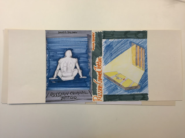
I think this idea could be improved by scrapping the back cover and using an image of the other character's (front cover) back covered in tattoos. I would also add handcuffs to the character to represent the criminal aspect of the book.


Fourth idea
pros
  •  interesting design
  • good use of colour
  • design integrates title better than other designs
  • wrap around design
 cons
  • not all elements covered (criminal)
  • back cover could be better related to the front
  • design could look cluttered
I need to change the back cover to make it related more to the front, i could include other tattooing equipment but would need to make sure the items are well known and easily recognisable.  I could also simplify the drawins to make the image clearer.


Fifth idea

pros

  • good use of colour to create the right mood
  •  covers all aspects of the book
  • dark background colour highlights key elements

cons

  • composition could be improved
  • back cover key elements need to be enlarged to be clear
  • character to be changed to show mood of the piece
  •  more colour experiments to fine tune and search for the bets media to use


This idea coul work really well if the character and colour can be made more sombre to communicate a feeling of being locked in prison. I need to experiment more with colour media to try and find the best process to complete this cover. I need to change to composition on the back cover to clearly show the items on the table.


Monday 2 November 2015

A Day In The Life Summary


Today we had a crit to look at our editorial pieces. It was good to get feedback and see if people shared my views on the strengths and weaknesses of my work. It is important to know that you are able to identify concepts that appeal to a wide range of people, these crits are a good way to develop confidence in your judgement. Of my illustrations the best feedback was for the cliff fall piece and the money pit piece however the group thought that the money pit idea needed illustration worked better with a knowledge of the text whereas the pit fall illustration was clear and easy to understand. One thing me and the group agreed on is that a some use of colour on each piece could possibly have helped with the clarity of concept.

I enjoyed sketching out roughs for this brief and brainstorming through drawing. I think i could have spent more time trying out different ideas and different compositions for each individual idea.
I tried to experiment with colour but found i kept pushing the boundaries of the brief and didn't think I could achieve what I wanted without fully breaking the constraints of the brief.

I started out drawing my ideas and used coloured pencils to experiment with colour. Once i had decided on a shortlist of ideas i made digital roughs to experiment further. I think i might have moved to this stage too early as it kind of cemented which compositions i was going to use.

I tried various digital techniques like overlaying vectored photos and digitally drawn line work but didn't think the image was clear enough to work.

From the feedback I think my concepts worked fairly well and were communicated through my compositions. I could have tried to communicate emotion through my characters rather than making then appear robotic but I liked the idea they had become drones in the hunt for unattainable wealth. 

I enjoyed this brief but wasn't entirely happy with my finished pieces. I think the concepts are good and with a few alterations could communicate the article well. I liked the article we were given and think it provided lots of options for us to work with.

Sunday 1 November 2015

A Day In The Life

When i was trying to decide on which of my roughs to use as a basis for my final pieces i struggled with the colour constraints we had. I tried to use photographs to add texture to my images but thought the effects i created took away from the core messages of the images. I also wanted my illustrations to to feel crafted and to create the the landscapes myself and the use of photographs almost felt like a cop out.

I tried to use splashes of colour on a grey backdrop at draw attention to the key components of the piece, this led to problems only having two colours plus the stock of the paper to work with. I could maybe make a case that black and grey are the same colour so the colours would be grey/black, green and yellow but then which one is the stock. I felt like pushing the the limits with the colours i could use was taking away from the exercise and stopped me exploring what could be done within the constraints.


In the end i decided not to use the photographs or the splashes of colour and opted for a fully greyscale colour composition. I think this best reflects the feeling of the text. I had to try out lots of different combinations of grey to make sure all the elements of the illustrations were clear.


My first image depicts a television luring a person over the edge of a cliff using money. I wanted to illustrate the unattainable life goals that television pushes young people to achieve. Celebrity has become an occupation in its own right and television advertises a lifestyle of fame and money instead of one of hard work and sacrifice. I think the image works well without the colours i used in the earlier version while maintaining the depressing nature of the concept.


My second image shows a person throwing money into an already huge pile with a scale to show that their happiness does not increase with their wealth. This concept is related to a statistic in the text that says even the richest people in the world feel they need on average 25% more than they have, and then presumably 25% more than that. The main problem I had illustrating this in grey was to make sure the money looks like money. I think it is fairly clear but would have worked better id the money was coloured in yellow. I have kept the characters emotionless in terms of facial expressions to show how they have become drones to technology and wealth.


My final piece shows a mobile phone as The Pied Piper leading people away from town into the wilderness. I used the phone to represent technology leading people from all age groups away from their communities and family into loneliness. Because of the complexity to this image I struggled to find the right combination of grey tones to make everything stand out. That being said i still believe the message is clear and the main elements of the image are well highlighted.

Overall i really enjoyed this brief, working to a brief and trying to problem solve was a good challenge. This project highlighted to me the importance of the message my work portrays and the precesses brainstorming and analysing ideas. I think i got lost half way through this brief and tried to force certain ideas rather than find new ways to tackle the problem. In the end I think simplicity, clarity and tone of voice are very important in this kind of work.