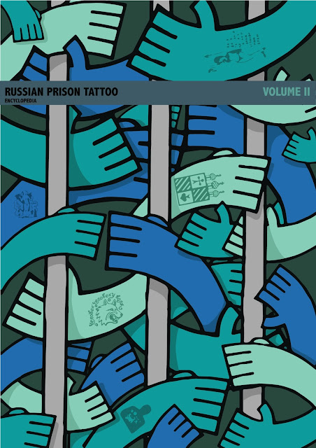
Following on from the decisions I made after the group crit I started to experiment with my chosen ideas. I wanted to see how the image would look after i had added the tattoos to the hands. I live traced some images from the book using Adobe Illustrator and used them in place of the my own designs just to see how the overall image would look. I wanted to add enough to draw the eye and generate interest in the books subject without overloading the image and masking the pattern of the hands.

I like the effect of only adding tattoos to a small number of the hands in the image but think i need to change the way the tattoo images are made. I want the qualities of the tattoos to match the simple bold design of the hands. I have made the tattoos a darker shade of the skin tone so that they have less effect on the structure of the image.

When I looked at the options I could use to add my title and author to the cover i looked at penguin books who often used a block of colour as a base to separate the patterned cover illustrations from the title. I like this design as it makes the text very clear and partially frames the illustration. The downside is that the block of colour covers a significant section of the design itself and with a small book like the one i am working on space is at a premium.

I wanted to create a space for the text on the spine that allowed the illustration to remain the main feature while keeping the text clear and crisp. I like the idea of the block of colour that leaves a gap at the sides as it almost looks like a add on or a label to the pattern, making the pattern appear like a solid object. I might change the angle of the 'volume II' text, I don't think there is any need to over-complicate the design and that the change in colour is enough to make the image interesting. I may also change the placement of the block of text altogether. If I decide to use the thin strip of colour design I would like this block to be at the bottom of the spine so that the 2 colour blocks don't overlap.
For this design I have shrunk the title box down into a thin line that I would like to continue around the entire cover. I think this will make the entire design look solid and add a feeling of quality crafting to it. The thin line provides a space just big enough to incorporate the text separated from the main pattern of the cover but allows almost the entire pattern to show. I think this way of incorporating the text is the best balance of clarity and maintaining the integrity of the illustration. The bigger boarder covers too much of the pattern and no backdrop at all makes the text too hard to read. I think the thin line creates a small amount of structure that contrasts well with the overlapping pattern of hands.

For the Dewey Decimal I decided to make change to the colour scheme and add pink. I wanted to make the number stand out and overlaying similar colours too much could have ruined the clarity of the image. I wanted to chose a colour that would work with the colours already on the image but would stand out and i think this soft pastelly pink does the job. I thought is would be a good idea to make the Dewey Decimal label stand out as it is a very important label that will be a lot of peoples first view of the book even before the title.
I didn't leave myself enough time to develop the other idea that I had selected to work on. I would have liked to have seen how the idea would have evolved into a final out come however I think i made the right decision in focusing my time on producing one book cover to the highest quality possible. I was interested in the idea of making an image similar to a repeating pattern that took up the entire cover and it is something i have never attempted before.
I didn't leave myself enough time to develop the other idea that I had selected to work on. I would have liked to have seen how the idea would have evolved into a final out come however I think i made the right decision in focusing my time on producing one book cover to the highest quality possible. I was interested in the idea of making an image similar to a repeating pattern that took up the entire cover and it is something i have never attempted before.
No comments:
Post a Comment