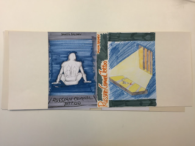
I have really struggled with this brief! I liked the ideas I came up with a first but after working on them all week I am not happy with any of them. I think there are positive aspects in all of them but overall they do not work as well as I like. The problem is finding a concept that finding a simple clear image that is interesting and draws the eye while successfully communicating the subject of the book.
here are my designs.......
Fist idea
pros
- clearly communicates subject
- leaves room for text
- tone of voice correct for subject matter
cons
- simple/obvious concept
- image doesn't make the best use of the space
- boring/unengaging
This idea could be a lot better with more work on the character design.I think the design of the hands and the figure on the back need to be a lot more interesting to liven up the idea while maintaining the clarity of communication.
Second idea
pros
- colourful, interesting design
- good use of space/negative space
- easily recognisable motifs (back)
- title integrated with design
cons
- idea requires some understanding of the process of tattooing (front)
- does not communicate criminal element of the book
- would need work to make the tone of voice right
- frongt image would probably need to be a photograph for the concept to work
I think i could use the back cover of this idea but would need to change the blood and ink soaked rag on the front. The image is not very clear and how relevant it is to prison tattoos is debatable.
Third idea
pros
- Front image fits well in the space
- character provides a good basis for the book title and authors name
cons
- front and back covers don't work well together
- simple idea
- doesn't represent all aspects of the book
- back cover concept too hard to understand
I think this idea could be improved by scrapping the back cover and using an image of the other character's (front cover) back covered in tattoos. I would also add handcuffs to the character to represent the criminal aspect of the book.
Fourth idea
pros
- interesting design
- good use of colour
- design integrates title better than other designs
- wrap around design
- not all elements covered (criminal)
- back cover could be better related to the front
- design could look cluttered
Fifth idea
pros
- good use of colour to create the right mood
- covers all aspects of the book
- dark background colour highlights key elements
cons
- composition could be improved
- back cover key elements need to be enlarged to be clear
- character to be changed to show mood of the piece
- more colour experiments to fine tune and search for the bets media to use
This idea coul work really well if the character and colour can be made more sombre to communicate a feeling of being locked in prison. I need to experiment more with colour media to try and find the best process to complete this cover. I need to change to composition on the back cover to clearly show the items on the table.


No comments:
Post a Comment