After looking through our photos from our walk round Leeds we to make a book of the sword fight we had in the toy shop. We had a tough decision between that and an idea of sounds echoing in the dark arches. the dark arches idea was really subtle and stylized with the sounds illustrated using shapes in the darkness. The reason we chose the toy shop idea was that as we would be illustrating separate pages in our own individual styles the more easily understandable narrative would leave less chance of the viewer being confused. The dark arches idea was very subtle and would have needed every element of the illustration to mesh together throughout the images to work. The narrative of the toy shop idea is that 2 adults walk into a toy shop and turn into children as they start to enjoy themselves and play with the toys, the back cover shows one of the adults still holding the toys and looking sad because they have to return to being an adult.
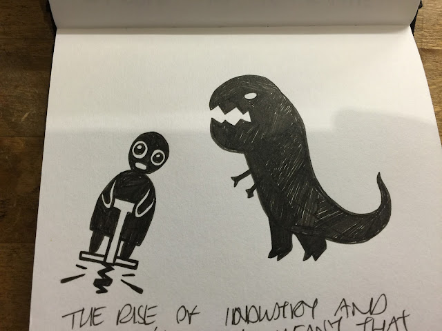
These are my first concept sketches for the book, I wanted to use block shapes to make up the images as they would be screen printed and I didn't know how much detail i would be able to use. I have worked with screen printing before but always with digital images printed on to acetate. I thought that the use of block colour would also help to simplify the colour scheme as we were only able to use two colours. As a group we looked at each others rough sketches and decided which elements to keep the same throughout the book to add continuity. We kept the characters clothing and the dinosaur in each page.
As a group we took turns to add trace our designs onto the acetate using various media, I tried to use posca paint parkers but the light was still showing through even after a few coats so tried the white solvent based paint pens from the college library that worked much better. Annie used a combination of cut paper, chinagraph pencils and maker that created some really nice contrasts in line quality and texture.
I think we made the right choice of story as even with a fairly simple narrative like this one the different styles effect the continuity. I think the colour scheme is bold and clear and the way the narrative is structured is easy to understand. I feel like I should have added more detail to my illustrations to match the rest of the group. It was a fun task and the group worked well together.


No comments:
Post a Comment