Saturday 27 February 2016

Greetings from... Process


Here are some process shots from Illustrator. I have tried to illustrate Aberdeen as parts of a Reebok Ventilator trainer.

I have tried to show the history of the cities industry with fishing in the detail on the sole, ship building illustrated through a ships bow on the toe of the trainer and textiles using the leather laces. I am thinking of adding a hand holding a sowing needle at the end of the lace to illustrate this element more effectively but I'm not sure I want to overcomplicate the composition. I have tried to make the Reebok logo into 2 rivers to represent the two river that Aberdeen is situated between. The detail on the grey sections of the trainer is to represent the architecture and environment of the city. The details of the flowers are represent the Britain in Bloom competition that has been won by Aberdeen on 10 occasions.

I played around with different colours to balance the design of the shoe and to try and make each element clear. I darkened the colour of the river and added another tone to give it more of a feel of water and motion. I also made the back of the shoe grey instead of dark green as the different sections of the back were blending together.


Adding the tread to the sole seams to made the shoe seem like a solid object. tried the design with different coloured backgrounds to see how the colours were affected. I like this composition but feel I need to fine tune to shapes making up the shoe. They need to be as smooth as possible without and mistakes in my work with the pen tool. Something else I would like to try is to move away form the original shape of the shoe and see if I can build a composition that gives the idea of the trainer but is made up of other objects. I would also like to experiment with negative space within the shoe in a more simplified design.


Friday 26 February 2016

Greetings From... Digital Roughs


I decided to create some digital roughs of the compositions I had sketched out. I think colour will be extremely important in this project and wanted to see how my ideas looked in full colour. I have used Illustrator a lot before but always use the brush tool with my Cintiq to control the thickness of the strokes. In the past I have never liked using the pen tool but thought this project was a good opportunity to learn how to use it properly. I used a combination of the pen tool and shape tools to make these illustrations and enjoyed the process. The more I used the pen tool the more it became an intuitive way to make shapes.


I like the trainer and flower form this piece but the piece of granite is too complicated and distracts from the clean shapes of the other items in the composition changing the feel of the illustration. I need to either find a new way to draw the granite or replace it with another object that represents the city. The trainer is the main feature of the piece and I want to find a way to make the most impact possible with this. I could try to make the shoe out of elements of the city. The shop has made a large number of trainers so I could search through to see which I could be utilise. If I can find a shoe that has a few tones of grey mixed with some flashes of bold colour it would work well.


I wanted to try and use some of the ideas we have been talking about in visual language in terms of composition. The idea of the composition is to make the trainer a focal point of the city's skyline. I like this idea as an image but feel similar things have been done before and the concept isn't the best way to showcase the city. After making these roughs I think the best way forward is to produce some more roughs starting with trainers made from elements of the city.

Thursday 25 February 2016

Greetings From... Sketches


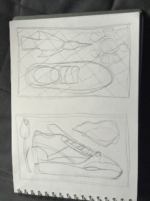
I tired out a couple of different ways of illustrating some of the cities and ideas I have researched. I liked the idea of the shoes from the trainer shop collaborations becoming part of the landscape of the city but will have to be careful not to make the image too cluttered. The other idea I want to explore is laying out elements of the subject I have chosen free from any typical composition. I think this could allow me to concentrate on the character of each individual element, I need to make sure the elements share some common ground to tie them together such as colour, texture or maybe just the style they have been illustrated. I will need to experiment with all of these to see what works.


I want to try and take these ideas further using collage and vectors. I am interested to see what textures I can apply to my digital work. I have tried to use textures quite recently and it did not work out the way I wanted it to.


Greetings from... Sneaker stores


I have collected trainers for years and would like to research the best shops in the world and the cities they are located in. Most of the well known shops have collaboration trainers with major manufacturers that are unique to them. The colourways are sometimes to do with the city or country they are in.


The first shop I am looking at is Kicks HI in Honolulu. The shop produces some great collaborations and clothing. The name Honolulu means sheltered harbour or calm port. The city is famous for a very diverse variety of culture, cuisine and traditions. Kicks HI made some trainers in collaboration with Vans that featured embroidered Mynah Birds all over the shoe. The box was decorated to look like woven lauhala leaves to pay tribute to Hawaii's traditions of handcrafting.


Patta is an Amsterdam based company that has collaborated with many other trainer and clothing manufacturer. Some of Patta's collaborations were released in very limited numbers and are now worth large sums of money. There are some things Amsterdam is very well known for that I would like to avoid because they are too stereotypical. Instead I would like to concentrate on Amsterdam's rich history and culture of art, specifically the graffiti scene that I know quite well.


I am trying to stick to shops and locations that differ greatly from one another. There are places in the world that have a large number of sneaker boutiques in a relatively small area. I have concentrated my search on the best known shops that have contrasting locations.

Atmos is a trainer shop based in in Tokyo, Japan. The shops collaborations often feature camouflage patterns. Another famous Japanese brand Bape also makes use of camo patterns on nearly all its products. There seems the be a culture or fashion trend in Japan for camouflage. Japan is well known for quirky fashion taking inspiration from a huge variety of styles and media. The combination of history, technology and fashion could make for some interesting juxtapositions and combinations.


Hanon is a trainer shop based in Aberdeen and is the leading force in collaborations in the UK. I own a few pairs of their collaborations and that are made to a very high quality and often feature added details. they have released some very colourful trainers that would contrast well with the surroundings of the 'Granit city'. Aberdeen has won the Britain in Bloom competition 10 times, this is another element that would contrast with the grey cityscape.


I really like this idea, the shops represent a hidden jewel in each city and their products are interesting items of design and colour variation. I could include the trainers in my illustrations or apply their colourways to the palette. I need to draw up some roughs to see how the different elements will work together.


Wednesday 24 February 2016

Greetings from... Best Restaurants


I want to look at the cities that are home to the top 4 restaurants in the world. I think this will make for some fun illustrations showcasing the food and culture of the cities and restaurants. I think making up plates of food from vectors will be fun and could work really well.

El Celler de Can Roca is a restaurant in Girona, Spain. The style of food is traditional Catalan with some twists. They have a variety of creative ways of presenting their food including caramelised olives served on a bonsai tree. I could use these styles of presentation to tie the food in with the city or the other cities I have chosen. Girona has a rich Jewish heritage but most of the evidence of this was destroyed when the Jews were expelled from Spain, the city has also been the subject of 25 sieges. I would like to show elements of the city's history and try to find remaining artifacts of its Jewish heritage. The restaurant is currently rated number one in the world.


Osteria Francescana rated as the second best in the world and is located in Modena, Italy. The restaurant combines 2 menu's, one that pays homage to classic Italian ingredients and recipes and another that is much more experimental. I would like to show the contrast between these two styles.
Modena is known as 'The Capital of Engines' due to the fact that the factories for the famous Italian sports car makers are or were located there. The car makers include Ferrari, Lamborghini, Pagani and Maserati. The well known shapes of these luxury cars could make up parts of my illustration or even be used to make the building of the city itself. The city is ancient and has an extremely rich history and in the culinary world is known for its production of balsamic vinegar. There is lots to look at with this city!!


Noma is the third highest rated restaurant in the world and is situated in Copenhagen. The restaurant focusses on reinventing Nordic cuisine which should contrast with the first two restaurants. Copenhagen was originally founded as a fishing village in the 10th century. I would like to link this to the restaurants take on Nordic food.


Central is a restaurant in Lima, Peru. Central is operating in an area that is 'zoned' as residential and has been open for many years illegally. they are appealing a court order for them to close at the moment and continue to open as usual until the appeal is finished. The restaurants food concentrates on Peruvian ingredients and recipes. Lima is home to one of the oldest higher learning facilities in the world and the oldest in the Americas. It was founded during the Spanish colonial regime. Lima was originally founded by Spanish Conquistador Francisco Pizarro but became the capital of the Republic of Peru after the Peruvian War of Independence. The stained glass window in the cathedral that portrays the last supper has guinea pig on the table.


Greetings From... Extreme Cities

First I want to research cities that exist in extreme locations and discover how the local community cope in such the challenges. I have started by researching cities in extreme locations and cities that reflect or make use of the environment they are built in.

The first city I came across is the city of Cuenca in Spain that is known as the walled city and has building carved out of the rock face of the gorge it is situated on. The city displays some amazing architecture and is well known for its 'hanging houses' carved into the rock as well as the remains of the Arab built castle that was partly destroyed by French soldiers in the 19th century. Muslim Arabs captured the city in 714 and built the castle after realising the city's strategic value. The city manufactured textiles and started to become prosperous. It could be interesting to create a juxtaposition between the city textile industry and military importance with a backdrop of amazing architecture.


Next I discovered the city of Harbin that has the most severe winters of all the cities in China. The city is well known for its ice sculpture festival and is known as the 'ice city'. The city started out as a small rural settlement on the Songhua River. The region was mostly populated with immigrants form the Russian empire. In the 1920's the city was seen as the capital of fashion in china as new designs from Paris and Moscow arrived there before they got to Shanghai. The combination ice sculptures and fashion could make for some very interesting imagery. A cool icy backdrop to bold colours of new fashions.


I have been trying to find different elements to look for in each city. I have searched the internet for mountain cities and floating cities and have struggled to find what I was looking for but have come across things I didn't expect along the way. I want to stay away from the usual famous cities that people would look at as holiday destinations.

I then found the city of Fez in Morocco. The city was built on the Jawhar River in 789. Another site was built on the opposite side of the river and they soon became almost completely autonomous spending larhe periods of time in conflict with one another. Until the 19th century it was the only place making fez hats that were also called tarboosh. The original dye for the hats was made from berries that grew outside the city. Fez was a manufacturing location for embroidery and leather goods. Fashion and fabric manufacturing is a huge part of all three cities. Another interesting thing about Fez is that a large area of the city is completely car free. A beautiful part of Fez is the Tannery dye pits that are still used today.


The Indian city of Jodhpur is the next city I have chosen. The city is immediately striking due to the  Mehrangarh Fort that towers over it and large swathes of buildings painted blue. The city is known as the 'Sun City' and the 'Blue City' due to its climate and painted buildings. The city's main industry's are described as handicrafts and the city manufactures textiles and inks among other things.


I want to rough up some ideas based on these cities, their history and industries. I think they all have elements that could help me produce some striking imagery and they should contrast well against each other.


Greetings From...


This is an exciting project for me!

I am familiar with using vectors and like the idea of researching and celebrating four city's from around the world. I straight away came up with a few ideas but need to make sure I research them and keep open minded about each of them as I have become set on one idea too soon in the past.

The ideas I have had seem to fall into two categories, ones that are interesting in themselves and ones that would make for interesting images. I have one in mind that I think fulfils both of these but don't want to commit too soon so have decided that I have to research at least three other options fully before I can look into that idea. I want to make sure I explore all possibilities as thoroughly as possible. I want to see how my views of my ideas change throughout the process.

I made a list of possible concepts-

-Cities built on seven hills
-Biggest slums in the world
-Best restaurants
-Origins of foods
-Trainers associated with cities
-Abandoned cities
-Most powerful cities in the world
-Cities with famous trainer shops
-Cities that celebrate the environment they were built in

Although a couple of these have negative connotations I would like to concentrate of celebrating the cities I choose.


Sunday 21 February 2016

Characters 7


This is my first attempt at my 3d Gif. I decided to include the same bearded character in each of the Gifs and try to use a narrative that links between all three. After trying to make friends with a ladybird and a frog the bearded man has found his sole mate, a seal. They decide to go into space to start a new life. 


I made the set for this Gif out of cut paper and cardboard, this is the set I used for the final piece that has some additions to the first attempt Gif. I made the structure on 3 levels to ass shadow to the animation and some the space between objects. In the first Gif the scene seemed sinister like the seal had locked the bearded man out and was celebrating. In the final Gif I added eyebrows to the seal to try and show surprise  and an 'I Love U' mug. 


I wanted to try something a bit different so decided to recorded a video and turn it into a Gif. My dad looks like the character from the other Gifs so I roped him into doing some amazing acting. I made a chicken mask out of a cardboard box and coloured paper. This was a very simple process compared to the other animations. 


Friday 19 February 2016

Characters 6


I decided to try and include certain elements in all 3 of my Gifs. I wanted their to be a strong link between them and even some semblance of a narrative. I am going to use the same character but place him in a variety of scenarios. 

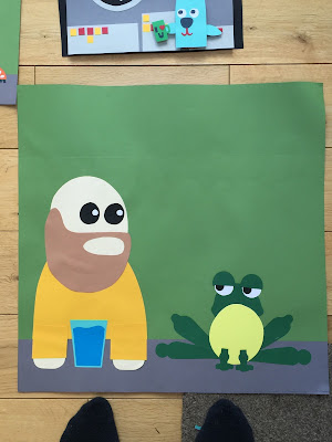
For my second Gif I decided to use the frog character I had drawn and pair it with the man sat at the bar. I wanted to show the mans reaction to the frog changing size until it was nearly as big as him. I worked out certain elements of the frog could remain the same the entire way through the animation but I would need to make multiples of the main part of the body to animate the frogs change of size.
I tried to make the expression of the frog quite grumpy and mean so that when he became much lager he was intimidating.

The man at the bar is made up of quite simple shapes and I didn't want to make any complicated changes to him that could alter his solid appearance. I decided to use his eyebrows to react to the frog and show his surprise.


I made the collage of the main elements of the image but left out the eyebrow and kept the frogs head and body separate so they could be moved or replaced.


This was my first attempt. I tried to use my phone held above the collage and line it up as best I could which results in a shaky animation. I think this is an interesting effect that could be useful in some instances but did not it was distracting in this context. I also felt that the animation needed some thing more. I was already toying with the idea of having the frog drinking the mans drink through a straw as it expanded so decided to set up a structure t hold my phone steady and add this new element.

http://gph.is/1KUcfso

I couldn't find a way to make a structure that would hold my SLR steady at the angle I needed to make the animation to I used a metre ruler, coffee table, kitchen cupboard, 3 boxes and some cellotape to make a structure that would hold my phone in place. My phone also has a useful function to take square photos making editing easier. Having the camera steady makes it easier to see and understand the movements of the characters in the Gif, I think the addition of the straw to make the frog drink the water really helps this animation making a more interesting composition and also expanding the story of the two characters.

Characters 5


This is the link to the first Gif that I have made. I scanned in the collage of the man sat at the bar and altered it in Adobe Illustrator to make each individual frame. I have gone a fair way over the recommended 25 frames to a total of 78 but I needed to to make the animation work fairly smoothly. 
I would like to make this Gif again using cut paper and no digital illustration as it takes away lots of the qualities of the original work.

This is my only Gif that isn't a square. I tried to think of ways to make the scene work to the set dimensions but adding to the top or bottom or even both would have had a negative effect on the composition. There would either be too much blank space around the characters or I could add some extra elements which would take emphasis away from the characters and movements.

I am really happy with the composition and how loneliness is portrayed in this piece, I also like the feeling of crafting I achieved by building the characters up from cut paper however I think a lot of that has become lost when I moved it into a vector format. I think the character manages to communicate the emotion of the scenario however I would like work more on animating the mouth. The movements and change of shape are too stuttered and do not seem to match the way that the image is put together. Everything else in the Gif is made up of very simple movements and I think the changes to the mouth should be more subtle to create a cohesive animation that tells the story to full effect.


characters 4


For the idea of loneliness I came up with the idea of a man sat at a bar by himself  whose only friend is a ladybird walking along the bar. 


I started to draw the character in different scenarios and they became more positive and changed to an idea of friendship rather than loneliness. 


I like the bold colours of the ladybird and the block shapes of the beard and bald head but think the eyes could be simplified to just black dots, The colours don't contrst enough and and seem to take away from the facila expression rather than add to it. I am really enjoying working with cut paper and think it could be very useful for making a Gif with some fixed elements and other that can be moved or replaced to shoe movement.


I made a larger collage to show the original scene. I like the difference in scale between the characters and the posture of the character hunched over the bar. I thought I could add a peanut on the bar that the man was using to get the ladybird to be his friend. 

I want to use this as my first Gif and then see how I can incorporate the characters or concepts to the others.

character 3


I started to draw some bear characters that I wanted to use for the for the idea of lethargy as they sleep all winter but the character quite quickly turned into a seal. 


I like the blank expression on the seals face and the simplicity of the character so decided to see what he looked like in some scenarios so I chose the spaceship idea from the original words I started with.


The space ship opens up some interesting possibilities for making the Gif that could be very simple or quite complex. In the scene on the left I could show the stars flying past the spaceship and change the facial expressions of the character excitement turning to fear. in the second one I could show the movement of the spaceship using the placement of the earth in the window.

I looked at Rebecca Mock's work. She creates complex images with movement kept to a minimum in most cases. These subtle movements are considered and add atmosphere or extra meaning to her work. This is a very interesting way to create complex images as it draws you into the scene. I like detailed digital work and adding these movements opens up a new dimension of possibilities. It reminds me of some scenes from Studio Ghibli films where there will be a huge intricate painted scene with one small element moving, like a flag blowing in the wind. This combined with carefully considered composition help me create a powerful atmosphere in a piece of work.

Character 2


I was looking at ways to use the idea of showing off or being overconfident and started to look at animals that seem to be showing off. I looked at the birds of paradise that that dance and put on shows, one of them manages to look like a character from Studio Ghibli.
I looked ta tree frogs that expand their throat massively and though it would make an interesting visual and open up possibilities for concepts, the change of scale could also be good to explore.


I was thinking I could add a facial expression painted onto the frogs throat to change its character to something completely different to work with its change in appearance. The frog could change from small and cute to huge and scary in a second.


The next animal I wanted to try and illustrate was a peacock as it fits perfectly into the idea of being a show off, I sketching the bird looking plain with its tail hidden and the in its full glory displaying its tail. I though it might be fun to make a peacock even more of a show off by portraying it taking part in other activities like riding a unicycle on one leg. I used cut paper to experiment with the ways I could illustrate a peacock as colour is a very important part of this character and the cut paper allows me to make a crisp image that had a very nice crafted fell and texture to it.

Charatcer 1

For the first task I chose the Feelings

Lethargic
Dispondant
Overconfident
Lonely
Impressed/ Unimpressed

Actions

Gulp
Sigh
Handshake
Facepalm
Drink

Objects

Spaceship
Computer
Glass/cup
Bomb
Bike


I enjoyed coming up with ideas using and combining these words that would fit into the format of a Gif. The format is limited to a short animation and means you have to create a concise image that communicates your ideas making the most of movement and expression. I tried to draw in a variety of different ways and got some good ideas from drawing quite freely and quickly without removing the pencil from the paper.

 My first idea was to create a highly detailed image of a character looking at a computer screen with the reflection of the screen visible in the characters glasses. Before receiving the brief I already had the idea in my head that I wanted to make a very detailed piece. I decided that this would not be the best use of the Gif format and would not push me out of my comfort zone. I have in previous projects too attached to ideas too early and not fully explored all possibilities before deciding on a final outcome. In this project I want to explore new media and make sure I take time to properly explore a range of concepts.


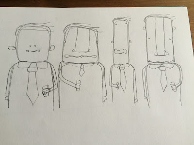
I like these drunk characters, I think the loose and wavy lines add to the characters and help to convey their level of inebriation. I wanted to see if there were other ways to add a rough loose quality to the characters so tried to recreate one of the using torn paper.

I don't think this works as well as the drawings. I think the loose lines and rounded shapes they are made of in the drawings are a better method to show their drunken character.

I looked at the work of Philippa Rice. She manages to instil character into her Gifs using simplified cut paper characters. I like her use of bold colours and careful consideration of movement that brings the characters to life. I need to experiment with animation as I cannot judge how my characters will work fully just based on static images. This is a new technique for me. I am used to trying to show movement using line and composition.