Thursday, 30 March 2017

Book Ideas

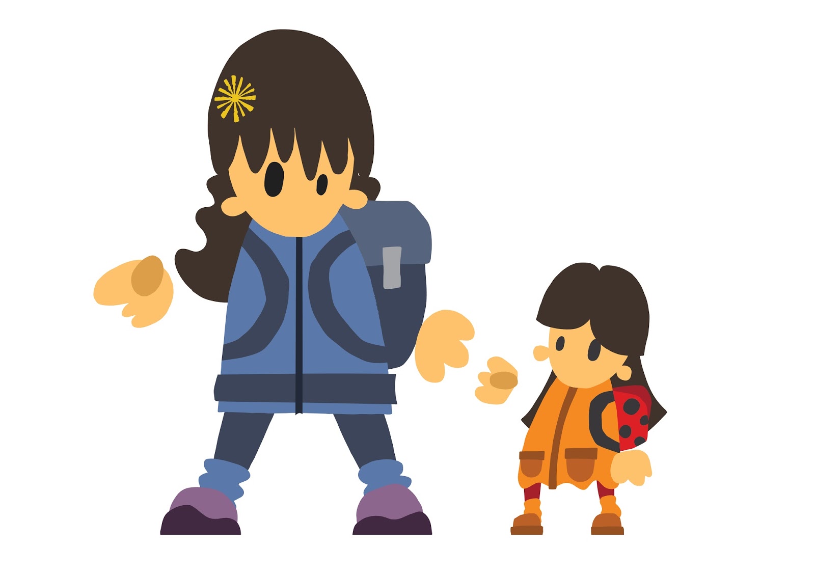
So far I have been designing double page spreads so that the pages are landscape but it might make more sense to use a portrait layout if I am going to use mostly double page spreads or the layouts will be stretched out especially for the pages that concentrate on characters. I could use the compositions I have already made but each one could form a double page spread by itself with some minor adjustments to the placement of the characters and key objects in the composition.


I am going to move on to some of the pages later in the book to test out some of the compositions that are close ups of the dog character. I also want to see how I can illustrate the other landscapes in the story using the same aesthetic as these first few pages. I also need to explore how I am going to add the thought/speech bubbles to the compositions. They need to be bold and easy to read while fitting in with the aesthetic and composition of the page.


Wednesday, 29 March 2017

Second page

I have started the second page of the book, I used the same shapes that I used to make the characters on the first page to see if  I could find a way to show the interaction between mother and daughter where the daughter says the dog is a polar bear. I am really happy with the results. In this page the characters are at the forefront of the image. and scaled up compared to the first. This made me think that maybe the characters should be larger in the on the first page but I think it works to set the scene of them being in the park and creates interest in the characters before they become the blatant, bold centre piece of the composition, also the rest of the book is going to be focussed on the dog and the majority of the compositions I have designed are fairly close up so the landscape composition will add some variation. I want to make sure there is variety in the compositions throughout the book and that they would work as a one of print as well as part of a narrative. I want each page to captivate the viewer and become an immersive environment. The children's book illustrators that I think are most effective manage to do this consistently through a variety of widely varying compositions so that each page grabs your attention and draws you into the scene.

I kept the original landscape in the background of the image to show how they have moved closer to the dog. I lowered the opacity slightly to give the image more depth. I could maybe add some more shrubbery to the foreground but it might make the composition too busy. I am going to work on the other half of this double page spread next, I need to make the dog look confused as to why he is being called a polar bear haha.

Collaborative slides

I have concentrated on the work I did for the collaborative brief as it says to do so in the submission briefing slides. I have aimed to cover what I did, why I did it, how I did it and how it will be used in the final outcomes. I wanted to include the gif I made that shows how my illustrations will be used to show there is available live content on the app as it was not included in our submission to D&AD but it will not work in the form of a PDF so I have included three images that demonstrate the animation.
On the first slide I included the simplified description of the brief and a paragraph explaining how me and the rest of the team approached it. On the second slide I included a images that show the range of our research into the festivals, BBC coverage and apps as well as a paragraph explaining our research and what we aimed to create. I made a range of characters for the app logos, most of which did not make it to the final designs so I made a board based on character development to try and illustrate the process I went through and explain why I made the choices I did. The development slide includes a large range of logos experimenting with fonts, hand drawn type and composition. The finals slide shows a mock up up image of how the illustrations look in the finished app layout.


Characters

I was not happy with the characters I made for the second page of the book. I don't think the was enough detail in the characters clothing or hands. I like the legs of the character with the crimpled walking socks and the stance. The stance look well grounded, linking the character with the landscape which could easily not be the case with a full white landscape. the character is wearing walking gear, walking socks and shoes so decided she should be wearing a nice coat to go with them. I wanted to add more detail to give more shape to the character, something more interesting than the standard body shape that I have used before. I added a mouth to the character but it didn't suite the aesthetic and if anything made the characters face less expressive and confusing. I added a flower in the mum characters hair the same as the flowers around them to add more character (that she had picked the flower earlier). The mums stance and posture is confident striding forward on their walk in the park. I moved onto the character of the little girl who I wanted to appear more apprehensive and unsure of her surroundings. I tried to do this by having her posture more leant back resting on her heels and reaching for her mums hand to lead the way. I am thinking of possible adding some line work to the shape with the Photoshop brushed I have been experimenting with to see if I can add more expression to the characters with overcomplicating them.


The bottom image will make up a double page spread so I need to make sure the characters are not too close to the centre fold. If I position them wrong the focal point of the page could become the trees of the background. I'm not sure whether it will be confusing that the dog and the characters have never met before. I will start work on the next page and see how I could work around that problem. It will be made clear on the next page but I would rather remove the confusing aspects all together.

Tuesday, 28 March 2017

Presentation Boards- Project Report

I think I now know how to go about making my presentation boards and project report and the difference between the two. The presentation boards are a more in depth look at each individual brief and the project report is a broader overview of all of them. I have started on some of the individual presentation boards trying to decide how much text to put on each one is tricky but I have been looking at the examples from the slide shows to give me some help. I want to include enough text to make sense of the images and explain the thinking behind them without writing full paragraphs of text. I have been trying to pick out work that demonstrates the development of ideas as clearly as possible and what I see as important parts of the creative process. I have tried to keep a constant layout throughout all of my boards, changing the colour scheme to differentiate between briefs.


These are the research boards for 2 of the briefs, I think there may be too much text on the second one. I could possible break the text up and change the layout to change the focus more onto the images. On the top image I may change the design and remove my name and the details of the brief from the board and include them on another board that explains the brief and my analysis of it.

second page

I have been working on the second page for the book to make my first double page spread. I played around with the positioning of the character and scenery on the page to alter the scale and perspective of the composition but decided that if I made the composition too complex it became confusing and had a negative impact on the narrative. So far I have only added the 'mum' character to the page and still need to add the child, I think the character needs some changes. The colours don't really work the skin tone doesn't stand out against the white background, I think I might try some brighter colours rather than sticking to realistic skin tones, I could use these to show the emotion of the character or just stick with the same colour to build up the characters identity. I need to add more expression and emotion to the face of the character, this is something I find a lot when taking sketched characters into shape based illustrations. they lose something on the process and I need to find a way to address the problem without overcomplicating. I want to make the characters hair darker to match with the darker sections of the scenery, I think this will give the character a stronger presence on the page. The scenery is a mix of the same tree illustrations from the first page and a lot of new small pieces of plant life. I have found of way of image making that I am enjoying at the moment and need to make sure I keep refining my images and compositions instead of getting carried away and trying to complete page after page.


Monday, 27 March 2017

Preparing Work For Presentation

I unfortunately missed the submission briefing and the briefing for studio brief 3 last week because I was ( and still am ill). I looked through he slideshow for both last week and have been starting to prepare my project report. The examples of reports from previous years was really helpful, it can be a bit difficult to sum up everything from the briefing at first. I have started by gathering all my finished pieces and some development work. I have downloaded some mock ups from Graphic Burger to demonstrate how my illustrations will look when they are applied as various products. I think showing the designs incorporated with the product they are designed for is especially important for the phone app and the book cover I made as they are designed for a specific purpose. The app illustrations are designed very specifically to work at the dimensions of a phone screen so it was good to be able to illustrate this on the boards.


I will need to try and balance the number of images and text on each slide, I don't want them to been too confusing or cluttered. I will also need to make sure I choose development work that demonstrates the how and why I ended up with the finished pieces I made. I have started to mock up my slides with images for final pieces and some alternate variations. I need to start working my way through my development work and get some good quality clear photographs.