
For this project I started with an ink drawing of a plant and used Adobe Photoshop to make adjustments and additions to alter its tones, texture, colour and composition. I started by scanning in the image and resizing it to A3. I changed to levels so that the paper texture dissapeared and became a flat white colour, this method also enabled me to make my ink outline into a solid black colour.
I used to wuick selection tool to select individual sections of the piece and the brush tool to add more tones and fades to the above image.

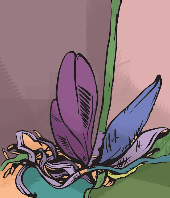
I wanted to get rid of the tones in my drawing so i used the selection tool to separate the solid black outline then deleted everything else leaving me with just the outline itself. I added a layer and selected to multiply option so that i could colour the drawing without affecting the linework.
I used 3 different fill colours to add some variation to the piece while still kepping the block colours very simple and bold.

I wanted to add more detail and colours to the piece so used the quick selection tool combined with the brush tool to enable me to add different tonal valuers without the problem of the colours getting into unwanted areas. I added darker and lighter shades to the leaves and stems. I find that you can then use the colours of the surrounding area to 'cut back' into the shapes you have created to add more detail, especially sharp points.
I saved all these images at 300dpi so that they would be the correct resolution for print. If I then decide to use them on a digital platform i can drop the dpi if needed at a later time.

I wanted to create an image with a more abstract colours that could possibly be made into a repeating pattern for fabric or wallpaer etc. I added to the linework using the brush tool to create solid shapes to separate the colours.
We created out own brushes usimg the images we had been manipulating. I chose a small section of leaf which had some interesting textures and sharp edges. I'm not sure it works as a shading texture for this piece but i think it would work with a more complex composition with overlaying tones of varying opacity.

I decided to swicth to another image to try and try out some other option that photoshop opens up. I chose this image of a yeti that has already been processed in Adobe Illustrator to make it a vectored solid black and white image.

I experimented a lot with this image to test out different elements of photoshop, I used layer and the eraser tool to combine the yeti image with a textured photograph and overlayed another brush stroke that i made from Gary Buseys face.

I combined the two images taking elements of both. I need a way to add flowers to the top of the plants stems so used the eraser tool to isolate the yeti's head and resized and altered the angle to make them fit the stems. I think the best section of this is the overlayed roots of the plants that have been scaled differently.
No comments:
Post a Comment