What are some of your considerations when working on these design commissions?
"I occasionally have to reign in the amount of colours I use. Sometimes if i'm working with similar colours the design team and I end up stripping away some and see whether the design can work with a more limited palette. This is obviously cheaper and more convenient to print.
But if the design is a particularly large scale pattern then production restrictions naturally allow less colours to be used. At Marimekko though we think more about the possibilities than the restrictions so as designers we are encouraged to create our original visions rather than be too swamped down by technical issues. The artwork studio has a fantastic team and can usually make anything happen or then certainly come up with very good alternative solutions to any problems!
We are also very guided by the emotion of colours for each collection and how they correlate with the time of year. So Christmas time we usually have reds and other warm colours within the collection as a traditional nod to that time of year but we always challenge ourselves to bring twists and experiment with colours to create new and exciting outcomes. Colour is a key part of how successful a collection is.
One other consideration when designing a collection is to vary the scales of the patterns. Marimekko produce lots of small textile homeware products made directly from the fabric (oven gloves, aprons, pot stands etc) so generally a smaller scale pattern would form part of the collection to cater for these smaller items. A large print used on an oven mitten for instance might look really boring as you don't get to see much of the pattern. This would affect the popularity of the item.
So when designing it's always a good idea to visualise what patterns will work best for each product category.
Ultimately our aim is to create beautiful products that have a longevity to them."
Sanna Annukka talks about the application of her designs and the restriction that can be imposed when working on certain briefs. It sounds like she is given quite a lot of freedom in her work in terms of colour but still has to take into account a number of things when designing for specific products. Because she works on products that often have seasonal themes her work has to fit the theme and colour scheme of the that specific season. I need to apply the same thinking to my book, instead of seasons I need to look at colour schemes that suit the narrative and tone of the story I am illustrating. Sanna's work is often used on homewares of various sizes and needs to find the scale and layout of the items effectively, these is not point making a large intricate design if the details are lost when scaled down or only a small section of the illustration is used on the product. I need to take into account the dimensions of the book and what the illustration is being used for, what is it trying to say.
"It’s been said that your children's books tend to be edgier than most; you avoid wrapping things up neatly with a bow. What’s your response to that impression of your work?
I never want to promote edgy things just for the sake of it. I think there's as much danger in that as going the other way and being too sweet or just too convenient. When the premise suggests that this can end more ambiguously, and if there's more to be gained there, it should be allowed to do that. I think kids are fine with that. They can’t necessarily tell you that they want sweeter things or edgier things. They just want a good story to be told as well as it can be told. They want to be entertained in a very uncomplicated way.
You could traumatize an audience with the wrong decisions. But I don't think that's inherent in scary stories. I loved being scared as a little kid -- through books particularly though. And I think that’s an important difference. With movies and television, it was too traumatic for me. I find it overwhelming when things are gratuitously violent. But with books, you can take it as it comes, trust that you can turn the page when you're ready. Children's books -- they’re supposed to be simple, and they are. A great challenge is to build the suspense with simple elements. You can condense everything about a scary story and bring it down to the language of the kid. They know that this is something for them and that they've not wandered into someplace that they're not ready for. It's amazing and it's so much fun.
You can deliver bad messages in a very sweet book, too. There's plenty of misguided stuff that sounds just as sweet as can be. These things come in many forms."
"Both of us here at Art of the Picture Book have been dog owners, and we feel that you really nail it with the eyes on your animal characters – especially in the way that their eyes move, while their expression remains the same. What's behind that subtle approach to character?
I grew up with dogs. We have a cat now. You get used to animals showing how they feel. You can't help but look for human emotions in them. They don't have a lot of ways of showing those things, so you get attuned to smaller movements. But it's also fun as an illustrator to draw the same thing five times and then, when you change it just once, it becomes meaningful. It doesn't have to look very complicated. It's a symbol of how they're feeling.
You can't draw a frustrated dog. When the situation is frustrating, he should be frustrated. You can give just the slightest indication, like if he was frustrated, he’d be looking at us by now.
In Sam & Dave Dig a Hole, the dog has been looking down at the diamonds the boys have been missing in the dirt throughout the entire book. And then at one point they miss the largest diamond in the book—it’s almost two pages across. The dog has just had it, he’s so frustrated that they keep missing these things, that he doesn't even bother to look at the diamond anymore. He’s looking at us for the first time, like in a comedy show, where they break to look at the camera, as if to say, “Can you believe this?”
It's as if you are making a film with really bad actors. They can't stop looking at the camera or they can't help but comment on the story outside of their place in it. With this book, that was the moment to do it. In picture books, the images are so spare that there are usually some opportunities to do that.
I don't have any trouble with the idea of making up a character. But it seems so pompous to say, "I've made up this guy and I know everything about him.” You can't know a person like that. We’ve got these two cute kids and there's the dog. But they also have outside lives that we don't know or understand. We get them to say our very simple lines and make them do their actions. I can think of characters like that. Their actions are very stiff. There's one point when the boys begin to split up and Dave puts his hand on Sam’s shoulder. It's a theatrical stagey action. It's not a private moment, because we can see them making this pose, but it also is an emotional moment. Like in a play, you
Although your landscapes are often quite spartan and they make no attempt to be realistic, they do stand in for exactly what you need for your story.
Right, they’re just symbols. They can get more complicated the better you get as an illustrator, depending on what the story needs them to be. The audience is always looking for symbols. You can have a beautiful illustration, but if it doesn't have the symbols that simply communicate what you need to communicate, then they’ll get lost. It’s the same with film. You can have a beautiful sequence of shots, but if it's not organized clearly, you get lost and the story’s gone. You've lost your audience, no matter how well you've done visually. It always has to have the idea behind it first.
You've said that illustration for you is a little scary because, unlike with animation, your drawing is not one of thousands. Each one stands on its own. The reader can hold onto the page for as long as they like. You no longer have that sense that it's going to be gone in a second. Every line and every bit matters.
Yes, at first it is really scary, because you're used to the safety of these drawings going by relatively quickly. Once you watch a film you've worked on, you realize how quickly this work goes by and it loosens you up. It’s just a different language. It's all moving instead of holding still.
With books, at first you think, “How am I supposed to live up to the idea that this is just sitting there on the page?” It's the only image that the readers will get to represent this particular moment. But then you get used to paper and leaving something behind on the page.
With animation, you fill up the frame all the time because you want it to be immersive. There's the implication of a much broader world off the frame all the time.
But with books, it's the opposite. You want it to feel like you thought of this picture specifically for this page. They are not just getting the book version of this story. This is the only story and this is the only way you're ever going to hear it. This is the only way it makes any sense, in this particular form. You choose your trim size for that, you choose your pages for that, and you know them going in. You don't plan an illustration that wouldn't work with that. You know you have complete control over it inside those parameters. can find yourself lost in the emotions. But at the same time, the actors are shouting the whole time. You can hear them from way in the back. And they're always facing the audience, favoring the theater’s audience. So it looks fake and you know it's fake, but you are still lost in what's going on. And I love that. When you can be artificial with the audience and you've done everything you can to convince them of that, but they can't help but get into your story. They get past all of that."
Jon Klassen talks about the way he builds compositions using symbols that help to tell the story and speak to the reader. You can make a very nice intricate illustration but if it is not geared towards communicating the narrative or if it is badly thought out then the message will become lost and ultimately it will not work for the purpose it was designed for. He talks about characters expressing emotions in his work especially dogs, which is very helpful given the main character for my book is a dog. He talks about not being able to express the same emotions as human characters, instead he makes the character look at the reader like a comedy actor as if to say 'can you believe this?'. I like this as a method of communication, creating a connection between character and the audience. I really like jon klassen's work, he seems to have a similar skill to Chris Haughton in being able to make a character stand out and catch the eye even when they make up a very small section of the composition. He seems to have found a good balance between creating intriguing compositions and tailoring pages to best communicate the narrative of the book.
I feel like I am stuck between the aesthetic of the book and making it communicate the narrative, I think I had some ideas for the aesthetic and compositions before I started and that has influenced how I have worked on this project so far. I think I may need to change my way of thinking and concentrate more on the narrative and keep open minded about how I put the pages together. This should hopefully free up my work and allow me to tailor my illustrations to the tone, emotion and narrative of the book. I don't have much time to produce my 6 pages so will need to make decisions quickly.
As I have been struggling with colour I decided to try and find interviews with illustrators talking about their use of colour. I found an interview with Chris Haughton that I have not seen before where he talks about his unusual use of colour.
"I don’t use the real colours of the animals and I just use colours in a way that best tells the story. For example the owl is the only thing black against the bright colours of the forest which helps define his body shape graphically. George fills so much of the book that he couldn’t be black. I wanted it to be a colourful book and for his shape to be easily recognised so I had him in one block colour which contrasted with the orange background and text. The whites of the eyes (which are the most important thing in every picture) are the only things that are ever white in any of the illustrations."
This quote was particularly useful as he doesn't use real colours. I like the way he tailors his colour ways to make serve the narrative and composition of the book. This frees up his use of colour to serve his needs rather than feeling he has a abide by colour schemes from the real world. he views the whites of the eyes as the most important thing in every picture. In my compositions the dog is purely white and stands out against the colour background to I have used black to make the eyes stand out. I want to try and use his ideas of colour to find new ways to work with compositions. Hopefully this new perspective will help me communicate my ideas more effectively.
I need to chose the rest of the pages I am going to illustrate for this project. I should treat the project as if I will be pitching the book to a publisher and chose a selection of pages that sum up the narrative of the book as clearly as I can. I would also like to chose pages that showcase a range of different compositions and characters.
Page choice ideas
1- The dog being called a polar bear by the little girl.
2- The dog saying he is not a polar bear.
3- The dog starting to question his identity.
4- The dog deciding to find more polar bears.
5- The dog finding out he is definitely not a polar bear.
I felt that the characters I had made for this book were too flat and lacked a feel of crafting. I want the characters to be able to successfully communicate emotion in every page of the book and also be appealing and interesting visually. I have been experimenting with brushes in both Photoshop and Illustrator to try and add another dimension to my illustrations, more depth and a more hand crafted feel. The book is aimed at teaching kids about identity and a feeling of belonging so I need to make sure my illustrations are based around communicating the message in a fun and interesting way. I have been thinking about using the colours on each page to reflect the tone of the scene but the problem is some of the pages are not that clear and feature a range of emotions from different characters and could lead to confusion.
I much prefer these characters now that I have added some texture and shading to them, it seems to have animated them, made them more emotive. I am still having trouble deciding on a skin tone that contrasts with the pink background. The little girl character is supposed to seem slightly apprehensive in this image as she walks through the park with her mother but the blue might make her look sad. I could possible use different colour backgrounds for each page in a double page spread, I will have to try out this idea to see if it breaks up the composition too much. I need to get working on the rest of my pages.
I have been experimenting with colour and compositions adding layers to the landscapes on the pages to try and create more depth. I have found that simplifying the colours of the background helps to make the characters stand out while managing to maintain the depth and detail of the scenery. One thing I am struggling with is the colour of the people in the illustration, I have been trying to find colours that compliment the rest of the illustration but any colours I would normally use as a skin tone are too close to the background colour and make the characters blend in too much. The only colours I can think would contrast enough are blue and green but those colours communicate illness and sadness and could add meaning to the characters that I don't want. Adding layers to the backdrop went against my original ideas of compositions almost floating in on a blank page, although I will be using a colour background I was thinking of using coloured paper and not having full bleed illustrations. because of this I wanted to find a way to make the scenery seem grounded on the page without a full complicated backdrop. Adding the rocks to the composition suggested the ground and the space the characters inhabit so I have added shadows to the scenery to give them more of a feeling of form.
The top image is my original design and the bottom one is where I am up to now, I think the bottom one works much more effectively as an immersive landscape and makes the dog the focal point of the composition. The use of pink makes the image possible makes the image seem otherworldly which could possibly be a bit confusing but the other colours I tried did not create the same appealing, soft aesthetic. I am going to continue the same aesthetic into more pages of the book and keep trying out different colours for the people in the book. I have been working on the scene where the dog is looking in the mirror thinking "I have teeth like a polar bear". The composition at the moment is too simplistic and needs some work. I am going to add more details and see how I could create a more interesting composition. The challenge has been to create an interesting immersive landscape that doesn't overpower the dog character as he is based on simple shapes and one colour. I have been looking at some illustrators that use textured line work combined with shape based illustrations to create some really nice effects, this is something else I am going to experiment with.
Amanda Hall's website had an FAQ section that tackles many of the processes and issues involved in illustrating a book including the common practices of publishers in relation to how they find and interact with illustrators. this site was really useful, it explains the best ways to approach publishers with your and work and what to expect in terms of responses. She says that publishers will often keep your work on file if they like it so they can contact you at a later date if they have a project that would suit your practice but they may not reply to you to let you know so it is important not to become disheartened.
"Q - How do you actually work?
A - I usually get a grid and a written brief and sometimes a visual brief from the designer too. I start work on a series of rough ideas in pencil, trying to get as much energy and animation into the image as possible, while thinking about the requirements of the brief. The roughs evolve into a final design, which these days I scan and e-mail to the client. Illustrators vary in how sketchy they are with their roughs, but I like to get all the lines resolved clearly. There’s usually then a bit of a wait before getting comments back: it can take a long time, particularly with educational publishers, as they often have to send the rough/s round to a lot of people for approval. The client might then want small details changed at this rough stage, or a more complete redraw, but this is relatively painless as a pencil rough is quicker to amend then final artwork. When I get a rough approved I then go to the artwork stage. If I’m working on board I usually reverse the rough on a light box and trace the lines, transferring the image onto the surface I’ve decided to work on. For more on the way I work see Illustration Assignments and Materials & Media.
Q - How do the pictures get into the book?
A - Once I have painted and drawn the illustration/s I send them to the publisher, either by sending the original artwork, or by scanning the original myself and sending it to them as a digital file. I usually do the latter now for clients in the US, as it saves everyone time and money. Once the publisher has my original artwork, the illustrations are placed into position by their designer. When the whole book has been designed in this way, it is sent off to a printer – often in the Far East these days. The book will then be printed and bound in the quantities the publisher thinks they can sell. The finished copies are distributed to shops and retailers, who sell them to their customers. Books are frequently published in different languages, and these are called co-editions. This is a license that another foreign publisher buys from the original publisher so that they are entitled to publish the book as well, but in their language. These deals are very often done at book fairs like the Bologna Children’s Book Fair in the spring and the Frankfurt Book Fair in the autumn."
These two questions were particularly useful as they go into detail about the interaction between illustrator and publisher during the design process. The first answer highlights how you have to open to changes during the process, receiving feedback after roughing and making the adjustments needed. It is also important to create roughs that clearly communicate your compositions to the publisher and author. She also mentions being given an grid, written brief and sometimes a visual brief at the beginning of the process. We are set briefs for our projects but none of them as rigid as these briefs are likely to be. researching these processes shows me how important the tutorials and crit's are and how important it is to be able to respond to them and be open minded and willing to making changes throughout the design process.
I started working on another one of the pages from my book. I have been trying to find ways to use a white background and silhouette the dog against the objects that make up the scene. I have found that some of my compositions that work well in the roughs are much harder to put together using shapes and a white background. On this page the two most important aspects are capturing the emotion of the dog and finding a way to add text that will work within the composition without breaking up the image. I have been thinking about simplifying the colours of the book, or even switching to a solid colour background the silhouette the dog character and make him stand out more from the rest of the image. I still think I can use the white background to create some interesting shapes and compositions on each page but need to experiment more with composition and definitely with colour. I have been concentrating on other modules that needed to be finished and left this project alone for a while which has made it hard to get back to my thought process for the pages I have already created but has also allowed me to take a step back and approach my work with a new perspective. I have some experiments I would like to try and I want to research some more children's picture books to inspire me to get back into this project.
I found an interview with the Editor of Maverick Arts publishing where she talks through 10 tips to sue when creating a children's book.
1- The title is king, every book needs a good title and it is the first thing a editor sees.
2- Guidelines, it is important to follow any guidelines set by the publisher, if they have set them then there is a reason that they have. One main guideline is the word count.
3- Make the manuscript as easy to read as possible, don't use different colour or fonts. The manuscript should be plain text with 1 1/2 or 2 line spacing.
4- Try to be original, something that is very difficult these days. Try to come up with something that will grab the attention of the person reading it.
5- Don't rush in to submitting your book straight after finishing it, take time and think what changes could improve it. Could try joining a critique group or attend workshops.
6- Know your audience, make sure the language you use is appropriate for the age range.
7- Rhyme or prose, some publishers prefer prose to rhyme as it can be translated to other languages without any problems.
8- Research other children's books. This is very important, try to gain a good understanding of the children's book market.
9- Get to now the publisher. When submitting your text it is important to know who you are submitting it to. Your book could be well written and be based on a brilliant idea but may not be the kind of book that the publisher is looking for.
10- Be prepared to make changes. Don't be precious about your manuscript. You need to be aware that you will be asked to make changes.
I looked at examples of children's books to see how illustrators use text. In some recent project I have made text using a number of processes like cut paper, drawing and making lettering fro Blu Tac. My main focus for this project was to make sure the lettering was as clear and easy to read as possible as the book is aimed at children who will be learning to read. The text in these three books varies in the way it was made and the aesthetic created by it but they are all bold and stand out clearly against the background. I have had mixed results when making text by hand recently and wanted to make sure the lettering was there solely to help tell the story. The way the story is worded is quite repetitive and helps set the tone and pace of the narrative.
"I look like a polar bear"
"I have teeth like a polar bear"
"I sound like a polar bear"
I chose a bold, simple font for the lettering and chose a dark colour that matches some of the darkest tones in my illustrations. I wanted the text to stand out but not overpower the rest of the image and look as though it was separate.
I found another section of Amanda Hall's website where she discusses how she started out as an illustrator and how she gets here work seen by publishers. She describes how she got here start as quite haphazard. She describes her work being seen by someone who worked at a book shop who put her in touch with a publisher and that acted as a catalyst for her illustration career. I have seen stories like this from a number of illustrators but one thing they all seem to have in common is they keep producing work and keep getting involved with projects to get their work seen by as many people as possible. She talks about the pro's and cons of displaying work online, saying she used to spend a lot of time walking round London to show her work to publishers picking up jobs here and there. Now publishers can view your work through a website so you can get in touch with publishers all over the globe and complete projects without having to change location, the downside is that publishers have become less accessible possibly due to being inundated with work from a huge number of illustrators worldwide that can now contact them easily. She talks about having your own website being a useful tool to showcase your work but also using sites such as childrensillustrators.com as they have large a pre existing audience. The downsides are that it costs to show work on the site and you will be showing your work alongside a large number of other artists. You would have to weigh up whether the outlay was worth it based on the jobs it helped you to get. I could see this being a bit of a leap as you could not know how much it would benefit you before spending the money, it would be good to talk to illustrators that use sites like these and see what their opinion of them was. It would be a good way to build confidence if it worked out, knowing your work was being chosen when showcased with other practitioners but could be quite daunting.
She mentions a book called Children’s Writer’s and Illustrator’s Market that is released every year. The book contains lots of advice on how to set up as a children's book illustrator and talks through how contracts work as well. The law is different in the UK to the US but this could still be a very useful book to look at. She says that a good way to find out information about the industry is to try and find any groups of illustrators in your local area. Hopefully these groups would have illustrators that are at different stages in there career and whose practice varies so you could find out about a large range of aspect of illustration all in one place from people who have more experience than you and have no reason to push you in any specific direction.
I decided to look at how language is used in children's books. I wanted to know what was appropriate for my chosen target audience and how it would help me to successfully communicate the narrative of the book. I looked at books by Chris Haughton and Jon Klassen.
Both of the books I looked at use very simple language and sentence structure, often using repetition to reinforce key aspects of the narrative. the text often forms a kind of rhythm that the book follows. In both cases the text is bold on the page and stands out clearly. The two artists have taken very different approaches to how they layout their pages. Jon Klassen places the text on the opposite page to the illustrations or in some of his work separated by on a band of white at the edge of an otherwise fill bleed illustration. This allows his compositions to be unaffected by the introduction of the text. Chris Haughton uses the text as part of his illustrations. I think this is so that he can clearly illustrate which character is saying what and create a closer relationship between the words and the actions of the characters. His work draws you into the scene and having the text separate could be detrimental to this effect.
To prepare m project report I have been looking at students reports from the previous year and gathering information for my presentation boards. I missed the briefing for the presentation boards so have been working from the slide show on estudio, from what i can tell I should make my presentation boards first then condense the content slightly for the project report but add more text reflecting on how I found the process of working on the briefs. looking at the previous years reports has been very useful giving me ideas on layout, organisation and content. I want the layout to be as clear as possible, I will number the pages and include a contents page to make it easy to navigate. I have tried to use the project report as a reflective practice talking about how I think each brief went, what I think was successful and the problems I encountered along the way. I will try to cover each stage of the briefs from research to development through to the final outcomes and highlight what I think were important developments or lessons leaned in the process.
I found an interview with Amy Schimler where she talks about how she became a children's book illustrator.
What do you think has been your biggest success?
In terms of children’s books, I would list two successes. I ilustrated a book for Ladybird Books in the UK titled, “Why is the Sky Blue?” It was chosen by a nonprofit organization, Booktime.org, for their bookbag program which distributes books to first year school children in the UK. My book was paired with an Eric Carle title and distributed to over 700,000 kids in the UK.
The second success for me is the book I am working on now. It is for Eerdman’s Books for Young Readers and is early on in its development, so I can’t share too much. I can say that it is my dream job and I feel like the past 14 plus years of illustrating has led me to this. I have a lot of freedom and creative license on this project and am enjoying every second of the process.
Has any of your work appeared in magazines?
Yes, mostly children’s publications – Cricket, Babybug, Highlights, Family Fun to name a few.
Do you follow any type of routine to attain your career goals?
My routine has changed over the years. There are many things I know I ought to be better at, like a newsletter, sending mailers, etc. But for me the most important routine is to make sure I am creating new art and to keep pushing myself to elevate what I do. Sometimes it is difficult to find the time, especially when working on deadlines. I find the best way to do this is to take some time out to create art for myself vs. an assignment. I usually wind up selling or using the artwork at a later time and it always moves my artwork, career, and client list forward.
Any words of wisdom you can share with the illustrators who are trying to develop their career?
I came up with the three p’s –be positive, persistent, and productive. It is important to put the hours in, keep plugging away despite rejections and keep improving your work. It is so easy to get discouraged. If you believe in yourself and your ability and/or your potential, just keep working at it. I guess I could add a fourth p, perspiration.
The interview doesn't cover too much of the specific processes involved in creating children's books but does provide some insight into how Amy Schimler has managed to become a children's book illustrator and how she finds jobs. From the interview it is clear that it is important to get your work seen and to continue to create work that pushes your practice forward. She talks about not aiming to be book illustrator but getting a job creating illustrations for children's clothing and how her practice became suited Children's book illustration. She mentions children's magazine publications and other organisations that have featured her work and helped provide a platform to promote her work. She sells prints of her work on Etsy, I have seem a lot of illustrators doing this. It seems like a good way to remove some of the admin of running your own website, which is especially useful if your time is mostly taken up with other areas of your practice. She does say in the interview that as a rule she does not illustrate for self published writers, this highlights the importance on publishers bringing illustrators and authors together and providing an organised foundation for the publishing process, removing stress and uncertainty from the process for illustrators.
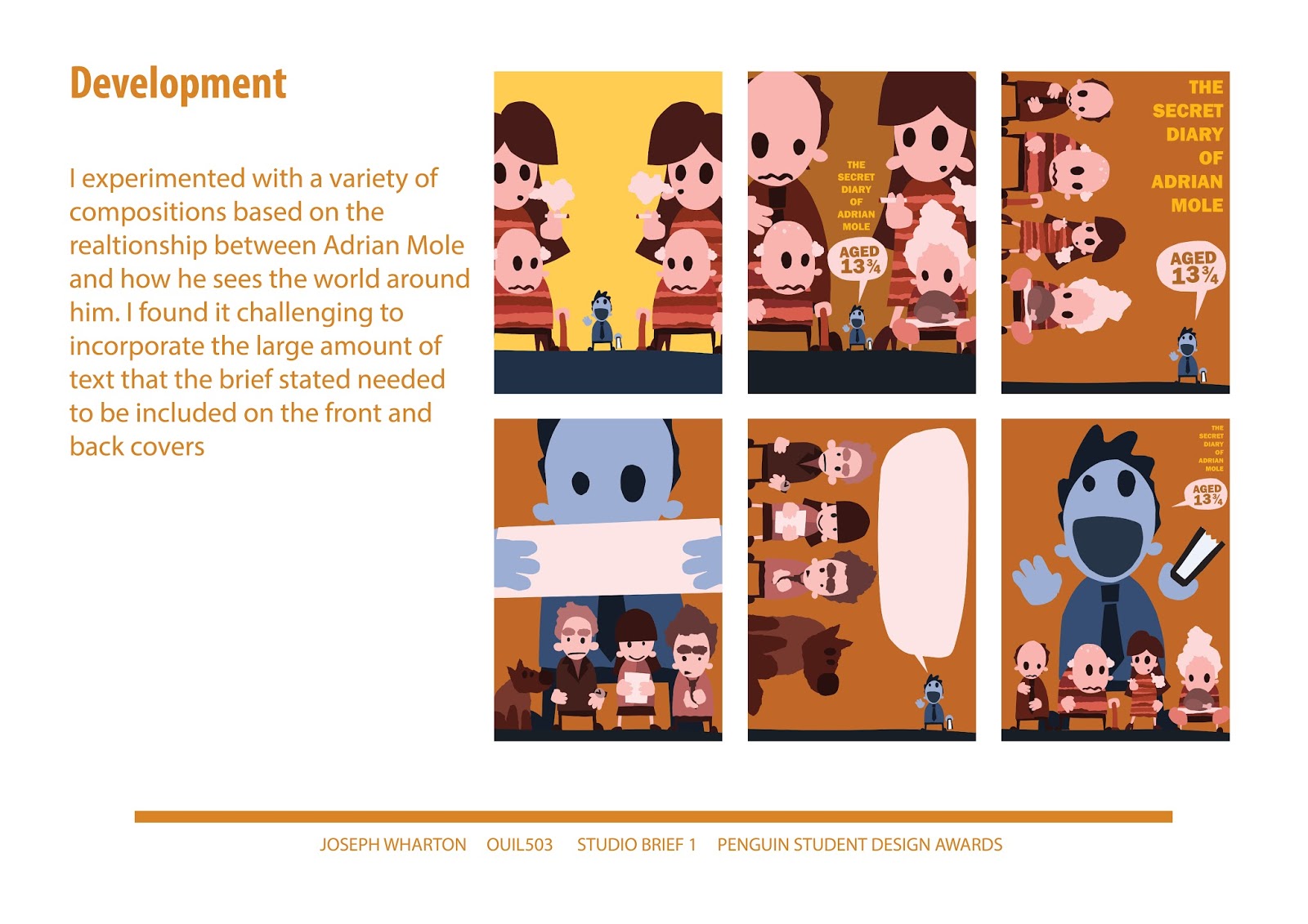
Adrian Mole was probably the project I spent the most time on for studio brief 1, I decided on a an aesthetic for the cover quite quickly but spent a large amount of time testing out different compositions and refining the final outcome. It was a difficult project for me and taught me a lot about working to a brief, there is a large amount of text that needed to be included on the front and back of the cover and I wanted the text to become part of the illustration not separate the two. I have included my research into previous covers and interviews with the judges. I found an interview with one of the judges specifically about what they think makes a good book cover which was incredibly useful. I also included a brainstorm I made at the very beginning of the project based on my research. The roughs I made were primarily based around character and composition, it was only after I started making digital images that I began to look at combing the illustration and the text. I made a set of characters that are involved in the story then tried out different compositions to see how they could be included without over complicating the cover, I wanted Adrian Mole to be the main focus of the illustration and to try and show that the story is written from his perspective. On the final board I have included both an image of the book cover layout and a mock up of how the cover would look if made to show as clearly as possible my final outcome.
I have made my boars for the Roald Dahl brief, I thought it was important to try and sum up the sections of the brief that I thought were most important and how I planned to meet those criteria. Researching the brief was quite difficult as the vast majority of images related to Roald Dahl are Quentin Blake's illustrations. I tried to find other interpretations of the Roald dahl stories but the results were limited to only a few practitioners so I started to look at other adaptations like film adaptations. The brief was quite vague and open to interpretation so I have tried to explain my thinking on the first slide. During this brief I worked through a number of aesthetics, compositions and stories so wanted to try and include as much of my development as possible without cluttering the slide. I have included illustrations that are earlier versions of the final outcomes and ones that I did not end up using but that influenced the direction I took the project in. I have displayed the final illustrations as a set of prints that include the Roald Dahl logo, the brief asked that the work appear as part of a coherent series and that they should compliment the logo so I have tried to demonstrate my response to this as clearly as possible.