Tuesday 27 October 2015

Photoshop Workshop


 For this project I started with an ink drawing of a plant and used Adobe Photoshop to make adjustments and additions to alter its tones, texture, colour and composition. I started by scanning in the image and resizing it to A3. I changed to levels so that the paper texture dissapeared and became a flat white colour, this method also enabled me to make my ink outline into a solid black colour.
I used to wuick selection tool to select individual sections of the piece and the brush tool to add more tones and fades to the above image.


 I wanted to get rid of the tones in my drawing so i used the selection tool to separate the solid black outline then deleted everything else leaving me with just the outline itself. I added a layer and selected to multiply option so that i could colour the drawing without affecting the linework.
I used 3 different fill colours to add some variation to the piece while still kepping the block colours very simple and bold.


 I wanted to add more detail and colours to the piece so used the quick selection tool combined with the brush tool to enable me to add different tonal valuers without the problem of the colours getting into unwanted areas. I added darker and lighter shades to the leaves and stems. I find that you can then use the colours of the surrounding area to 'cut back' into the shapes you have created to add more detail, especially sharp points.
I saved all these images at 300dpi so that they would be the correct resolution for print. If I then decide to use them on a digital platform i can drop the dpi if needed at a later time.


 I wanted to create an image with a more abstract colours that could possibly be made into a repeating pattern for fabric or wallpaer etc. I added to the linework using the brush tool to create solid shapes to separate the colours.


 We created out own brushes usimg the images we had been manipulating. I chose a small section of leaf which had some interesting textures and sharp edges. I'm not sure it works as a shading texture for this piece but i think it would work with a more complex composition with overlaying tones of varying opacity.


 I decided to swicth to another image to try and try out some other option that photoshop opens up. I chose this image of a yeti that has already been processed in Adobe Illustrator to make it a vectored solid black and white image.


I experimented a lot with this image to test out different elements of photoshop, I used layer and the eraser tool to combine the yeti image with a textured photograph and overlayed another brush stroke that i made from Gary Buseys face.


I combined the two images taking elements of both. I need a way to add flowers to the top of the plants stems so used the eraser tool to isolate the yeti's head and resized and altered the angle to make them fit the stems. I think the best section of this is the overlayed roots of the plants that have been scaled differently.

Saturday 24 October 2015

Digital Roughs


I wanted to research which colours are associated with certain emotions so that i could use them in my final illustrations. because we are limited to 3 colours effectively it is important to use the best colour combinations to best illustrate the important characteristics of the article. I needed contrasting colours to communicate health, sickness and sadness among others.

here is a list of the information i gathered on colour theory-
  • red is associated with energy, war, danger, strength, power, determination as well as passion, desire, and love.
  • Orange is associated with enthusiasm, fascination, happiness, creativity, determination, attraction, success, encouragement, and stimulation.
  • Yellow is associated with  joy, happiness, intellect, and energy. 
  • Green is associated with growth, harmony, freshness, fertility, safety and money.
  • Blue is associated with trust, loyalty, wisdom, confidence, intelligence, faith, truth, and heaven.  
The idea of colours associated with mood or emotion becomes more complicated at this point as different shades of each colour can dramatically change the effect. here are a few associations-
  • Light red is associated with joy, passion,happiness and love.
  • Dark orange can mean deceit or distrust.
  • Gold is associated with wealth or quality. 
  • Dull yellows are associated with sickness and decay.
  • yellow-greens can mean jealousy, sickness and cowardice.
  • dark blue is associated with knowledge and seriousness.
I tried to use different combinations of colours in the following images to see which i thought worked best and to test these linke between colour and emotion/meaning.


In the thought bubble i want to add the character looking up to someone at the top of a bigger hill.


 Although the red is more commonly used as the colour for a heart i think the yellow image communicates the feeling of happiness better.


It id difficult to colour this more complicated image using only 3 colours. I may have to use tones  enhance certain details.
I think this image may work better if I add more smoke to the background behind the large character so that he stands out more against a background of gray.
  
I have cheated in this rough sketch and used 4 colours yellow,green,black and grey. I am really struggling to find a way to somplify the colour scheme while still highlighting the key elements. The only thing i can think of is to use the same green as the money for the television screen.

Friday 23 October 2015

Roughs

This is an article from The Guardian by George Monbiot. In this project i will be creating 3 images to accompany this article. The 3 images will fit set dimensions and and be limited to 2 colours plus the stock/paper. The images will be used to communicate the idea central to the text. Each of the 3 images must be distinct but work as a set/series that are visually consistent. I need to avoid generalisations and vague messages.

Things i need to consider-
  • What tone of voice will i adopt?
  • How will i create a functional image, visual metaphors?signs? symbols?
  • How to illustrate the relationship between character and object?
 

 "What do we call this time? It’s not the information age: the collapse of popular education movements left a void filled by marketing and conspiracy theories. Like the stone age, iron age and space age, the digital age says plenty about our artefacts but little about society. The anthropocene, in which humans exert a major impact on the biosphere, fails to distinguish this century from the previous 20. What clear social change marks out our time from those that precede it? To me it’s obvious. This is the Age of Loneliness.
When Thomas Hobbes claimed that in the state of nature, before authority arose to keep us in check, we were engaged in a war “of every man against every man”, he could not have been more wrong. We were social creatures from the start, mammalian bees, who depended entirely on each other. The hominins of east Africa could not have survived one night alone. We are shaped, to a greater extent than almost any other species, by contact with others. The age we are entering, in which we exist apart, is unlike any that has gone before.
Three months ago we read that loneliness has become an epidemic among young adults. Now we learn that it is just as great an affliction of older people. A study by Independent Age shows that severe loneliness in England blights the lives of 700,000 men and 1.1m women over 50, and is rising with astonishing speed.
Ebola is unlikely ever to kill as many people as this disease strikes down. Social isolation is as potent a cause of early death as smoking 15 cigarettes a day; loneliness, research suggests, is twice as deadly as obesity. Dementia, high blood pressure, alcoholism and accidents – all these, like depression, paranoia, anxiety and suicide, become more prevalent when connections are cut. We cannot cope alone.
Yes, factories have closed, people travel by car instead of buses, use YouTube rather than the cinema. But these shifts alone fail to explain the speed of our social collapse. These structural changes have been accompanied by a life-denying ideology, which enforces and celebrates our social isolation. The war of every man against every man – competition and individualism, in other words – is the religion of our time, justified by a mythology of lone rangers, sole traders, self-starters, self-made men and women, going it alone. For the most social of creatures, who cannot prosper without love, there is no such thing as society, only heroic individualism. What counts is to win. The rest is collateral damage.
Advertisement
British children no longer aspire to be train drivers or nurses – more than a fifth say they “just want to be rich”: wealth and fame are the sole ambitions of 40% of those surveyed. A government study in June revealed that Britain is the loneliness capital of Europe. We are less likely than other Europeans to have close friends or to know our neighbours. Who can be surprised, when everywhere we are urged to fight like stray dogs over a dustbin?
We have changed our language to reflect this shift. Our most cutting insult is loser. We no longer talk about people. Now we call them individuals. So pervasive has this alienating, atomising term become that even the charities fighting loneliness use it to describe the bipedal entities formerly known as human beings. We can scarcely complete a sentence without getting personal. Personally speaking (to distinguish myself from a ventriloquist’s dummy), I prefer personal friends to the impersonal variety and personal belongings to the kind that don’t belong to me. Though that’s just my personal preference, otherwise known as my preference.
One of the tragic outcomes of loneliness is that people turn to their televisions for consolation: two-fifths of older people report that the one-eyed god is their principal company. This self-medication aggravates the disease. Research by economists at the University of Milan suggests that television helps to drive competitive aspiration. It strongly reinforces the income-happiness paradox: the fact that, as national incomes rise, happiness does not rise with them.
Aspiration, which increases with income, ensures that the point of arrival, of sustained satisfaction, retreats before us. The researchers found that those who watch a lot of TV derive less satisfaction from a given level of income than those who watch only a little. TV speeds up the hedonic treadmill, forcing us to strive even harder to sustain the same level of satisfaction. You have only to think of the wall-to-wall auctions on daytime TV, Dragon’s Den, the Apprentice and the myriad forms of career-making competition the medium celebrates, the generalised obsession with fame and wealth, the pervasive sense, in watching it, that life is somewhere other than where you are, to see why this might be.
Advertisement
So what’s the point? What do we gain from this war of all against all? Competition drives growth, but growth no longer makes us wealthier. Figures published this week show that, while the income of company directors has risen by more than a fifth, wages for the workforce as a whole have fallen in real terms over the past year. The bosses earn – sorry, I mean take – 120 times more than the average full-time worker. (In 2000, it was 47 times). And even if competition did make us richer, it would make us no happier, as the satisfaction derived from a rise in income would be undermined by the aspirational impacts of competition.
The top 1% own 48% of global wealth, but even they aren’t happy. A survey by Boston College of people with an average net worth of $78m found that they too were assailed by anxiety, dissatisfaction and loneliness. Many of them reported feeling financially insecure: to reach safe ground, they believed, they would need, on average, about 25% more money. (And if they got it? They’d doubtless need another 25%). One respondent said he wouldn’t get there until he had $1bn in the bank.
For this, we have ripped the natural world apart, degraded our conditions of life, surrendered our freedoms and prospects of contentment to a compulsive, atomising, joyless hedonism, in which, having consumed all else, we start to prey upon ourselves. For this, we have destroyed the essence of humanity: our connectedness.
Yes, there are palliatives, clever and delightful schemes like Men in Sheds and Walking Football developed by charities for isolated older people. But if we are to break this cycle and come together once more, we must confront the world-eating, flesh-eating system into which we have been forced.
Hobbes’s pre-social condition was a myth. But we are entering a post-social condition our ancestors would have believed impossible. Our lives are becoming nasty, brutish and long."


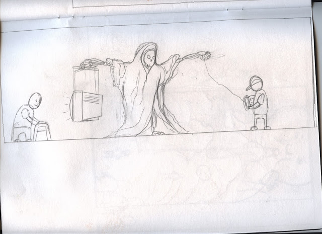
This image shows death drawing in 2 different generations using different forms of technology. I wanted to show how advances in technology have changed the way digital media affects people in terms of causing or being a symptom of loneliness.


With this image i wanted to show the way that television promotes unobtainable levels of wealth and celebrity that mean people will never be happy with their lives no matter how successful they become.


The idea behind this design id to show the health implications of loneliness. I tried to keep the image simple and bold and use colours that would the message.


This image is designed to show the way that a competitive society drives people to view each other as competition and that we should set our own goals instead to looking at others accomplishments.


This picture shows a mobile phone as the pied piper leading the youth of today away from themselves and each other.


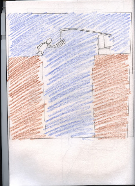
I got the idea for this picture from Scrooge McDuck. I wanted to show how even the most well off people in the world feel they need an average of 25% more than they have now to be financially safe. At which point they will most likely decide they need an extra 25% again.


In this image i tried to show how mobile phones allow people to see the entire world while sat in their own home, something that has caused people to spend more time alone at home.


For this illustration I have drawn the central character in a hospital bed thinking about the things that have had negative affects on their health. The thought bubbles illustrate loneliness and the quest for wealth.


Tuesday 20 October 2015

Line

 Today we looked at the different qualities of line we can use to change the our illustrations in a multitude of ways. I tend to use thin fine liners to build up thicker lines with varying widths. I think this method has a lot of positive effects on my work in terms of a crisp clean finish and a high degree of control over line width and shape. the problem is that it doesn't really allow for loose expressive lines that help create a feeling of movement or form. I think i need to find a balanced combination of the two using faster looser strokes to plan out my sketches and precise built up lines to deal with fine detail.


 The first sketch i did was with a brush pen. I like some of the lines especially the feathers on the griffins face and the stripes on the body. I am so used to block shading all my drawings that it was difficult for me to stop myself. I put too much detail on the front leg and the wind doesn't look right.


I drew this sketch of an owl griffin using a very light grey Copics marker. The shape and flexibility of the Copics brush nib makes them very enjoyable to draw with. I like the idea of mixing different animals to create new mythical creatures. I normally use Copics markers with solid black outlines but think i will try and see what effects i can create without.


 I drew these owl griffins with a felt tip pen, although not as loose as the previous drawings i like the forms created in the sketches. I found an image i liked and decided to draw it repeatedly because I struggle with anatomy, my drawings often appear too staged or stationary. this process allowed me to isolate and change the parts of the drawing i was having trouble with. I think i tend to under emphasize the more predominant parts of the animals or people I'm drawing, drawing what i think something should look like rather than whats actually there. I am most happy with the second sketch down in the second column. The right front leg works really well as does the shape of the body and neck. The back legs need to be drawn as freely as the front. I think its a matter of confidence as much as anything else. I am going to keep working on this repetition to see where it takes me.


 this sketch is a similar composition to my repetition sketches. dashes at the top of the leg and on the neck add to the texture of the drawing giving a feeling of form. my favourite parts of this sketch are the textured lines making up the tail and the wings although I think I could refine the lines on the wings.


Sunday 18 October 2015

First 4 Pages of Sketchbook


I chose mythological beasts as the theme of my drawings. The first drawing i did was of a Golem which is taken from Jewish folklore and is a being created from inanimate matter like stone or clay. I drew inspiration from the Darksiders computer game in which stone giants act as gates throughout the world.


The second page i drew was of a Yeti. i wanted most of the monster to be silhouetted  against a white backdrop of snow.


 The third image i drew was of a Aspidochelone which is a giant sea turtle so large it can be mistaken for an island, i decided to populate the the shel, of the turtle with a city and trees after seeing an illustration by Jared Muralt that created a similar composition using a giant fish.


I looked at a lot of Greek mythology that is littered with many mythical beasts but decided to draw one of the most well known, The Minataur.

Typology Chosen Concept and Finished Piece

There were two or three of my original ideas that i really liked. I was stuck between the list of falls, Mister Men and Little Miss, and the reasons to hate catching the bus. I was leaning towards choosing the list of falling  as i thought I could illustrate each fall well fairly easily using simplified characters making it easy to understand while making it look nice. I thought that the Mister Men and Little Miss idea would only look good done in full colour and with some more work done a some of the characters that didn't really work. I liked the bus idea but wasn't sure how well I could illustrate each situation to communicate the scenario however after the feedback i received in the croup crit I decided to change to the bus idea as it got by far the most positive response. I think it got this response because it is a scenario that everybody could relate to and made people feel a connection to it.


I drew each idea at the scale they would be on the final poster to get better idea of how they would look when finished. I kept the simple line work and characters as i liked the way the simple facial expressions communicated the depressing reality of each letter. I added some extra details and slightly changed the layout of some of the images i wasn't happy with.


This is my final Poster, I used a light box to trace my designs onto the A2 sheet and drew them using a fine liner. I wanted to add a couple of levels of tone and decided to use copics markers as I've used them before and they work well with fine liner. after adding the first layer of shadow with a very light grey I decided not to add anymore. I think more tones of grey would of over complicated the illustrations and made them look cluttered. I am happy with the concept of this poster but think i could have spent more time on the layout and the lettering for the title.

Typology Concepts


 For this A-Z i wanted to take the characters from Studio Ghibli films and place them in real life situations. The situations are dark and contrast well with the beautiful illustrations and fantasy world of Studio Ghibli. The problem with this list is that the viewer would need a good knowledge of the animations to appreciate the concept.


 In my original list of ideas i wrote down an A-Z of dogs however when I thought about it the idea is a bit dull. I decided to still keep the same idea but draw the same dog for each letter but change what the dog is doing. I tried to make each letter funny and light hearted.


 For this list i chose to draw a portrait of famous boxers. Like the first list the viewer would need a knowledge of the subject matter, also due to the alphabet format I had to leave out a lot of big names and include some very obscure ones.


 I normally cycle everywhere i go but on the day we received this project it was raining so i caught the bus and was reminded of all the reasons i hate it. I wanted to make a list that people could relate to. I struggled with one or two of the letters but i think nearly all the situations are things people will have experienced and hated.


 After talking to the other people in the group i realised that they were talking about lists of tv programs and cartoons I didn't know as I'm older than them. I decided I wanted to do a list of cartoons that I watched growing up. Originally I wanted to stick to 80's cartoons but had to include a few 90's ones to complete the list.


 I had the idea to create an alternative group of Mister Men and Little Miss characters. They are fun interesting characters that are enjoyable to draw. This theme opened up a lot of possibilities as it is less specific and allowed me to really use my imagination. I would really like to make a full colour poster of this concept.


 I decided to create an A-Z of hats because I thought it could look good as a very graphic minimal line drawing. This idea could look really good but the concept is quite dull.


 I think this list of facial hair could be a challenging concept to complete. I would like all the portraits to be detailed line drawings. I think some of the ideas are quite funny and could look really good as a poster.


 I really like some of the drawings from this list of animal clothing especially the pelican scarf, octopus gloves and rattlesnake sock. I thought a couple of the ideas were good like the quail bullet proof vest  but overall the list is fairly random.


I really like this idea, i skateboarded when i was younger and i rock climb and cycle a lot now so have a lot of experience with falling. I think everyone will find at least one or two falls they can relate to and some more they find funny.

Wednesday 14 October 2015

Sketchbook Seminar


Sketchbooks are a place to develop ideas and images with the freedom to make mistakes and explore all possible outcomes. I tend to find it difficult starting a new sketchbook as i want every page to look good. I think it's important to discard any feeling of pride or ego in sketchpad work s it can hold you back and influence your decisions. I think i need to draw more freely and experiment with media and line to improve my drawings and concepts.
Although a sketchpad is a place to log ideas and concepts through both drawing and writing it is a good idea to keep notes minimal and keep any larger pieces of writing on a blog. It is important to understand and recognise transformative moments and make of note of which drawings represent these changes, these drawings should be uploaded to my blog.

Important things to remember


  • Be stupid
  • Be serious
  • Be subjective
  • Be yourself
  • Make comics
  • Write down all ideas

  • Don't censor
  • Don't tear anything out
  • Don't be tentative
  • Don't make illustrations
  • Don't make it an academic document
  • Don't loads onto each page

These are some sketchpad pages from Jared Muralt. He uses mole skin pads and draws across both pages to create one one bigger image. I'm not sure i could draw like this as i prefer a single sheet of A3 with nothing in the way to effect hand movement. His sketch pads contain a combination of full page illustrations and rough sketches.


Tuesday 6 October 2015

Drawing from Observation

Drawing From Observation


I chose this brush and ink sketch because i like the shape and relative simplicity of the tones. It was my first attempt at drawing this cactus and it gave me some good ideas of how to put together following sketches.


this sketch has more depth of tone than the previous one making the form more apparent. I think it makes it a more interesting image than the first one. I am happy with the added depth but should tone down the sold black outlines.


This sketch was the third in and final sketch in a series based on the same photograph. I wanted to highlight the shadow of the trees on the building, the detailed silhouettes of the leaves and branches contrasted well with the solid form of the building.


Drawing from reference is an extremely useful way to gather information about a particular subject that may not be readily available for you to draw live. You can draw from a wide variety of examples but are constrained by the photographers choice of composition and the quality of the image. Drawing from you own observations means you can choose your own composition and study movement and form more completely.I often use reference photographs to help me with illustrations but observational drawing has given me a new perspective and altered the way i look at certain compositions especially figure and movement.

making multiple drawings of the same image has been an interesting and challenging experience. often drawing at home i will sketch and erase lines and forms until i find the right one then carry on with that image until its a finished product. The problem with that is it  doesn't encourage experimentation. I definitely noticed improvements the more i repeated the same image (as well as things that didn't work). A big challenge for me was to maintain concentration and not rush main parts of the composition after already drawing them a few times previously.

I would like to work more with ink & brush. It is not something i have done much in the past and i like a lot off the effects and tones the media helps create. It also pushes me away from crisp built up fine liner lines that i am used to using in the majority of my illustrations.