Tuesday 19 April 2016

Simple


I wanted to create a simplified version of my final poster design that concentrated on the emotions of the characters.


I created the image in the same way with hand drawn line work and digital colour overlaid with textures. This was put together quite quickly but I think if I spent more time fine tuning the characters this kind of simpler composition would work well. I need to learn to hold back on the number of details I put into an image that are not necessary and end up confusing the message I am trying to convey. I tend to start off with a small number of elements I need for my design to work and then add more and more in the search of a finished product that looks good. I need to focus on making each of the original elements perfect instead of adding more detail to disguise imperfections. I need to spend more time fine tuning in between roughing and final designs!!!!!!!!!!!!


Monday 18 April 2016

Emotion


I like my final pieces from this project but I am still having trouble communicating emotion. I spent a long time drawing facial expressions for the Alice character in this project and still feel it could be improved. I am trying to find a balance between a polished finished image and something looser. I need to spend more time researching illustrators that have a style similar to mine but manage to really get into the feel of a situation or story. It is a hard aesthetic to pin down as it is subtle and can be achieved in a huge range of ways, it is not a simple matter of colour, crafting or composition etc.
I like a lot of my quick character sketches but they lose something when I try to transform them to a finished product. I think in my process I tend to make things too uniform and work to a set method that can compromise any feel of movement or emotion. As in previous projects I have come back to struggling with subtlety and simplicity. I start out trying to keep an image as simple as possible to make an idea as effective as possible in its purest form but over time it becomes blurred or lost in my attempts to create an aesthetically pleasing image.
I need to break away from my process and looking at other artists will help me to understand how I can do this. It is easy to feel completely lost when trying to change how you work. At the beginning of this project I had the idea to create a serene garden scene with Alice playing and birds chirping in the trees around her but didn't know how to realise the idea I had in my head. I need to be braver in these situations and not revert back to a creative practice I feel safe with.

I looked at artwork by an illustrator called Nick Hamilton who is also called The Hammo. his work shares some characteristics with mine as it often includes heavily detailed crisp digital work. Looking at his work I realised that the ones I liked best were his more simple pieces that didn't look like impressive technical drawings but were easier to take in and made good use of limited line work and colour. I think in these simpler designs you can see the how the character is made to tell a story from facial expression to posture. With a simple image anything that was not in keeping with the theme would be far more obvious. An overly detailed image can be used to disguise mistakes and this confusion applies to the message your trying to communicate as well. The quality is in the character design and composition not the intricate line work. These images feel softer and more inviting.


Ella 10


I got my printing done on Thursday in the digital print room. I was quite nervous to see if it would come out right as I only had chance to get one appointment in time for the hand in. Before taking my work to the print I resized the images with a 3mm bleed and crop marks. The printing went well and i'm glad I spent so much time making adjustments and printing off all the different versions.


I made the postcards ands stamps using the same elements that make up the poster. This way I could keep a constant theme throughout and they could all work as a set. Having 3 characters on the poster meant that I could dedicate a postcard to each. I tried to create compositions that make the most of the shape of the characters. The postcards allowed me to have a chance to put together an image tailored to that one specific character without having to think about balancing out a more complex layout.


In the stamp designs I framed the images very close up. I wanted to make the beaks and mouth of the characters look almost like patterns. I have used elements from my poster to make my postcards and stamps changing the composition in each. I have tried to use the lettering to create movement in the pieces giving the feeling of the sounds surrounding Ella Fitzgerald in her last days. Working this way means that the three different dimensions I have worked with will have a lot of similarities but I think I have used scale and layout to make each image stand out from one another while remaining part of a set.


Sunday 17 April 2016

Ella 9

I got rid of the border completely and made a silhouette out of the lettering form the piece. this allowed me to make a more interesting shapes border for the characters without using a border. This keeps the composition lighter and more open. In my previous print outs the 2 tones in Alice's hair were hard to distinguish between so I lightened them and tried create more contrast. I also changed the skin tone to balance the composition that had previously been too dark towards the bottom. i changed the positioning of the colour fade in the background so that there was a glow around Alice's face to highlight her. I tried a range of other textures to try and find something more subtle that would still give the vectors a nice crafted feel. I experimented with creased paper and tried using tea to stain the paper and bring out the imperfections. in the end i used a scan of an inside cover page from an old book. The paper has a really nice grain to it with a few marks and imperfections but is lighter coloured and not as distracting form the vectors as previous textures I have used. 
I made some changes to the quote as well. I wanted it to look like ink on the page that had faded in places.


Ella 8


Over Easter I got some help form a friend that runs a printing company so i could test of my designs on high quality printers. the images were printed on banner material which has a slight cross hatched texture to it and highlighted the problem with adding textures in Illustrator. The digitally created textures look good when printed on a smooth flat surface but when combined with another texture look confused. The whole point of the texture is to create a crafted and aged feel to a digital image, if the textures clash with the surface they are printed on it has the opposite effect and makes the image look false.

I printed off 3 different versions of my poster altering the texture and brightness.


the first print came out way too dark, the character is completely lost in the composition and some of the tones in the picture have disappeared completely. I like the level of the texture added to the image but at this level it has a detrimental effect on the images colour balance.


I used the texture of cracked plaster on a wall for this version and overlaid it at an opacity of 60%. Once again the character has come out too dark and the colours look over saturated. 


this print has been lightened in Photoshop and is the best of the three in my opinion. It still has some problems and needs to be tweaked. Alice does not stand out enough among the bring colours around her, I need to change the tones of her skin and hair independently from rest of the image. Although this was not successful as a final print process it helped me to figure out some problems that i could not have foreseen working only on screen.


  • The tones I used for the Alice character need to be tweaked.
  • Printing onto textured surfaces is a bad idea for this kid of digital texture.
  • the effect of the overlaid texture seems to be stronger when printed compared to on screen.
  • the border overpowers the image adding unnecessary darkness to a bright composition.
  • I need to find a balance with adding textures. I like the way the textures add a crafted feel and mute the colours slightly but need to find a way to do this without darkening the image too much.

Saturday 16 April 2016

Ella 7

I used Adobe illustrator to put the separate elements together into a composition. I used a tall thin frame to exaggerate Alice looking up at the birds. I wanted to make a frame inside the page boundaries and have some negative space around the edges to contrast with the busy and bold composition. I needed to find a way to create a border that fits with the rest of the piece.
 I didn't want the border to be a perfect sharp edged line as all of the pieces I used to build up the image although vectored are hand drawn and aren't 'perfect'. I think a straight edged border would clash with the rest of the image so i made a broken up line and built up the frame from there. I wanted some of the lettering to overlap and leave the frame to break up the structure of it and make the overall shape more interesting and appealing as if some of the elements are leaving the confines of the image. i tried to use brown as the colour for the border as I have tried to avoid black (even though the character line work is a dark grey).

I like using textures but have been trying in recent work to add textures to make the images feel more crafted and 'real'. I watched a few tutorials to find some new ways to achieve this and started to look at overlaying textures using multiply on Illustrator. Doing this muted the colours I had used and made solid vector shapes look as though they had been painted or printed. I really liked the muted colours and the image looked bright enough on screen but when i printed it the image was too dark. The character I drew for Alice was the darkest  section of the image and got lost among the lettering and grass at the bottom of the page. I tried changing tones and exporting the image to Photoshop to change the brightness of the entire image as one. it was a difficult process as I had to keep printing off copies to give me a good idea what the final piece would look like. I have a laptop with a good quality screen but it might be time to invest in a more colour accurate monitor!!


Ella 6


I looked chose some of the interpretations of bird noises and laughter that I though would represent the scat singing form Ella Fitzgerald's songs. 


I want to layer the words in front and behind the characters on the poster, changing the scale and colours. I would like the colours to form a background that matches the colour scheme of the piece and doesn't look too busy. This will be difficult with the amount of information on the page. I wanted to use a background that looks like the sky as the sun is setting to give a feeling of serenity or relaxation so decided to use colours for the lettering that matched that colour scheme. I tried to make the lettering bold and easy to read without using type and uniform letters.


Friday 15 April 2016

Ella 5


I decided to try a few more character designs and try to make them slightly more subtle in terms of emotions. I looked at the date Alice was born and tried to figure out how old she would have been at the time of the quote, from what I could work out she would have been around 11 years old so a lot of the characters I have drawn would be way too young. I wanted to draw Alice looking calmer than in  my previous sketches. I also wanted her to look in awe of her surroundings and the chorus from the birds.


I drew a couple of birds in a similar style to the character and tried to make them look happy, I think it might be easier to apply simple emotions to as they are not associated with a wide range of emotions. With human characters one line out of place can change an emotion completely but with birds there aren't the same number of signifiers. I wanted to chose colourful birds so that I could use less of them in the composition but still have an interesting colour range.

I want the birds to be strong characters in the composition so I think having only two of them scaling them up to be larger in the frame than my roughs will work better and also help to make the composition less hectic and confused. I will need to make sure the lettering doesn't clutter the feel of the piece and detract from the characters.

Ella 4


I wanted to use the sounds of Alice laughing and the birds singing to draw comparisons with Ella's scat singing. I needed to find a range of sounds for birds tweeting and laughter so I looked up the ways that laughter is written down in different languages.

WWW-Japanese
RSRSRSRS-Brazilian
55555-Thai
AH AH AH-Italian
KKKKK-Korean
HI HI-Icelandic
MDR-French
XA XA XA-Hebrew
JAJAJA-Spanish

Finding these gave me lots more options for the sounds I could use in this image and gave me the idea to search for the ways animal sounds are translated in different languages. I found an illustrator that had made a book of lots of different animal noises and their translations.


This book provided some perfect inspiration for my work and made my research a lot easier. There is a good range of sounds allowing me to add variation to the ones I choose making them more comparable to scat singing.


Ella 3


I started to rough out some compositions to give myself an idea of how the characters would work within the frame.

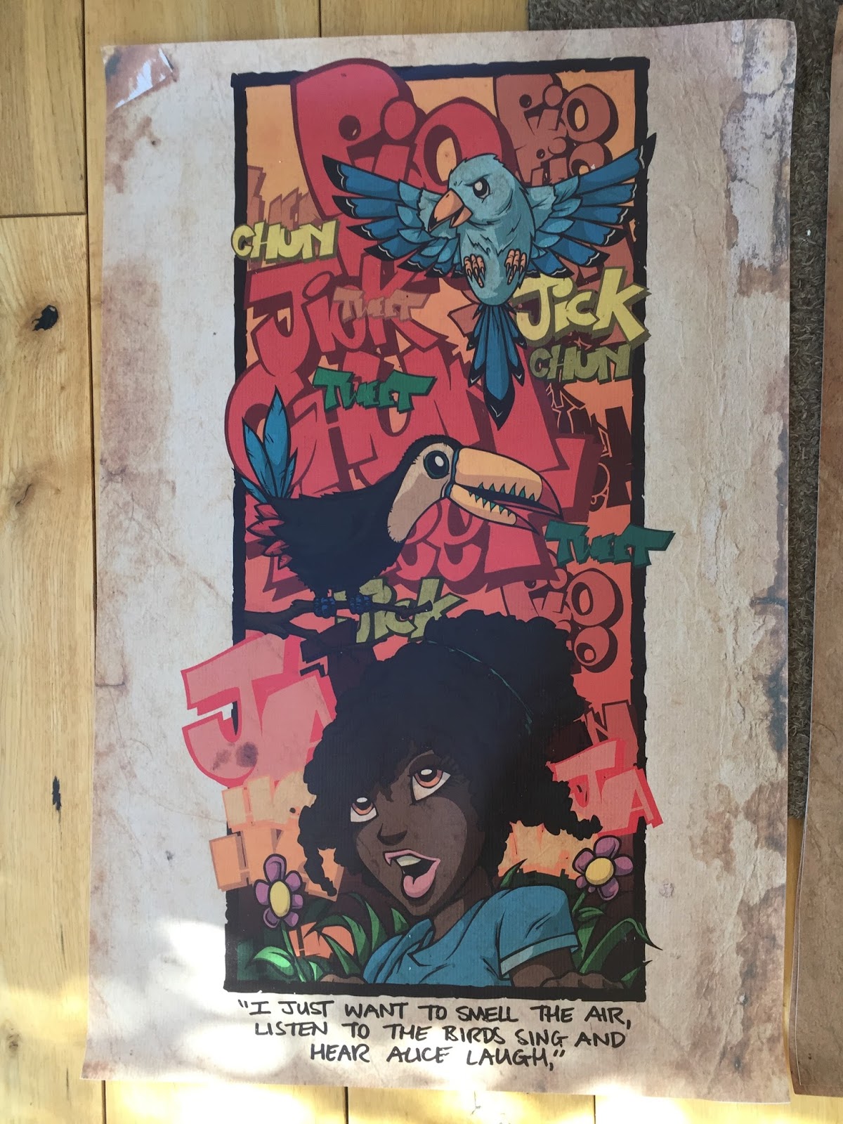
I want to show some interaction between Alice and the birds, whether she is jumping out and scaring them or just watching them sing. Having lots of birds in the picture is good and bad, good in that it opens up an incredible colour spectrum but it is difficult to fit lots into a composition without it looking cluttered.


I like the idea of basing the composition from Ella Fitzgerald's viewpoint. I am not sure I like having Ella's arms in view. They could change the focus of the illustration and add depth to it in the wrong way. it could work with her arms in view but I think it would shackle my options for the rest of the composition.


I chose two of the roughs and made more detailed versions of them adding colour. Of the two I think the bottom one works best. the character is lined up with the birds and her eye line leads up to them. I would add sounds to the sides of the image in the background using grass and sky colours. I like the change in scale between Alice and the tree in the top design but I think the bird characters will be too small in the composition and wont be as effective as I would like.


I reworked the image in Adobe Illustrator to see how the sounds in the background would work. I think I need to do more work on the lettering. The character jumping out combined with the lettering and the movement of the birds makes a hectic energetic composition that doesn't really communicate up a serene beautiful day in the garden. I want to involve sounds and a performance but need to find a balance.


Ella 2


I really struggled with my drawings of Ella Fitzgerald's grand daughter Alice. I wanted to show her happy and laughing but kept making mistakes with facial expressions. I think I have tried too much in the past to make characters look 'good' without putting enough thought into the emotions that they are conveying. I made sketch after sketch trying different styles and started to feel quite negative about the process.


While trying to make characters that look like they're laughing I managed to draw lots that look angry, not much help with this project but at least I know how to draw angry people. I did like the simpler characters like the one above. The big bold eyes and giant smile sum up the emotion I was looking for. Another problem with this character design was that I could not find a picture of Alice anywhere. She was Ella's grand daughter and the daughter of Ray Brown Jr who was well known as a jazz pianist and singer so I thought finding a photo of her would be quite easy.

I really want every part of this image to communicate the happiness felt by Ella Fitzgerald sat in her garden at the end of her life. I want my illustration to look like a performance from the birds and Alice. I think I should use bright summery colours to represent nature and her surroundings.

Ella 1


I chose Ella Fitzgerald out of the three people I was given. She had was an amazing person and is an inspiration to many people. I wanted my illustration of her life to be more personal and about her as a person rather than her career. I kept coming back to a quote from her when she was very ill towards the end of her life.

"I just want to smell the air, listen to the birds and hear Alice laugh,"

Although this is a quote from a time that could be considered sad it highlights her personality and spirit in the face of adversity. It also highlights a change in her life from performer to audience, she had spent most of her life entertaining people all over the world and was now being entertained by the world around her.

I wanted to make a poster that featured each element from the quote and find a way to include the sounds of birds singing and laughter.


I thought about combining bird characters with musical instruments. One of the problems I had was deciding whether to draw the birds holding instruments of make the birds beaks into the instruments. I liked the idea of the beaks forming the shape of wind instruments but the images looked quite surreal and I don't think they would have suited the feel I was wanting.